During World War II the United States was able to mobilize industry and motivate its citizens in breathtaking speed. Factories were overhauled and consumption habits transformed. Strong, graphically compelling posters played a crucial role in the success of this campaign.
These posters presented the actions of individual citizens as vital for the nation and portrayed those who took part as attractive, dynamic American heroes.
Today a similar mobilization is required to address the crisis of global climate change and achieve energy independence. That’s why The Canary Project and its partners have launched Green Patriot Posters.
Green Patriot Posters is a communications campaign centered on posters that encourage all U.S. citizens to build a sustainable economy. These posters can be general (“We Can Do It!”) or can promote a specific sustainability action.
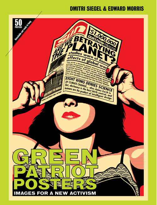
This quote is taken from the About section of the group Green Patriot Posters. The website greenpatriotposters.org allows you to browse the submitted posters, get inspired, and submit your own poster. The aesthetic bar appears very high, though they possess a wide array of styles. Above, the cover for their newly released book “Green Patriot Posters: Images For A New Activism” published by Metropolis Books in the US and Thames & Hudson in the UK. The group is also very proud of their methods of production.
“The book was printed in the US (a big deal as anyone in the publishing industry knows), with 100% recycled paper, using vegetable inks and also using 100% wind power (via the purchase of REC’s) in the manufacture of both the paper and the book itself. Courtesy of Monroe Litho and Mohawk Paper.”
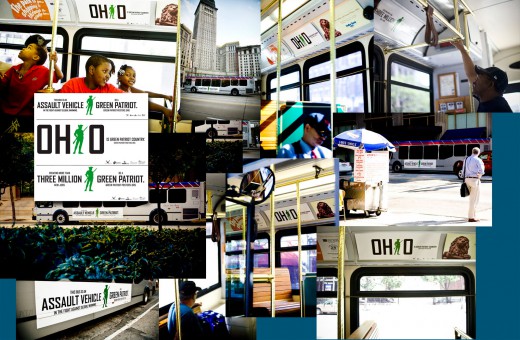
The design group launched their idea with a series of advertisements on 70 busses within the Cleveland, Ohio area, designed by Michael Bierut of PENTAGRAM.
Americans have a great ability to pull together in times of crisis. Each day brings headlines that make it clear that global warming and dependence on costly and scarce foreign oil will demand the same kind of resilience, self-sacrifice and ingenuity that we’ve exhibited in the past: in short, that special American brand of patriotism. Back in the 30s and 40s, folksinger Woody Guthrie had a slogan on his guitar: “This machine kills fascists.” I was looking for a similar kind of statement to turn every bus ride into a blow for the environment.
The idea of fronting a campaign that is so politically charged is quite complex today, as it’s always been. Though in recent history there seems to be an increasing amount of re-appropriation of propagandistic aesthetics and strategies. There is a certain immediacy to the style, and it poses a kind of relevance when questioning the amount of “militancy” that is needed when considering what needs to be done in this “new activism.” However, this cultural power seems to rely on these “tactics” to be seen without the viewer considering it a stylized or chic imitation of a style that focuses on “real” issues like war, causing the movement to be ignored by the very masses they were made to address. It is a difficult balancing act.
The activity of greenpatriotposters.org reminds me of some of the concepts behind Broken City Lab‘s methods of engagement and disruption (and I’m not only talking about the ads in busses). An open poster contest might be a good idea for BCL to create avenues of engagement with artists and designers in the local community and people from around the world. Possibly focusing on certain local issues like buying local, riding a bicycle or even bicycler’s rights might be interesting subjects to open a public forum of ideas in the form of posters and graphic design.
Below is a collection of, what I considered, some of the strongest posters submitted so far in the Posters section of the greenpatriotposters.org website.
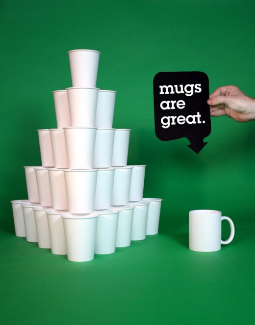
Mugs Are Great by dsiegel
Buy Local by Jessica Colaluca, Seed
Plastic Prisoners by Robot-Uprising
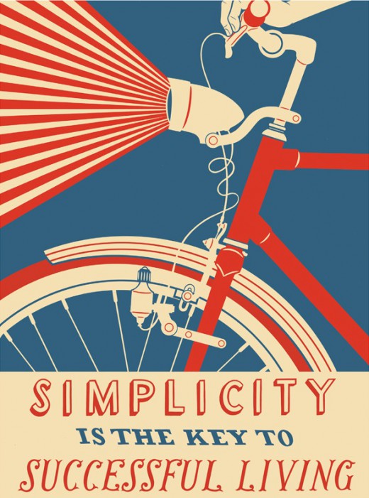
SIMPLICITY IS THE KEY TO SUCCESSFUL LIVING by Nick Dewar
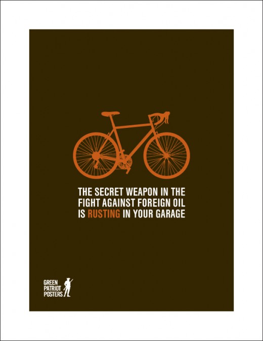
Rust by Matthew Geiger
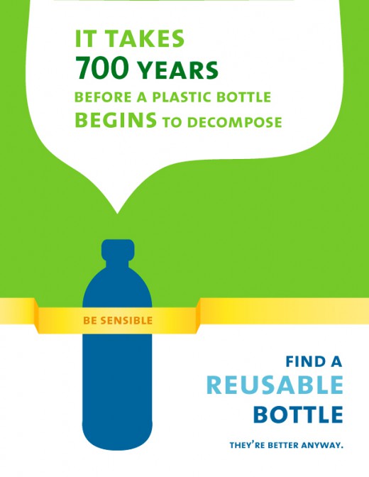
Think Before You Waste Reusable Bottle by Estraire



Funny, I have the header image as a huge 2-foot-by-3-foot original print form the G20 Summit in Pittsburgh from 2009.
It’s hanging in my living room. My brother thought I’d like it…and when I saw it, my jaw dropped. It’s gorgeous…and a Shepherd Fairey. Sweet.
Ha Wow. That sounds good. I was surprised and happy with the amount of posters that didn’t employ that kind of Shepherd Fairey aesthetic. Especially since the Obama posters, that style has become a bit neutralized as far as impact-full imagery.
Though I still like his work.