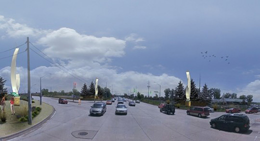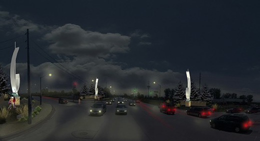
Physical civic improvements are an important step for Windsor. Our gateways, if you’re unfamiliar with the city, are a bit lack-luster at present. Where gateways do exist, the markers are underdeveloped, poorly executed, and are the kind of “this could literally be anywhere” design strategy.
Why do gateways matter? Physically and visually defining space is crucial to understanding where you are, and if gateways are to be the entrance to a city, they need to clearly enunciate where you are, and one might argue that this should denote a certain specificity. Failing at gateways means failing to define a space appropriately and in turn continuing to fail at getting over the “non-place” hump.

Windsor’s latest gateway proposal continues in this lineage, although with a greater budget attached — $520,540 to be exact. As noted in the Windsor Star, these new gateway markers, pictured above, are to be something of “significance,” something to announce you have “reached your destination” in the City of Windsor, and something “embracing.” I read all those words as resolving to, “something you could find in absolutely any other North American city.” Depending on your attitiude towards these markers, you can either read, “‘Gateway markers’ stir criticism over cost” or “Gateway Windsor markers to have ’embracing’ feel,” in the Windsor Star, both headlines feature the same story.
Above all though, it’s not necessarily the cost, or the questionable aesthetic choices, or even the totally insensitive design rationale, but it’s the blatant missed opportunity that is most crushing.
Windsor could have had a national or even international competition for the design and construction of these gateways — that is, a competition to artists and artist-led design teams, you know the ones we read about every single day on Akimbo. The jury could have been made up of community members, local artists and architects, and city planners. It could have started a real conversation about what a gateway means to our city, what it should do specifically for our city, how it could have truly defined that space, it could have possibly even been commissioned to a local artist or architect.
Indeed, these markers could have become a touchstone for how we can consider rethinking this city’s infrastructure. It could have been the beginning of Windsor shaping our own story at both a local and national level. It could have been an opportunity to make a decision that considers these types of civic improvements not merely decoration, but absolutely essential to infrastructural design.
Instead, we get something from the international company NORR, which, to be fair, hasn’t necessarily done anything overly offensive in their other work, but which ultimately hasn’t really done us any favours with this design. However, it’s not about NORR, it’s about the city’s lack of vision and understanding for how to make great places that makes this so frustrating. Whether this passes at council on Monday night looks potentially questionable, but even for the original allocation of $300,000, I’d like to think that we could have ended up with something a bit more appropriate, or dare I say, inspiring for this space.
On a closing note, that these gateways announce you entering Windsor’s non-place par excellence (that is, the stretch of Walker Road featuring kilometeres of sprawling big box retail) is another issue entirely — 26,000 daily commuters aside, this is still one of the worst places in the city.

Oh, wow. I don’t like this at all. In no way does this really feature Windsor as a ‘gateway’ city. So bland. And this is planned to be on Walker?! I’m not sure how many people get off there from the 401 in comparison to people going through Huron line, but… it doesn’t seem as ideal.. you know?
Will they be talking about this at a council meeting soon? I’d really love to sit in and listen. I’ve never done that before.
I remember driving with Terry to the big-box area of Walker road a few summers ago and watching him cringe in disgust. I distinctly remember him saying “get me out of here” as we headed for Old Walkerville.
That being said, I’m not too sure about these illuminated can openers. Maybe I’d have to see a mockup from a different angle or something. The most important issue is that the concept and design was done by a firm that probably has little to no stake in Windsor’s community, right?
Rosina mentioned sitting in on a council meeting. Is that possible? I know it’s broadcasted on local cable TV; my dad often watches it.
Council meetings are Mondays at 6pm.
The vote would be on whether or not to spend the money, but the design is already set to go.
It’d be awesome for you two to go and report back on how it all went down!
People can and do have more than a generic experience in Windsor.
Who says they don’t?
This proposed gateway says they don’t.
Ahhhh! yes, word … and really, that’s the gist of all of the vast majority of our infrastructure, isn’t it? Why does it seem so impossible to develop something identifiably specific to here?… Lack of confidence?
It’s lack of imagination.
Josh, I’m pretty sure those meetings are open to the public. BCL field trip? I’ll be in touch.
Anybody can attend Council meetings.
By the way, did you notice the two women standing in the bottom left hand corner in front of one of the markers? At a busy intersection that has no sidewalks? Bit of creative licence, that – that particular intersection is one of the least pedestrian-friendly places in the city!
You might think I’m nit-picking, but I’m just pointing out that the artist’s rendering is trying to convey an element of liveability that simply doesn’t exist at the busy entrance to Windsor’s “non-place par excellence” as Justin aptly described it.
Great eye, Philippa, those Photoshopped pedestrians are completely absurd.
Here’s hoping that if the 1% for art policy recommendation (#11) in the Municipal Cultural Master Plan actually gets enacted that it gets utilized to its full potential… quoting from the recommendation (with wishful thinking), “Any acquisition and unveiling of a new public work of art should strive to generate media attention to demonstrate the City’s support for the cultural sector.” This builds from the 2005 public art policy that was developed, but never actually implemented.
these things are riiiiiiiidiculous. $500,000 could be better spend 500 ways as $1000. could you imagine if 500 creative individuals were each given $1000 to do a specific project in and about windsor? or if there were large collaborations across borders/time/disciplines? this would bring far more satisfactory buzz to the area. it would be something beyond the ‘driving down walker road experience’.
a funny note about norr, they were ‘consultants’ to the city of windsor about 10 years ago for a new windsor arena to be located across from the art gallery. i have an image. in front of the proposal there are a few large ornaments like these crab-claw gateways.
I agree. If the city is going to spend $500k on Windsor’s streets, I’d rather it went towards something that would actively benefit the residents who live here. For example, we’ve been waiting for years for bike lanes and a decent sidewalk on Riverside Drive and apparently there’s insufficient money left in the coffers to complete the job now that the Eastons’ legal objections finally seem to be out of the way. That is a project that could be used & enjoyed by hundreds of residents every day. Not so the 4 pieces of non-art to ‘welcome’ out of town commuters at one of the most depressing intersections to be stuck at. Just thinking about it makes me grateful I don’t have to pass through there more than about twice a year.
I wish the city would realize it’s more important to make the place at least a little bit attractive to those of us who live here already. I say no Norr crab claws!
some cool gateways http://www.reynalddrouhin.net/rd/wp-content/uploads/2011/01/ma.jpg