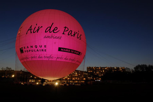
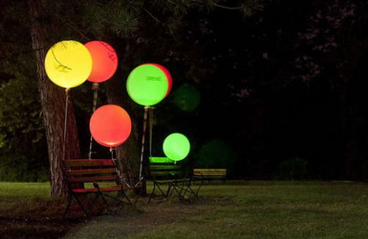
I found this post not too long ago and have been wanting to make one of these ever since. What’s making these balloons glow is the pollutants in the air around them, with colours ranging from green (signifying excellent air quality) to red (poor air quality).
In 2007, Paris launched a few hot air balloons above the city to show citizens the quality of their air that they were breathing in. Eric Paulos from Carnegie Mellon University and a few of his students created these step-by-step instructions on how to craft one of these balloons for under $40. A small tri-colour LED and tiny air quality sensors are what allow the balloon to run. Of course a few tweaks can be made to improve its function, such as adding a transistor to make the balloon brighter. It is a very interesting and fun way to grab the attention of the locals and in-still a sense of awareness. We could even stencil Broken City Lab on the balloons and use them as some sort of installation piece. Pretty cool !


This is such a cool concept! Having a physical representation of our air quality and something to show our progress as we change it is an awesome way to get people on board to make a cleaner city.
Nice find, Karlyn. We’ve posted some stuff in the past on data visualization design and art projects, it’s a really powerful way to “make the invisible visible“… there’s something about the idea of being able to act on information better once it’s presented to us in a novel way. Air quality statistics on paper = alarming, but difficult to incite a response towards understanding; air quality statistics through light-up balloons = curious and inviting for further exploration and analysis. Conversation starters can start change, I think.