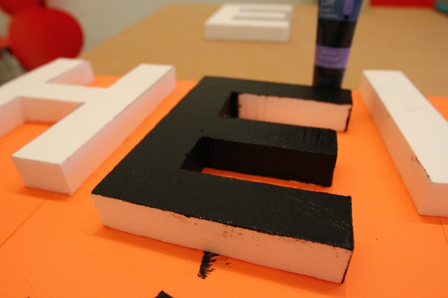
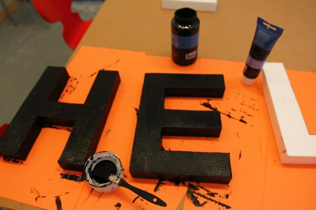
Wednesday afternoon shifts into further work on testing the efficacy of the styrofoam letters being black. We’re trying to decide in anticipation of our Letter Library (A Collection of Alphabetic Interventions).
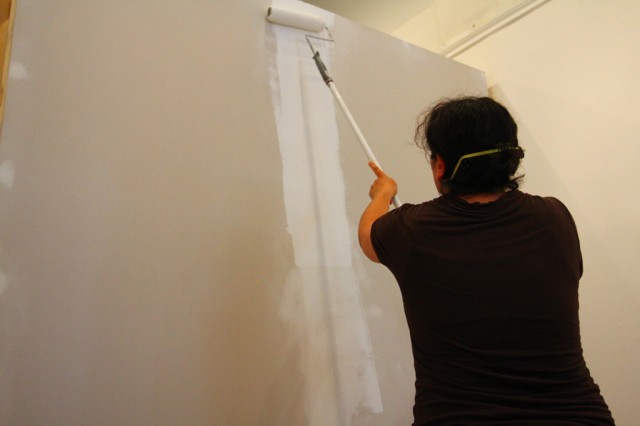
Sara and Hiba painted.
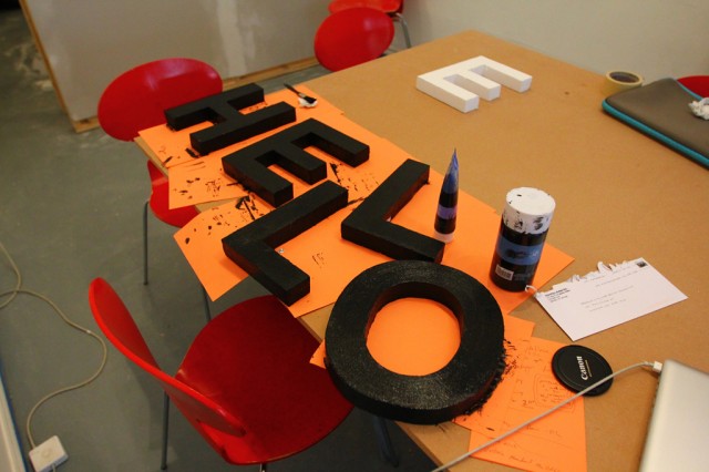
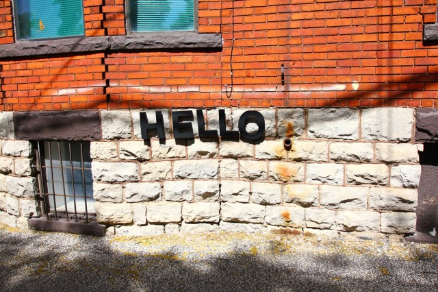
HELLO.
Also, Kiki came by to help us paint the movable wall!
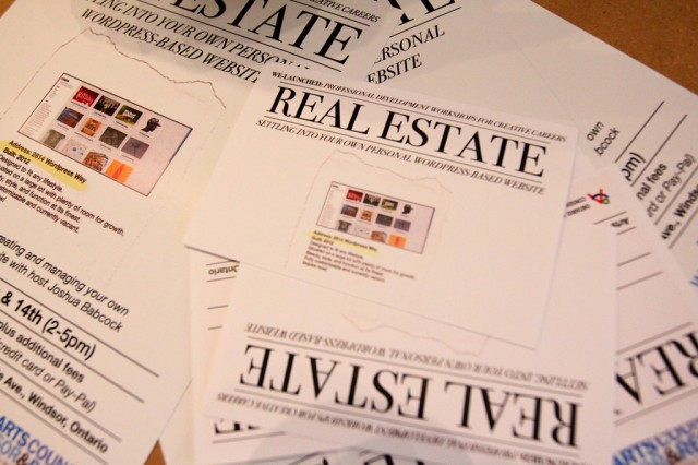
And, Josh made these for a workshop he’s giving through our friends at the Arts Council Windsor & Region.
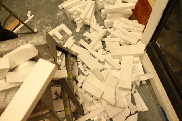
The pile of cut-offs.
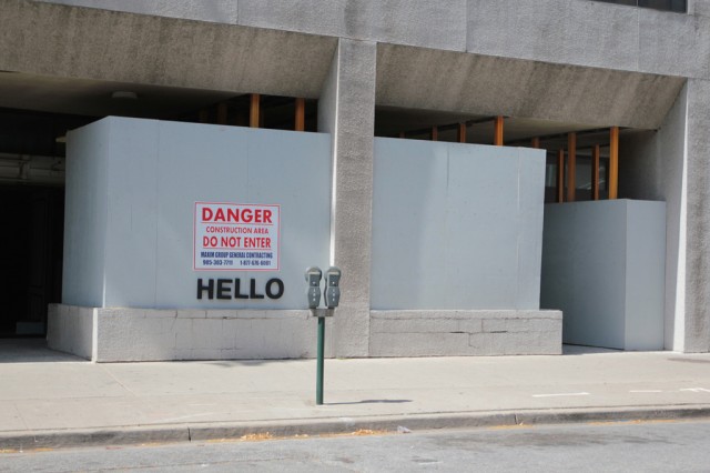
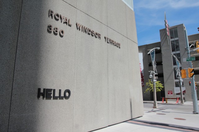
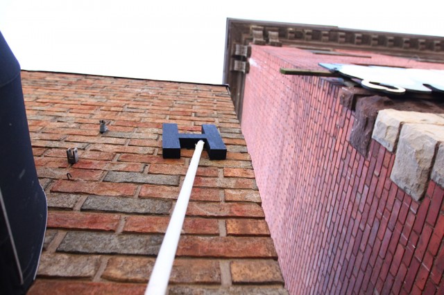
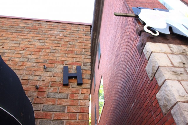
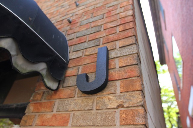
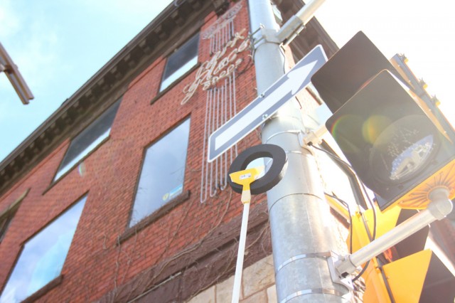
After the letters dried, I went outside and started to do some test installation. The black works well in the space, but outside, the shadows can destroy some of the legibility.
On lighter surfaces though, it works well.
Those shadows are difficult though.
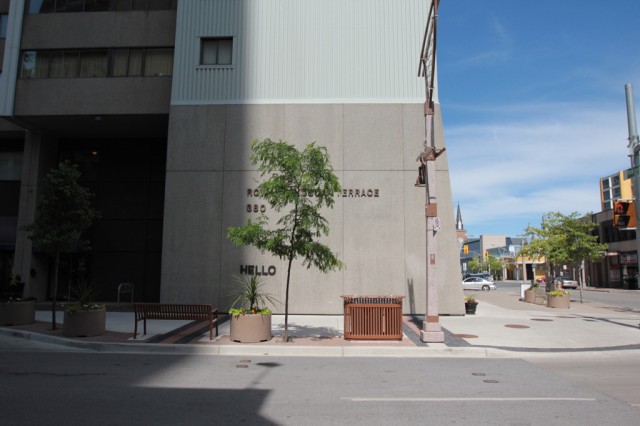
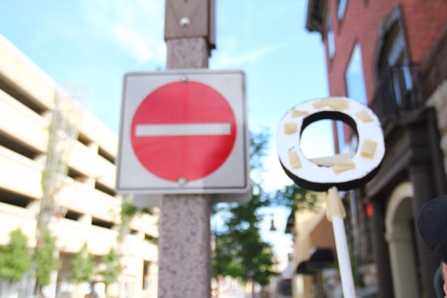
From across the street.
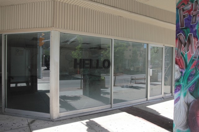
On glass.
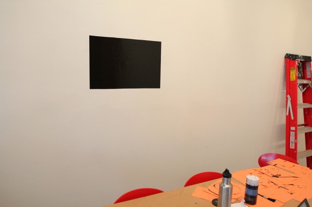
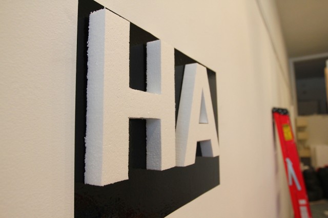
Inside, we discuss the possibility of keeping the letters white, but using a black background to help them stand out.
This could work, but would be a huge pain installing. This remains unresolved.
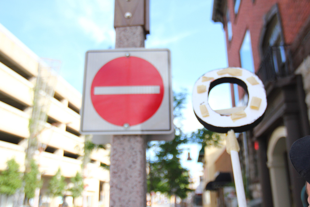
On to other ideas … we start wondering about creating a tool to assist with installing the letters in high places.
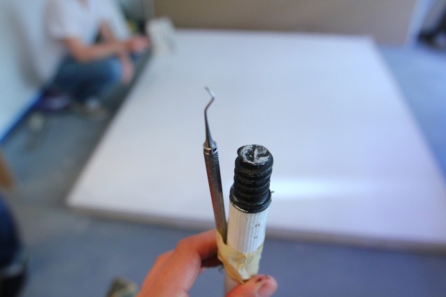
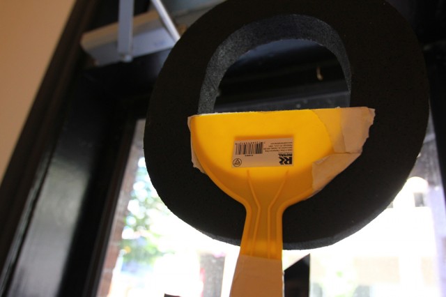
An old dental tool and some tape for the test.
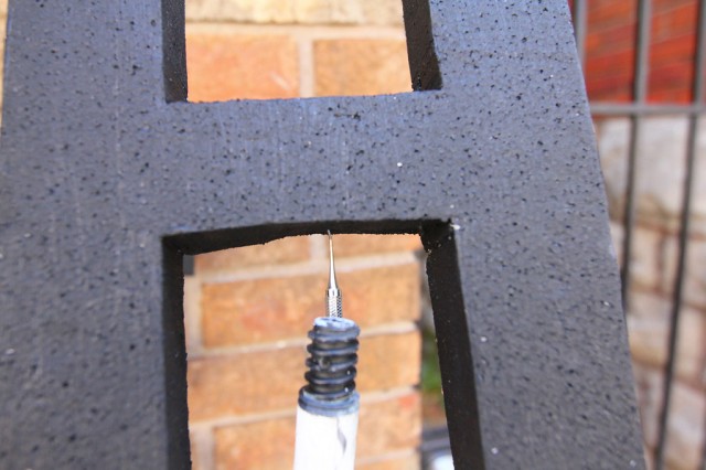
It works fairly well…
But, it needs refining.
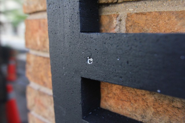
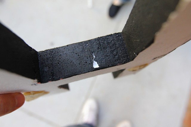
Some evidence of where the letters were punctured.
Gash.
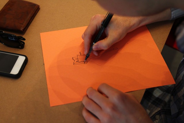
So, Josh starts a redesign.
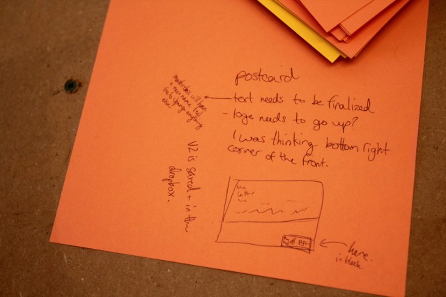
And Sara left notes about what to finish up on the postcard.
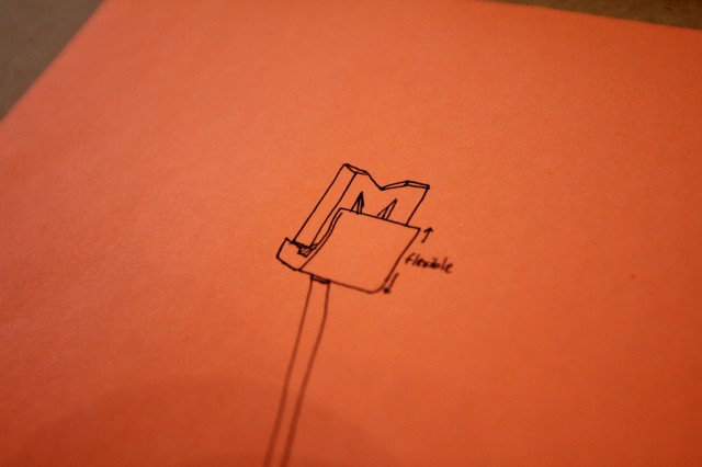
A detail of Josh’s latest design for our letter installation tool.
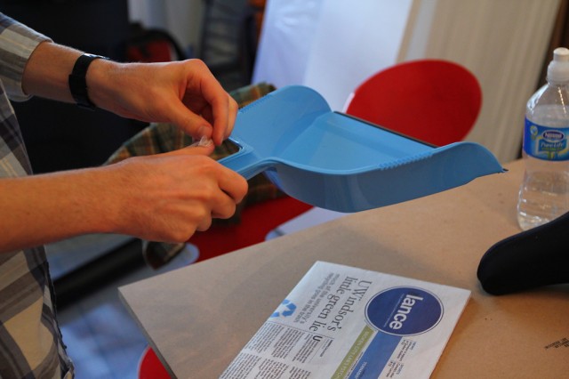
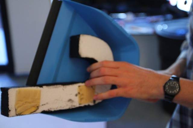
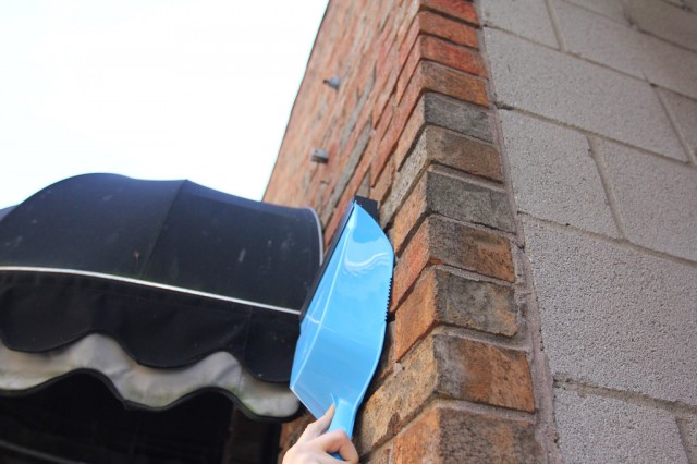
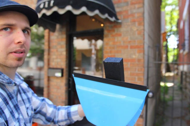
For a quick demo, a dust pan will suffice.
It will cradle the letter, but also act as a brace to help stick the letter to the wall.
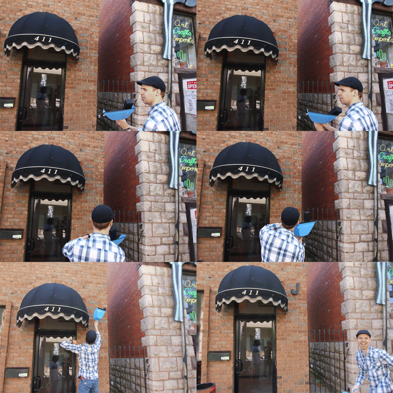
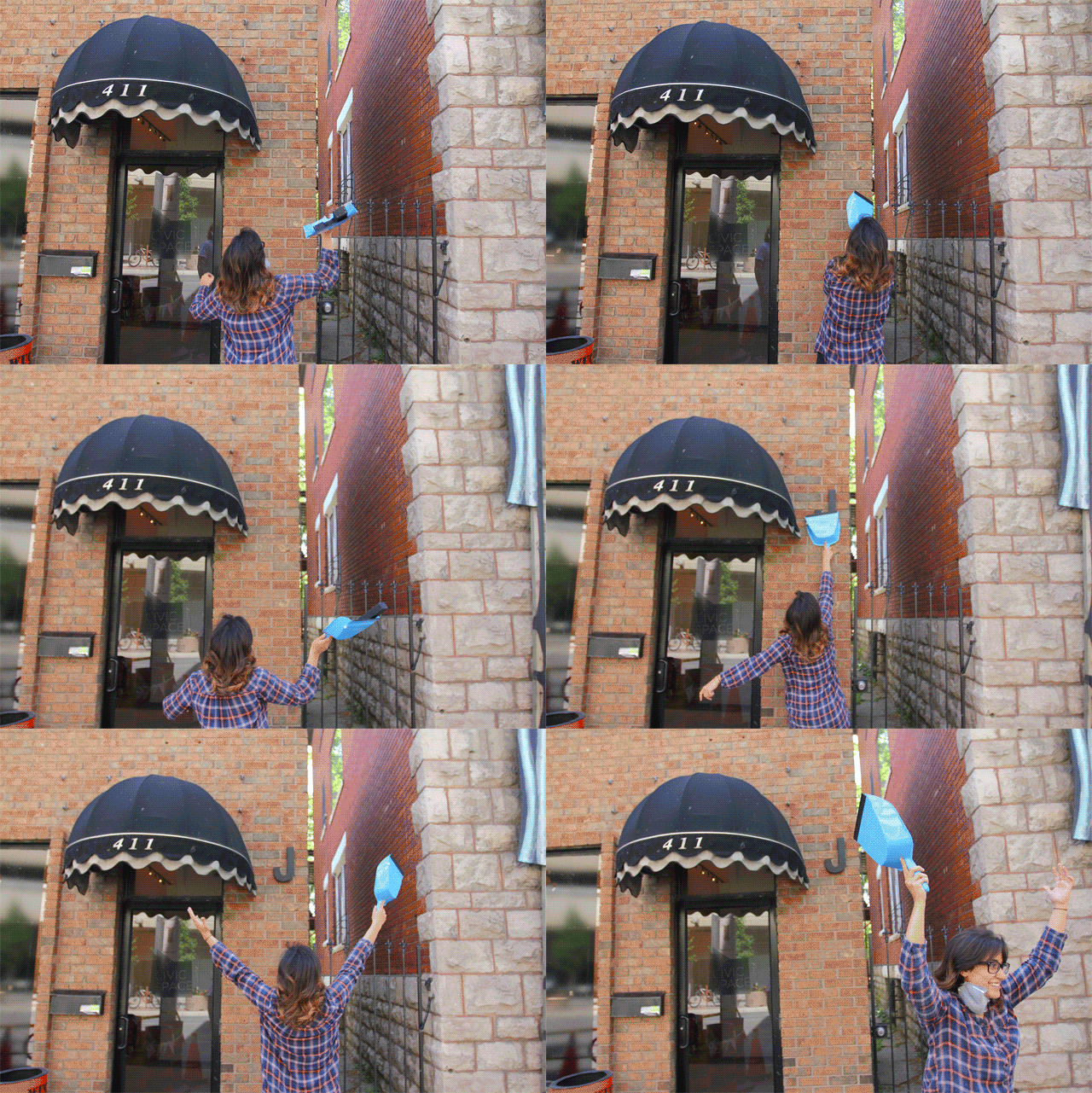
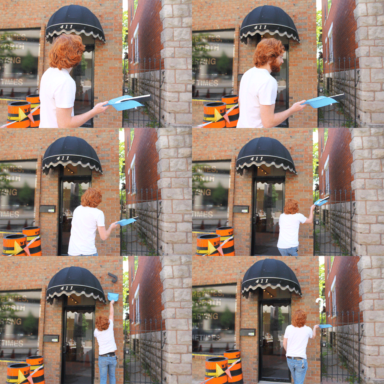
Josh testing.
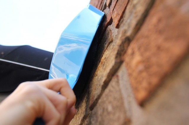
The scrap and push.
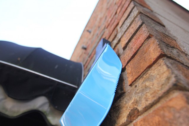
Looks promising.
It works!
Josh demonstrates the techinque.
Then, another revision…
It’s though that we need the option to have a smaller surface to work with letters that will not stand up on their own in the dust pan scenario.
Out the door…
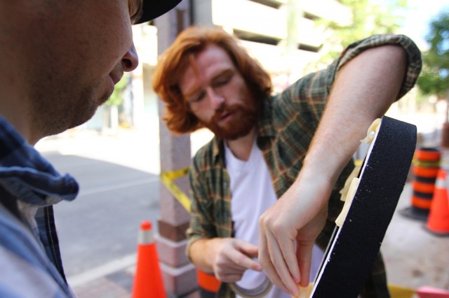
…more tape.
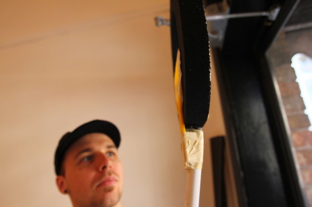
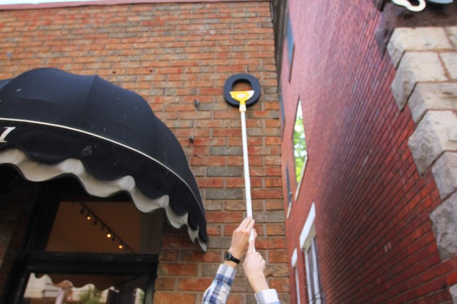
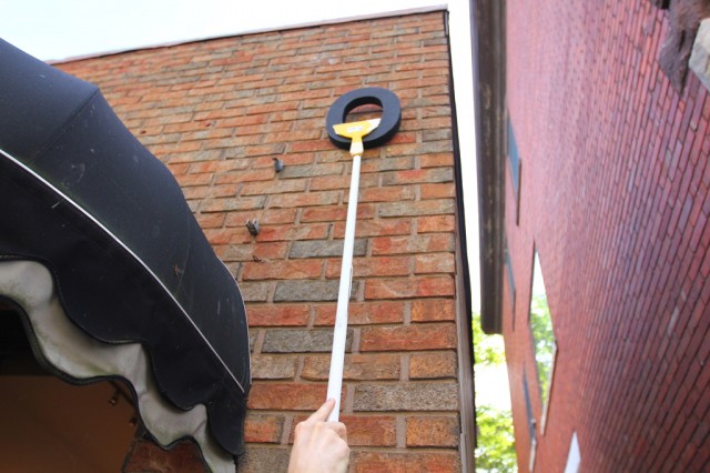
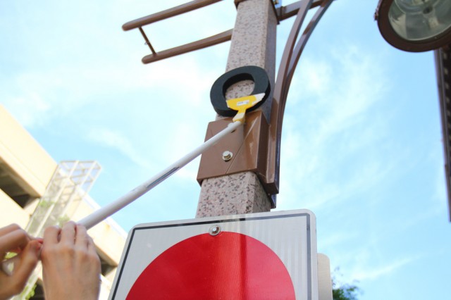
A reaching test.
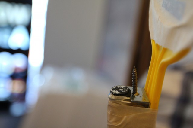
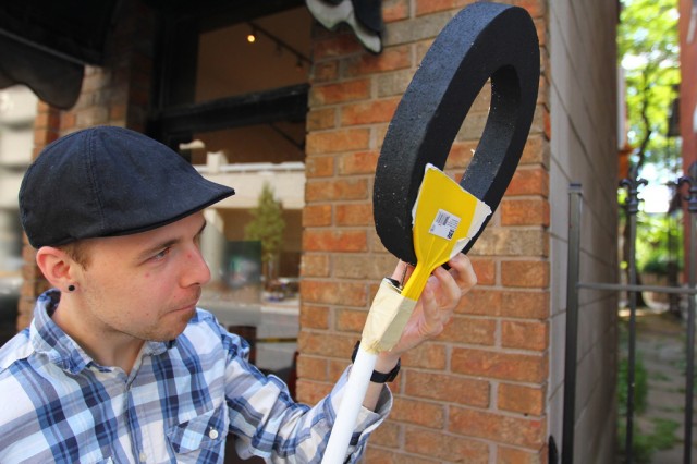
Adjusting the placement of the letter on the screw.
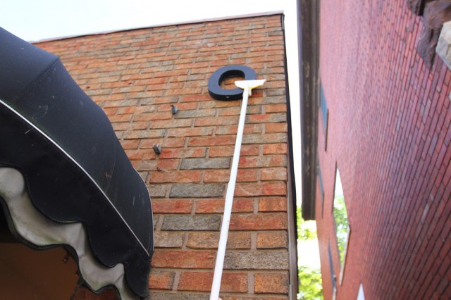
Attempt #2.
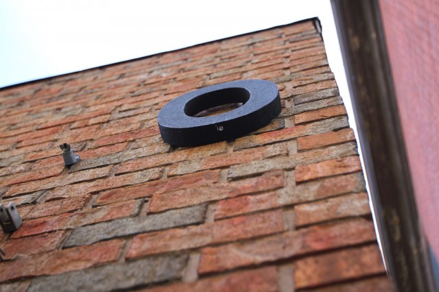
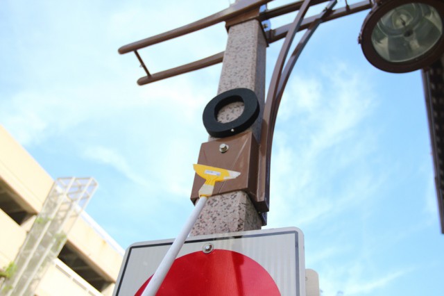
And it’s up!
The letter O.
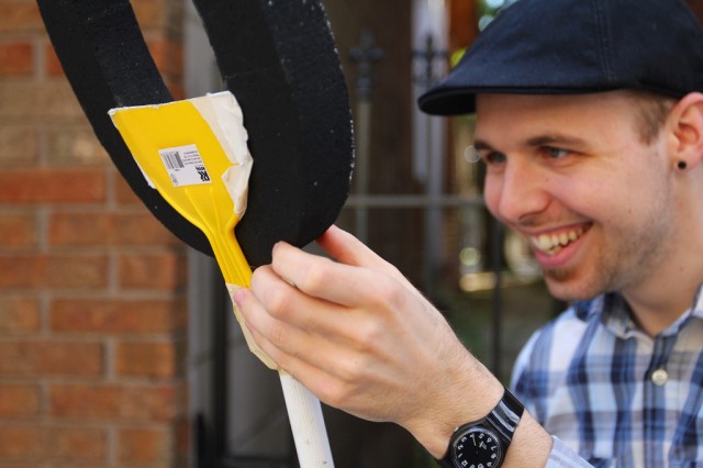
Josh reviews the rig.
Then, loftier attempts.
And, in closing … some animated gifs from Hiba, Kevin, and Josh’s scrape dust-pan attempts.
Yes, it was a good day.
White letters all the way. They pop so much against the cityscape, where nothing is pure white. Is the goal to have them look sweet out in the city where they belong, or sitting in the gallery where they aren’t doing much? I understand not wanting to paint a black wall inside the space for them to sit against,, im sure there could be a temporary solution such as fabric? It’d be interesting to see as well, over time, how dirty they get as more people use them. I think the accumulation of grime over time also adds to the concept. Think of a well-loved library book.
Is there a plan for collecting images of participant’s interventions, or are we just going to ‘let it be’?
I can’t wait to sign out these letters. If they’re black though, I’d reconsider using them at all, the photos wouldn’t nearly look as crisp. I really feel that black letters will sit in the space, and white letter will exist in the city.