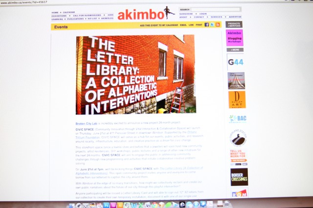
Single-Use Camera Tests: Captioning the City

	Documentation with single-use cameras: Putting letters up in city spaces (1)

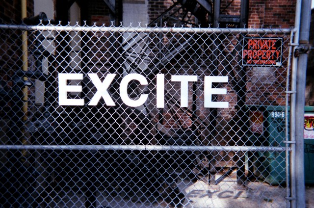
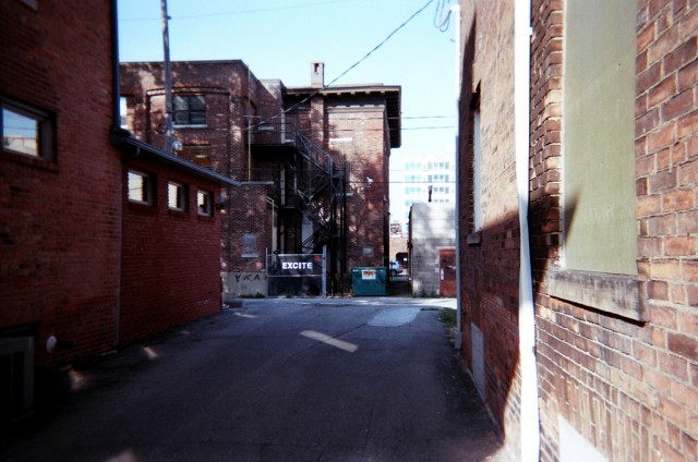
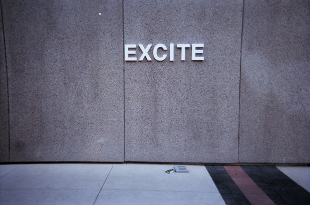
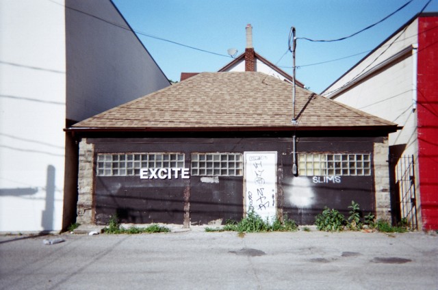
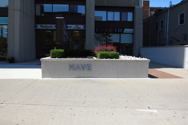
Kevin and Josh ventured out with a single-use camera to test what the temporary installations would look like, as we continue to prep for Thursday’s launch of the Letter Library here at CIVIC SPACE.

Also, film is fun.

	Documentation with single-use cameras: Putting letters up in city spaces (2)

The letters look great and the photos aren’t too bad either. They definitely have a colder tone to them, but it works!

	Documentation with single-use cameras: Putting letters up in city spaces (3)

This shot was excellent — love how visible this is from a distance.

	Documentation with single-use cameras: Putting letters up in city spaces (4)

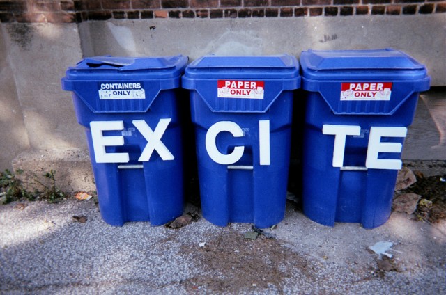
Recycling containers = excite.

	Documentation with single-use cameras: Putting letters up in city spaces (5)

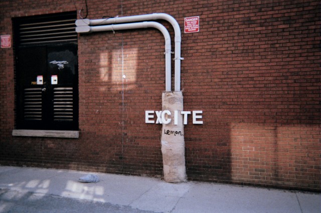
Strange undulations in the wall = excite.

	Documentation with single-use cameras: Putting letters up in city spaces (6)

Blank walls = excite.

	Documentation with single-use cameras: Putting letters up in city spaces (7)

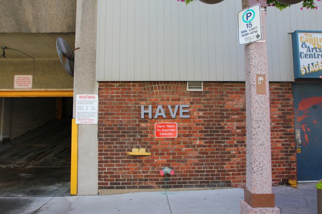
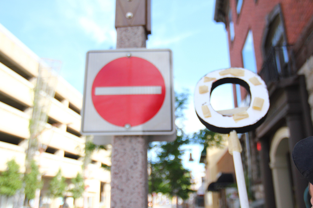
The conversation these texts have with other tags, signs, etc. are really interesting.

	Documentation with single-use cameras: Putting letters up in city spaces (8)

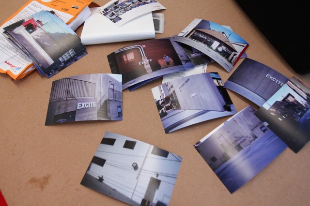
The prints. 4×6. We’ll need others.

	Documentation with single-use cameras: Putting letters up in city spaces (10)

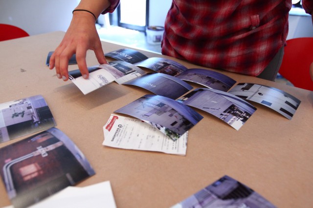
Hiba starts to arrange these test photos as we figure out how we’ll design the exhibition space.

	Documentation with single-use cameras: Putting letters up in city spaces (9)

Also, on the to-do list — pick up our postcards today!

Grey Paint Test, Tattoos, and Talk of Homework II

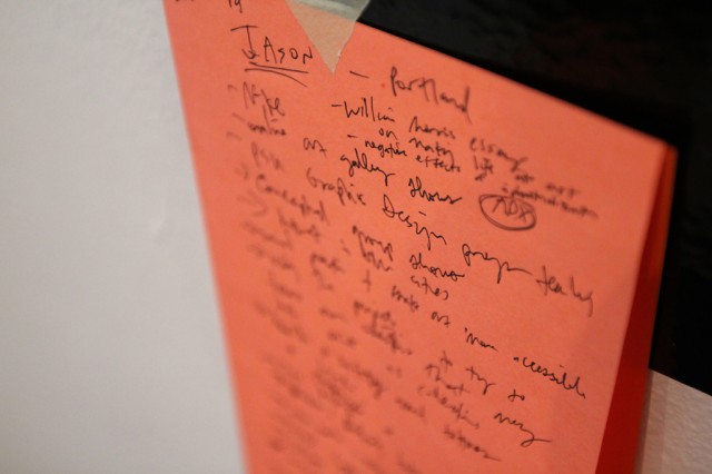
This afternoon at CIVIC SPACE started out with a video chat with Jason Sturgill from Portland about a really awesome project we’ll be collaborating with him on in the spring of next year.

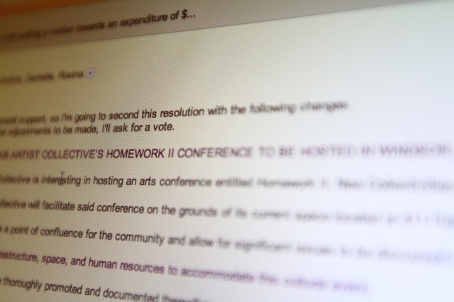
There is also talk of Homework II happening this fall…stayed tuned for more info on this.

Also, our Akimbo ad was released today! Cool.

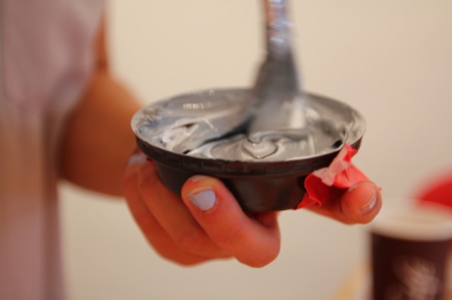
On the production side of things, we decided to do the final letter paint test for the Letter Library. While both white and black paint tests have had their pros and cons, we agreed on a final test of the colour grey to see if we can find a happy middle.

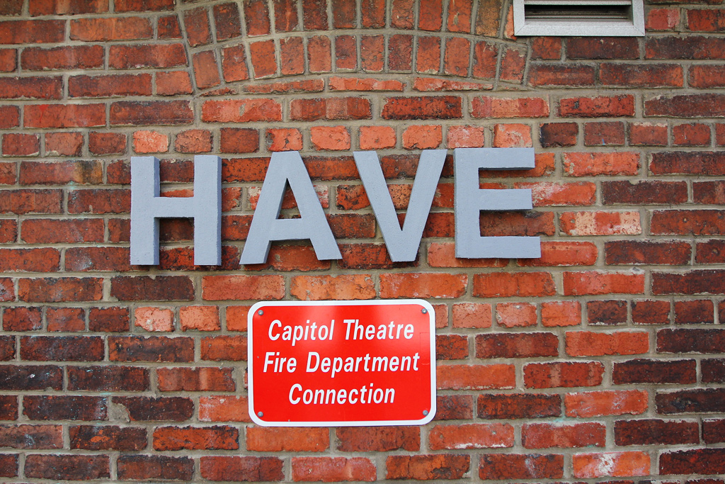
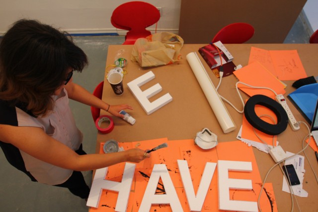
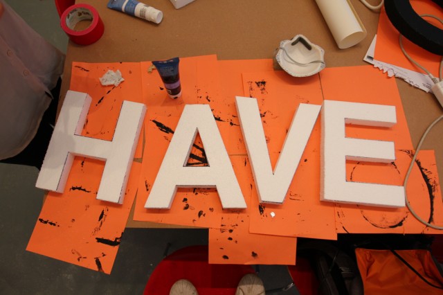
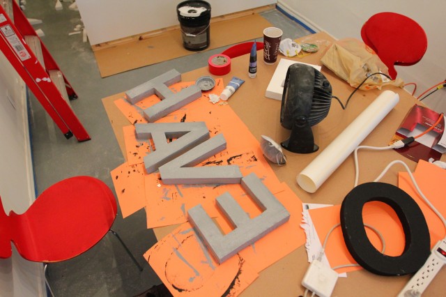
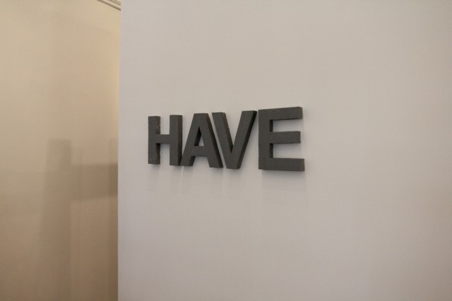
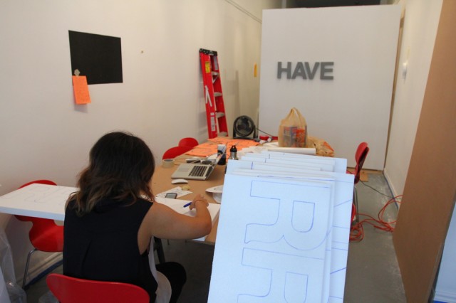
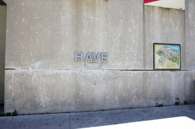
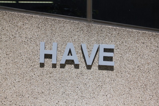
Word of the day today is: HAVE

Pre-paint.

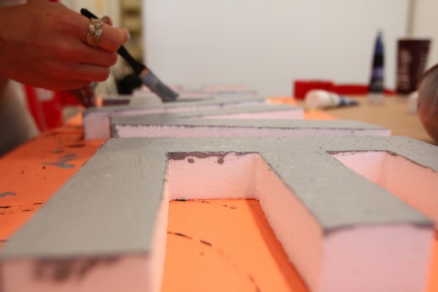
Before coming to the space, Hiba went to Michaels to grab some grey paint. All the grey paint was sold out (weird), so we resorted to making our own by mixing our black and white paint remnants.

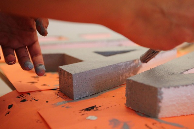
Painting…

Waiting…

After the letters dried, we hung them up in the space to see how they fit.

The grey definitely pops more than the white did in the space … and we do need to decide soon …

We took to the streets shortly after to take some install shots on different wall surfaces to compare with the white and black tests we did previously.

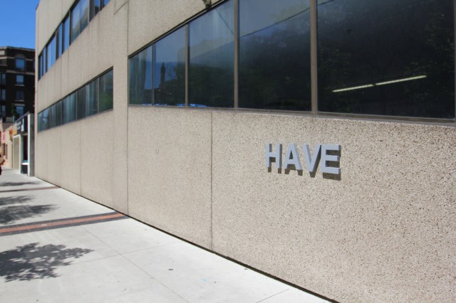
The grey has a nice pop, even on muted walls like this one.

While white had a really great pop on brick walls, the grey letters have a very interesting presence.

Almost looks like concrete on concrete!

The shadows cast on the grey letters give them more depth, while the black letters got lost in their own shadows.

The grey as the middle ground (in every sense) might win the day. It stands well on our white walls and looks interesting among the different textures of the buildings outside. Maybe we should sleep on it.

Remember, June 21st at 7pm, you’re invited to our Letter Library launch!

Designing & Prototyping tools for intervention: Letter Library + Gif Party

Styrofoam letter tests for our Letter Library Project (1)

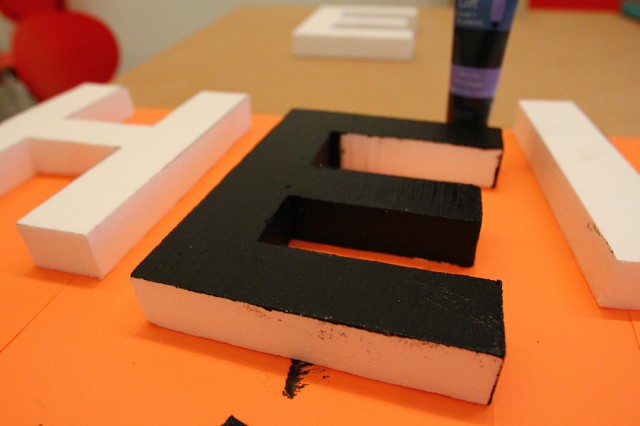
Wednesday afternoon shifts into further work on testing the efficacy of the styrofoam letters being black. We’re trying to decide in anticipation of our Letter Library (A Collection of Alphabetic Interventions).


Styrofoam letter tests for our Letter Library Project (2)

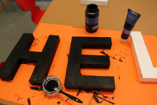
Sara and Hiba painted.

Styrofoam letter tests for our Letter Library Project (3)

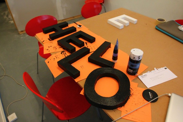
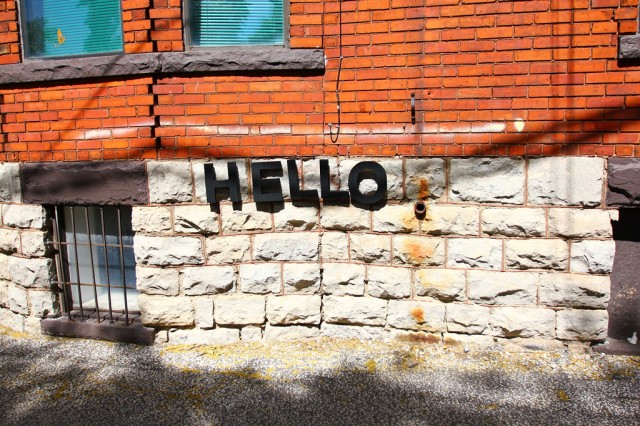
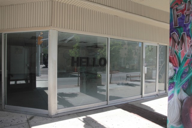
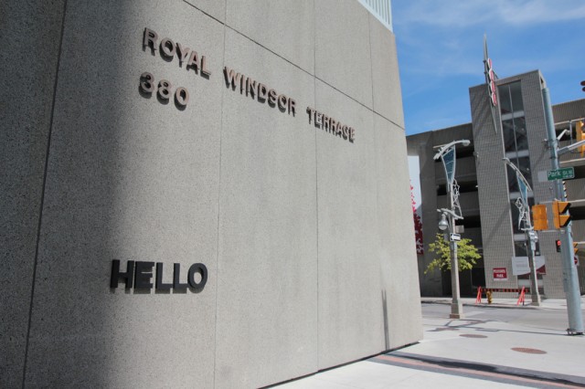
HELLO.

Styrofoam letter tests for our Letter Library Project (4)

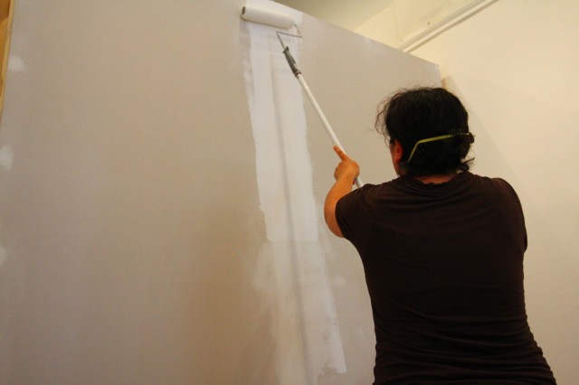
Also, Kiki came by to help us paint the movable wall!

Styrofoam letter tests for our Letter Library Project (5)

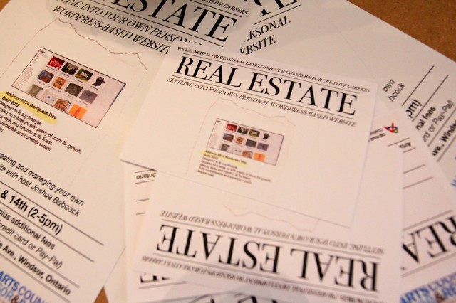
And, Josh made these for a workshop he’s giving through our friends at the Arts Council Windsor & Region.

Styrofoam letter tests for our Letter Library Project (6)

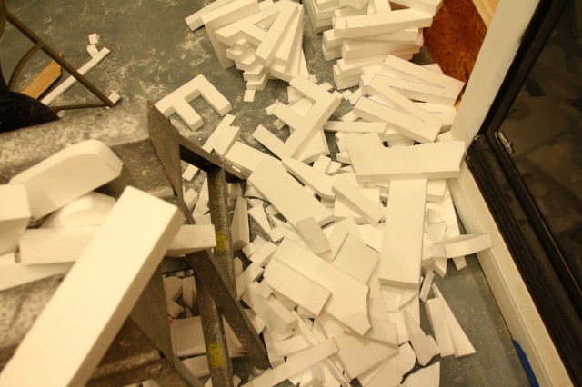
The pile of cut-offs.

Styrofoam letter tests for our Letter Library Project (7)

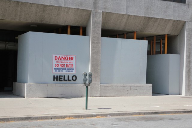
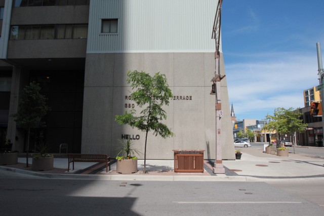
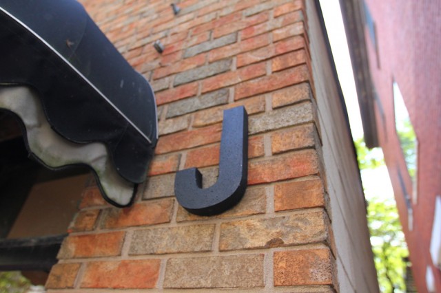
After the letters dried, I went outside and started to do some test installation. The black works well in the space, but outside, the shadows can destroy some of the legibility.

Styrofoam letter tests for our Letter Library Project (8)

On lighter surfaces though, it works well.

Styrofoam letter tests for our Letter Library Project (9)

Those shadows are difficult though.

Styrofoam letter tests for our Letter Library Project (10)

From across the street.

Styrofoam letter tests for our Letter Library Project (11)

On glass.

Styrofoam letter tests for our Letter Library Project (12)

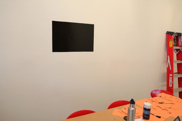
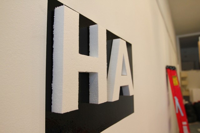
Inside, we discuss the possibility of keeping the letters white, but using a black background to help them stand out.

Styrofoam letter tests for our Letter Library Project (13)

This could work, but would be a huge pain installing. This remains unresolved.

Styrofoam letter tests for our Letter Library Project (14)

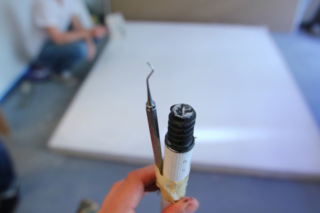
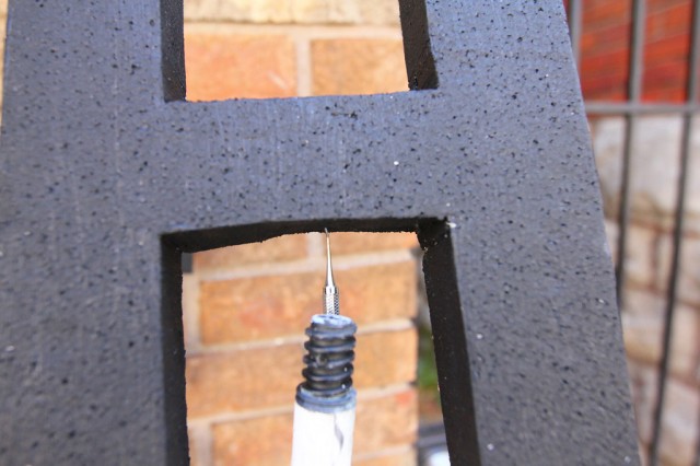
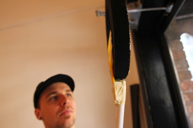
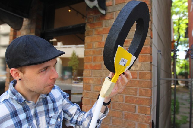
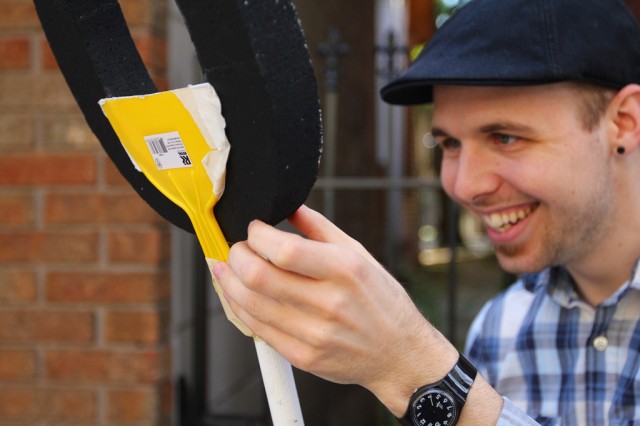
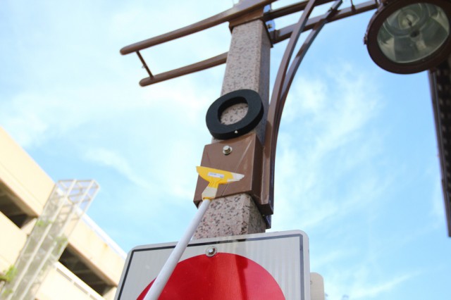
On to other ideas … we start wondering about creating a tool to assist with installing the letters in high places.

Styrofoam letter tests for our Letter Library Project (15)

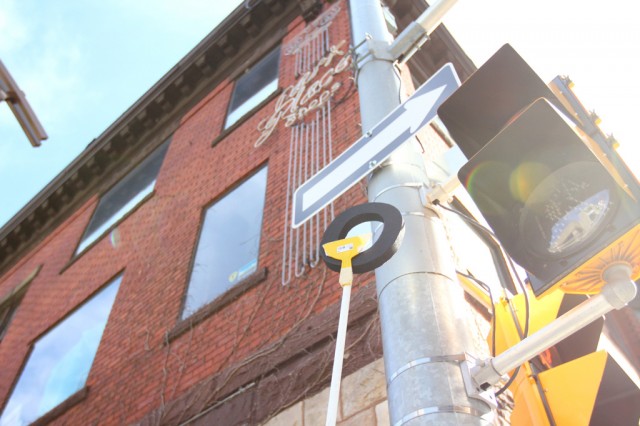
An old dental tool and some tape for the test.

Styrofoam letter tests for our Letter Library Project (16)

It works fairly well…

Styrofoam letter tests for our Letter Library Project (17)

But, it needs refining.

Styrofoam letter tests for our Letter Library Project (18)

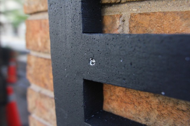
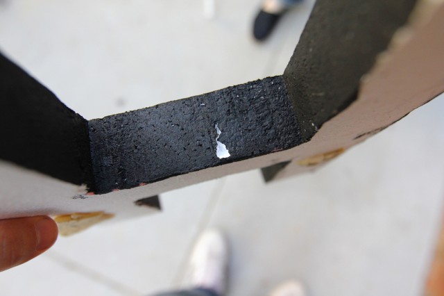
Some evidence of where the letters were punctured.

Styrofoam letter tests for our Letter Library Project (19)

Gash.

Styrofoam letter tests for our Letter Library Project (20)

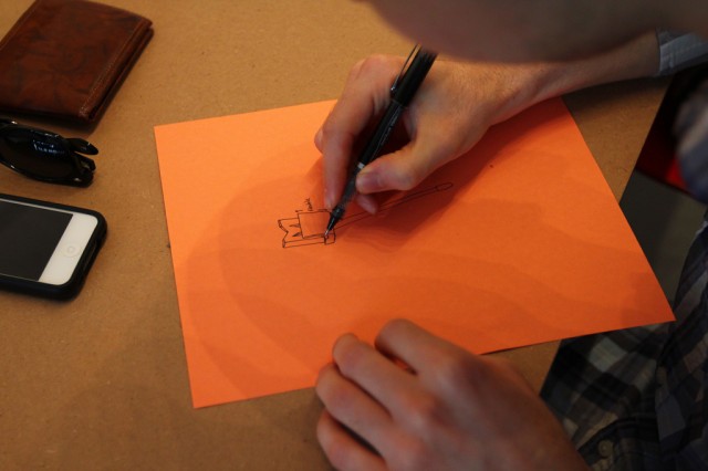
So, Josh starts a redesign.

Styrofoam letter tests for our Letter Library Project (21)

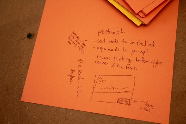
And Sara left notes about what to finish up on the postcard.

Styrofoam letter tests for our Letter Library Project (22)

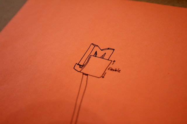
A detail of Josh’s latest design for our letter installation tool.

Styrofoam letter tests for our Letter Library Project (23)

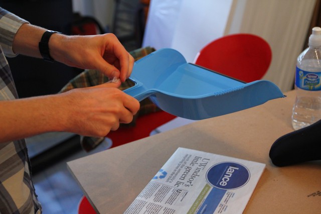
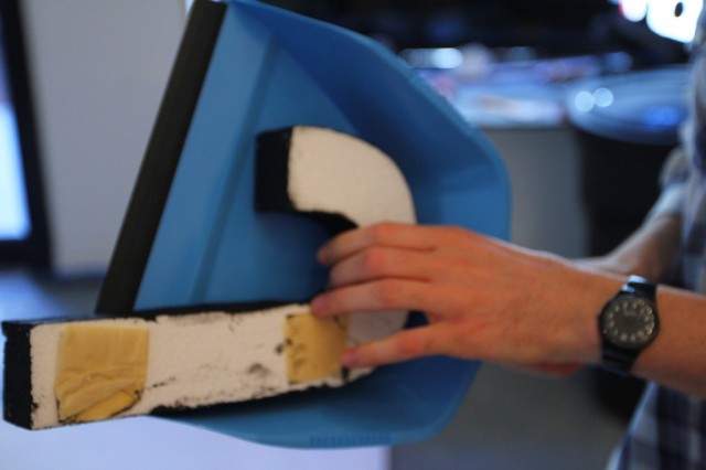
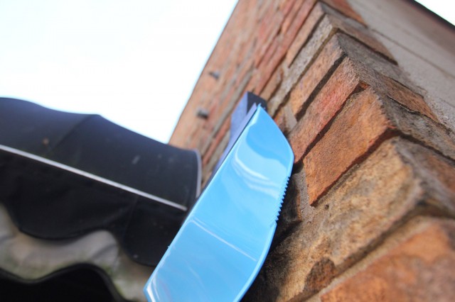
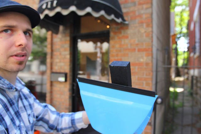
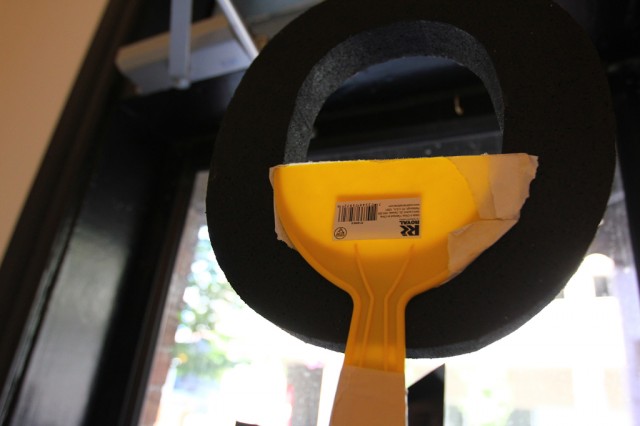
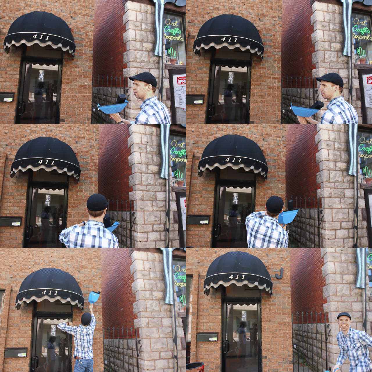
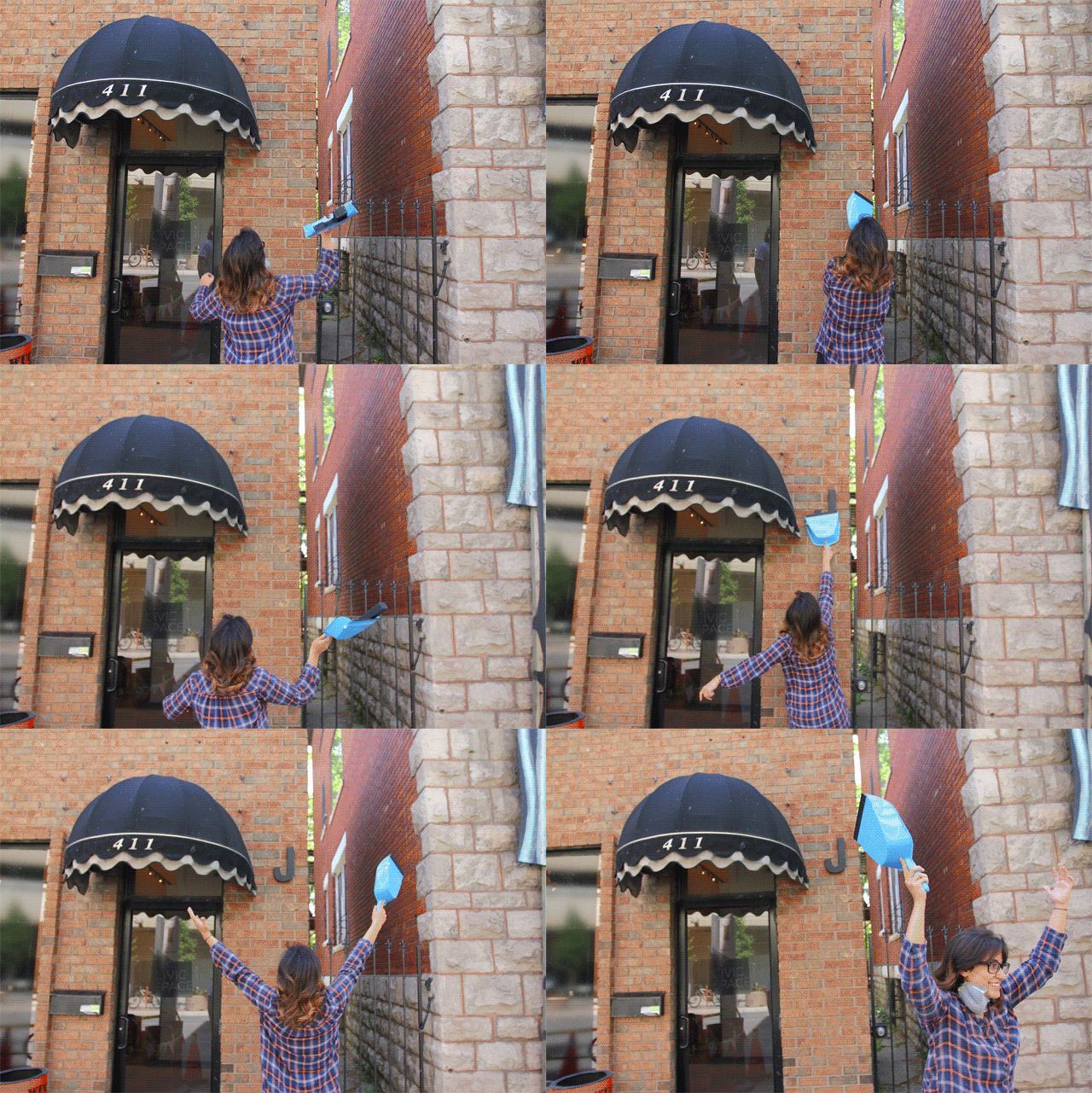
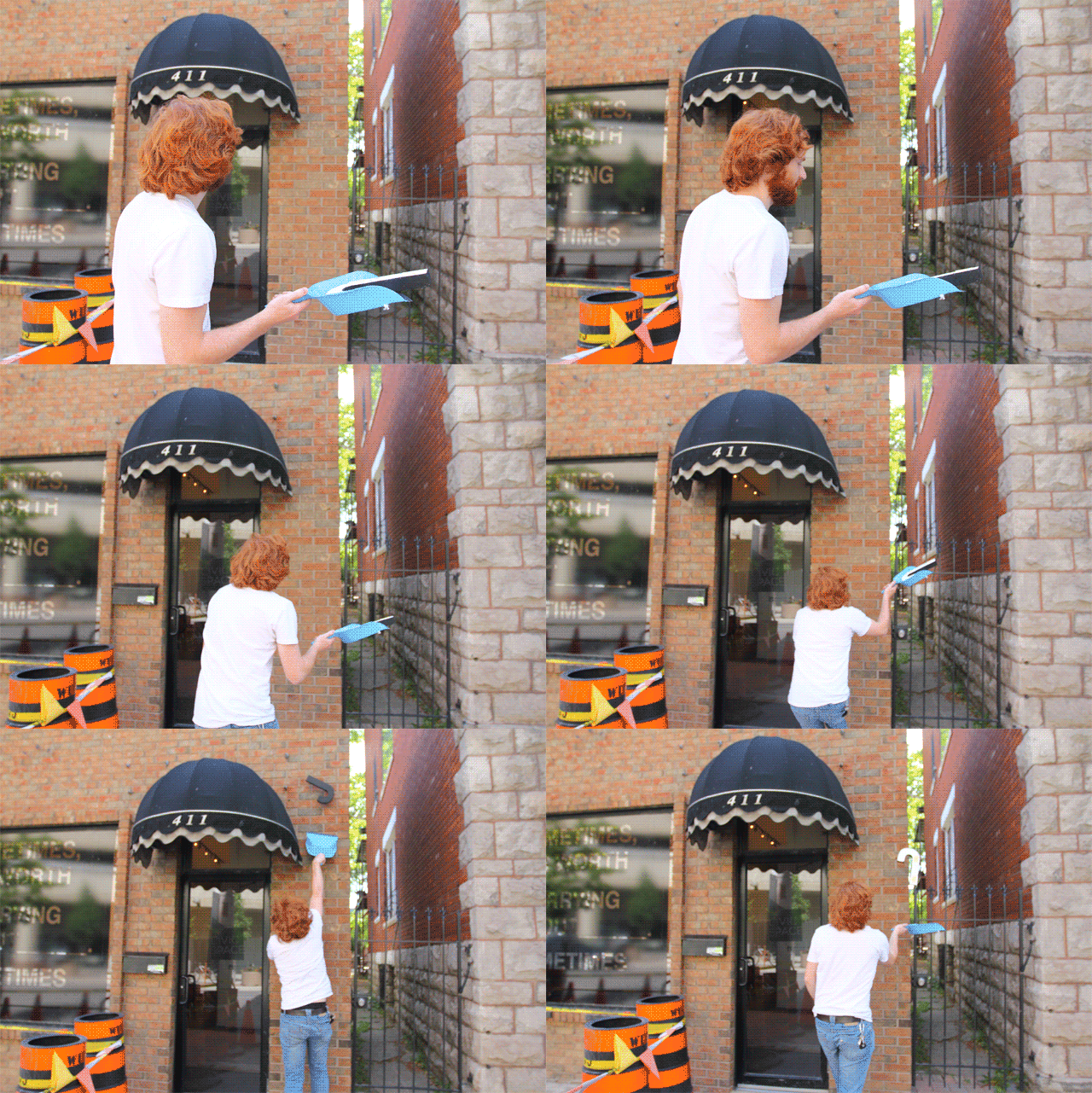
For a quick demo, a dust pan will suffice.

Styrofoam letter tests for our Letter Library Project (24)

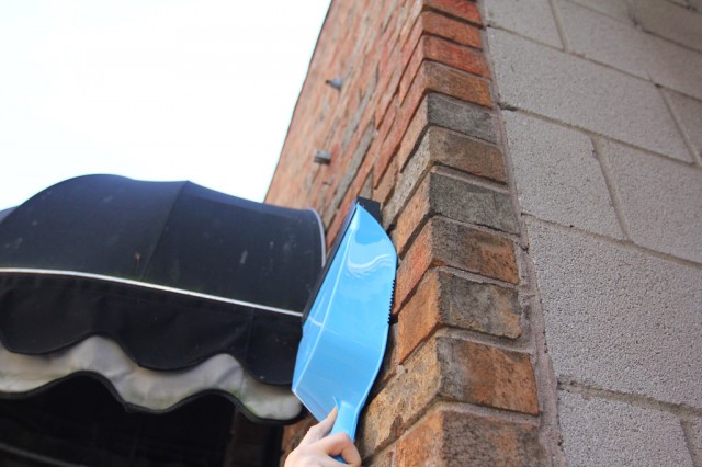
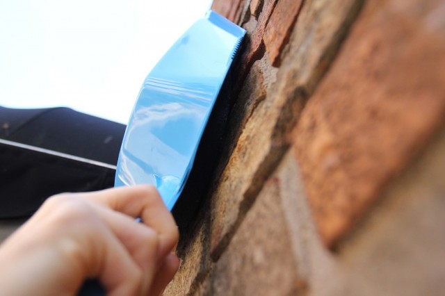
It will cradle the letter, but also act as a brace to help stick the letter to the wall.

Styrofoam letter tests for our Letter Library Project (25)

Josh testing.

Styrofoam letter tests for our Letter Library Project (26)

The scrap and push.

Styrofoam letter tests for our Letter Library Project (27)

Looks promising.

Styrofoam letter tests for our Letter Library Project (28)

It works!

Styrofoam letter tests for our Letter Library Project (29)

Josh demonstrates the techinque.

Styrofoam letter tests for our Letter Library Project (30)

Then, another revision…

Styrofoam letter tests for our Letter Library Project (31)

It’s though that we need the option to have a smaller surface to work with letters that will not stand up on their own in the dust pan scenario.

Styrofoam letter tests for our Letter Library Project (32)

Out the door…

Styrofoam letter tests for our Letter Library Project (33)

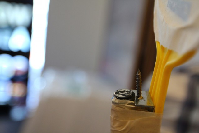
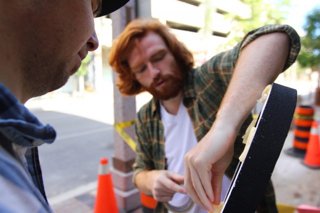
…more tape.

Styrofoam letter tests for our Letter Library Project (34)

A reaching test.

Styrofoam letter tests for our Letter Library Project (36)

Adjusting the placement of the letter on the screw.

Styrofoam letter tests for our Letter Library Project (37)

Attempt #2.

Styrofoam letter tests for our Letter Library Project (38)

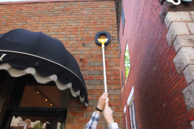
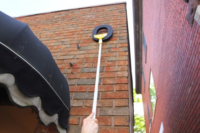
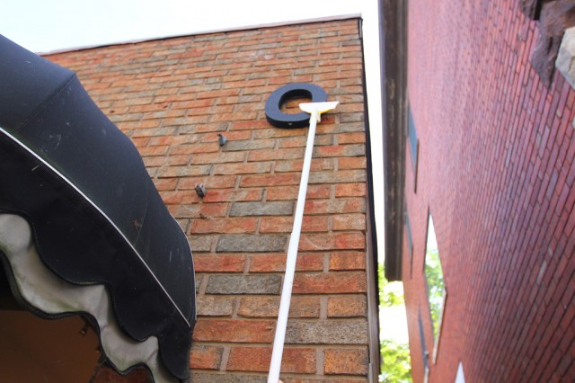
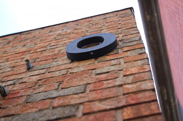
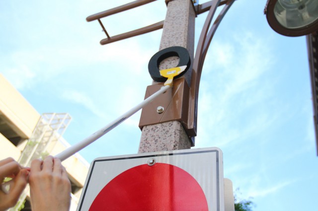
And it’s up!

Styrofoam letter tests for our Letter Library Project (39)

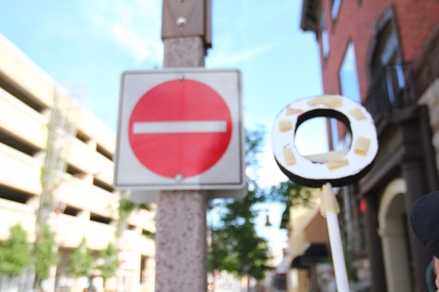
The letter O.

Styrofoam letter tests for our Letter Library Project (40)

Josh reviews the rig.

Styrofoam letter tests for our Letter Library Project (41)

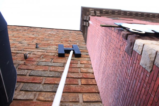
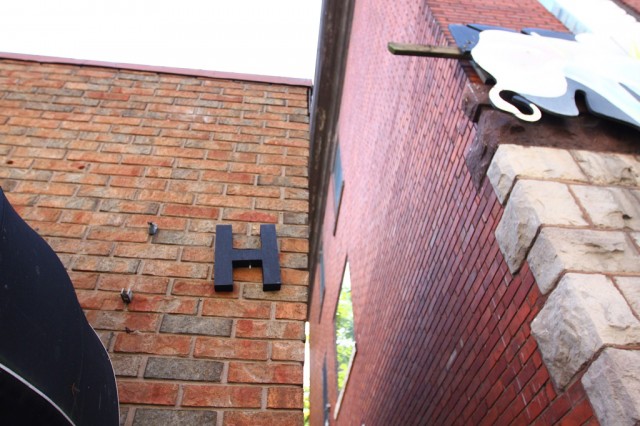
Then, loftier attempts.

Styrofoam letter tests for our Letter Library Project (42)


Styrofoam letter tests for our Letter Library Project (43)


Styrofoam letter tests for our Letter Library Project (44)

And, in closing … some animated gifs from Hiba, Kevin, and Josh’s scrape dust-pan attempts.

Styrofoam letter tests for our Letter Library Project (45)


Styrofoam letter tests for our Letter Library Project (46)


Styrofoam letter tests for our Letter Library Project (47)

Yes, it was a good day.

A Week in the Studio: Some Documentation and Reflections on Last Week at CIVIC SPACE

While we prepare for the launch of CIVIC SPACE on June 21st with the Letter Library project, we’re also settling into a routine of being in the space at 411 Pelissier. The idea of having a space of our own is really new to us. Four years after starting BCL by meeting in the classrooms at the School of Visual Arts in the summer, and our backyards, living rooms, and a bunch of coffee shops and restaurants, we’re realizing an intensity in our work that was basically impossible before.

Never much of a studio collective, per se, we’re now enjoying the shared space and time, and it’s impacting everything we’re doing. More time together means more time for ideas, concerns, and conversations to work themselves out rather than trying to get through everything in one sitting. In the past, meeting altogether just once a week narrowed our collective time and often translated into a very stop and go process — there was a lot that was happening, but it existed as reports, reflections, or to-do lists that never really got done.
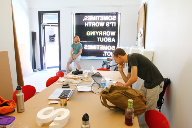
Of course, we’re also only experiencing one side of having this time and space together. When CIVIC SPACE launches next week, we’ll be entering into a new dynamic with the wider community as well.
This dynamic will be necessarily different than our past projects like Storefront Residencies for Social Innovation — that was a very intense concentrated thirty days of open door programming at a time and in a place that was challenged by the construction happening just outside our doors. CIVIC SPACE will aim to meet and respond to the possibilities of collectivizing around creative responses to the community in front of us.
On the ground, this will translate into fairly regular weekly programming — these will start as small events and opportunities to connect with other people towards exploring art as a position from which we can become engaged in the spatial and civic practices that shift constantly in the background of our experiences of the city.
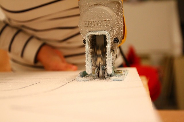
Of course, the legibility of these events as such will be most pronounced from the longest view of the project. In front of us, these weekly “events” will be simply opportunities to spend time together (and together includes you). Increasingly, we’re understanding our work not as a way to fix a city, but as a way to fix the ways that we act (and assume we can act) within it.

But until next week, here’s a look at what we’re doing and how we’re doing it.
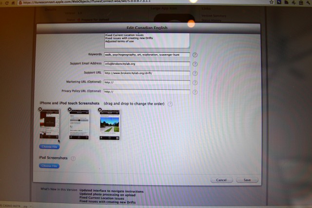
First off, Drift v1.5 has been submitted to the App store for approval. While the wait time is something around 7-10 days, it’s super exciting to do the actual submission part of it.
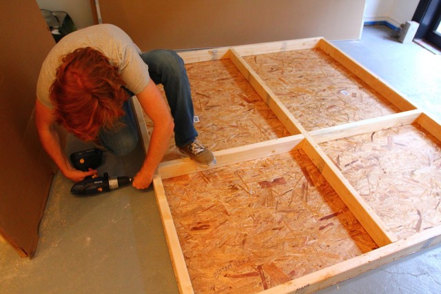
Kevin has been working on building a rig for our window so that we can change the window display more frequently, while also keeping it flexible to start screenings.
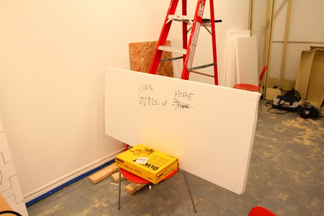
Remnants of an afternoon of cutting out letters.
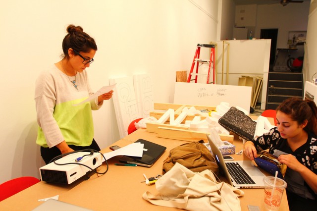
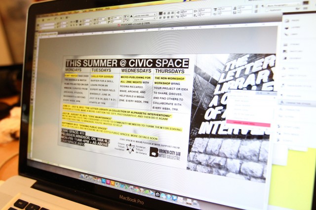
Hiba and Rosina working in parallel. Hiba holds a two-sided page of a to-do list. Rosina pulls cards from her wallets as she works on the design of the Letter Library card.
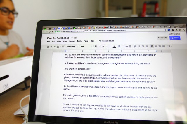
Hiba and I also work on some writing. So early in the process, and so wide. We’ll submit later this month to Evental Aesthetics.
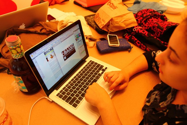
Rosina’s mastering Illustrator.
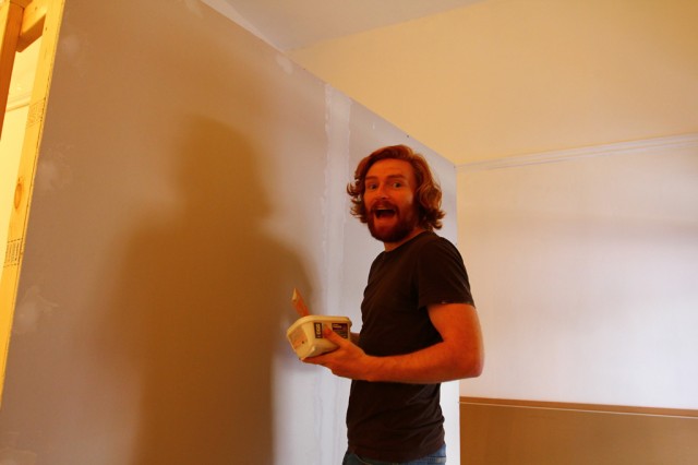
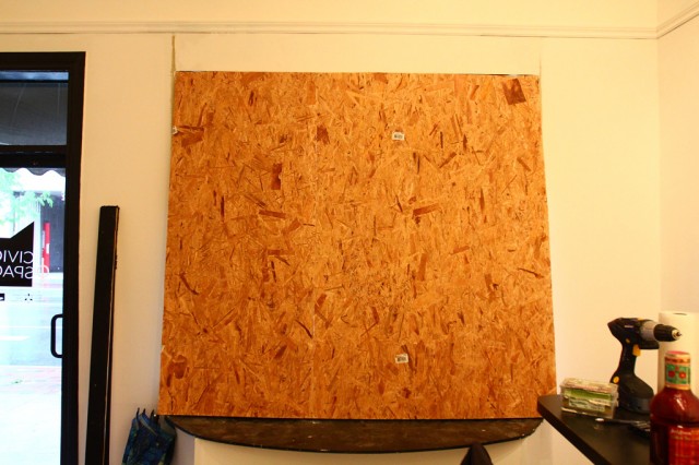
Kevin meets more drywall. We built a moveable wall that’s still waiting to be moveable. But in the meantime, it’s getting a coat of mud and paint.
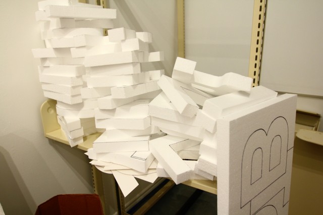
Just a small number of the letters we’ll have ready for you to use as part of our Letter Library project on June 21st.
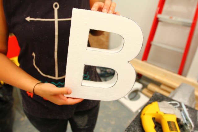
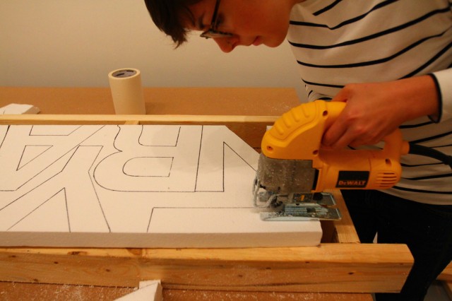
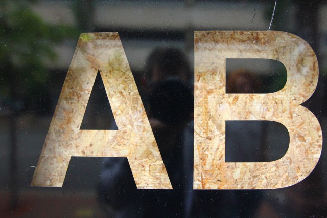
Hiba showing off her jigsaw skills with an expertly crafted B.
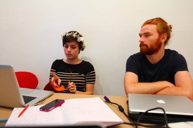
An evening session with Sara, Danielle and Kevin. Felt nice to meet in the space when the street was quiet. It’s not always great to have to break up the group so much, but on the other side, often small groups share more, faster.
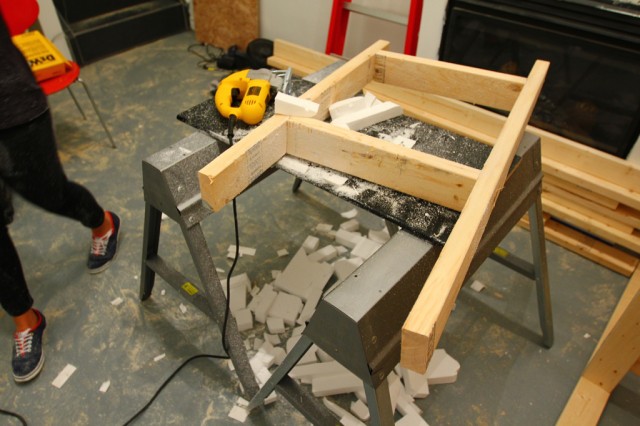
An early jigsaw rig.
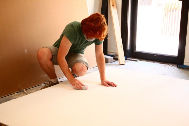
Wall to wall Kevin.
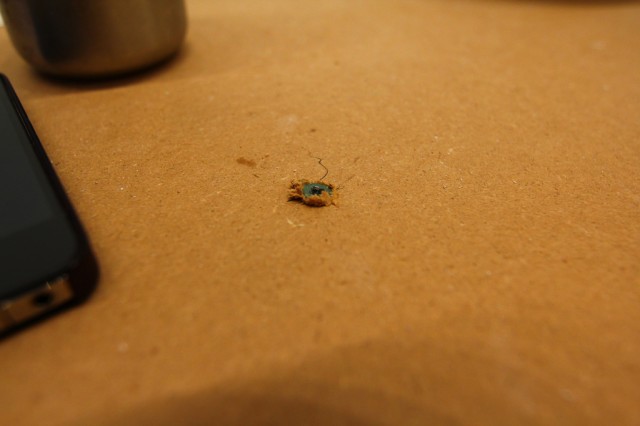
We made a table from MDF and sawhorses, but it’s probably our most favourite table ever.
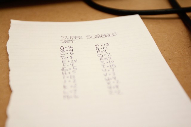
One letter set of Super Scrabble has 200 letters. We’re aiming to make two of these.
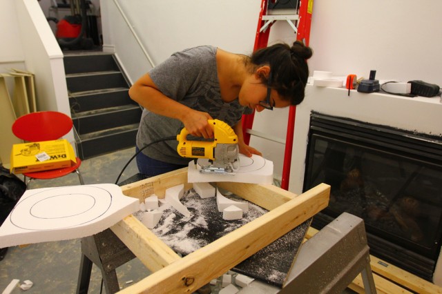
O, curves.
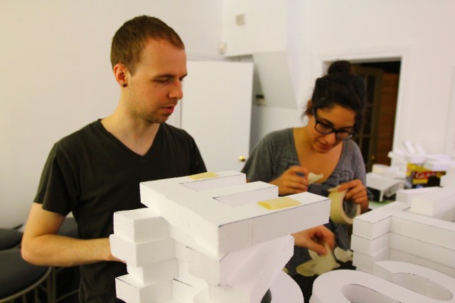
Josh and Hiba spend Friday afternoon temporarily installing some letters to make this.
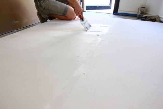
Kevin with more drywall mud.
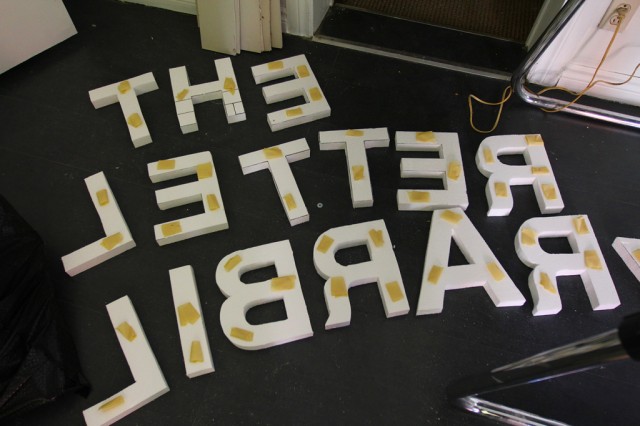
The Letter Library. Some masking tape stuck these styrofoam letters to a brick wall all afternoon. We love how light these are!
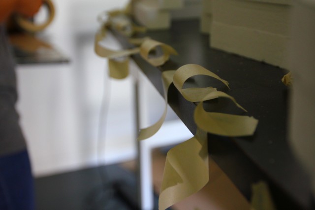
Masking tape prep.
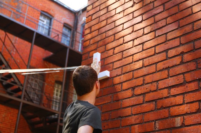
Josh places the maiden letter on the wall.
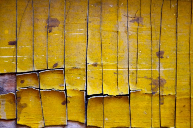
The side of our building.
Up and down the ladder, Josh uses just his eye to line up the entire text.
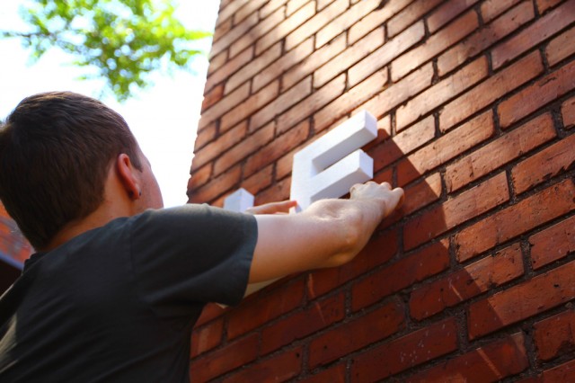
The brick pattern helped.
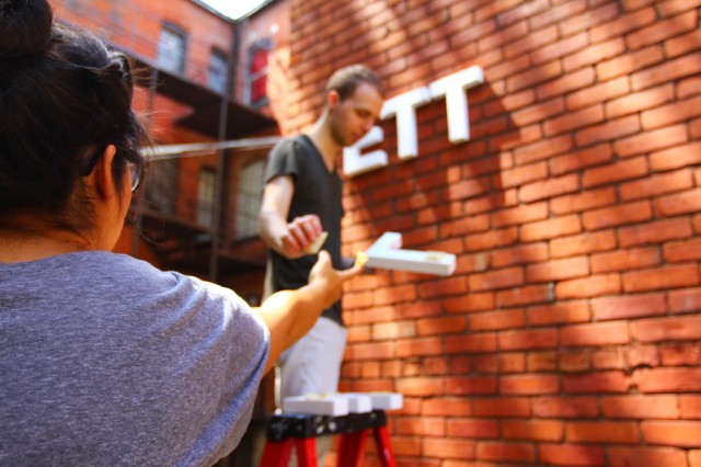
Hiba and Josh in the alley.
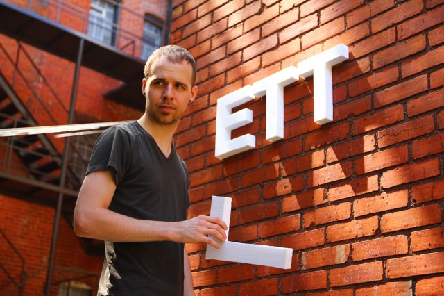
A serious man.
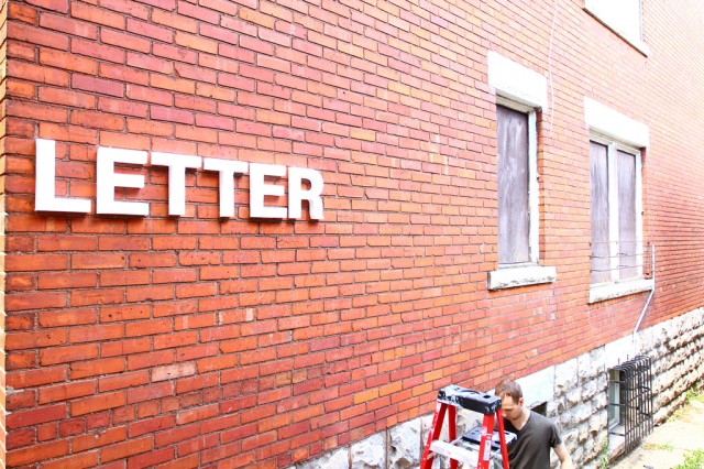
We’re still trying to decide if these letters are going to be painted white, or black, or something else entirely.
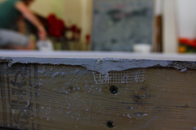
Inside, Kevin works the surface of chipboard to a super smooth finish.
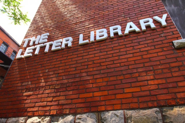
Josh’s kerning was spot on for Helvetica, but maybe a bit too loose initially for the amount of wall space we had.
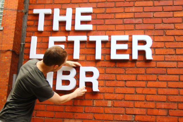
So, Josh made a lot of adjustments, but eventually got it all to fit really well.
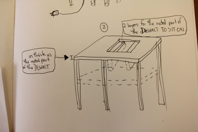
Between drywall mud layers, Kevin also mocked up this jigsaw rig. Despite our experience with jigsaws (we used them to cut out the letters for Reflect on Here), they get really heavy after a while.
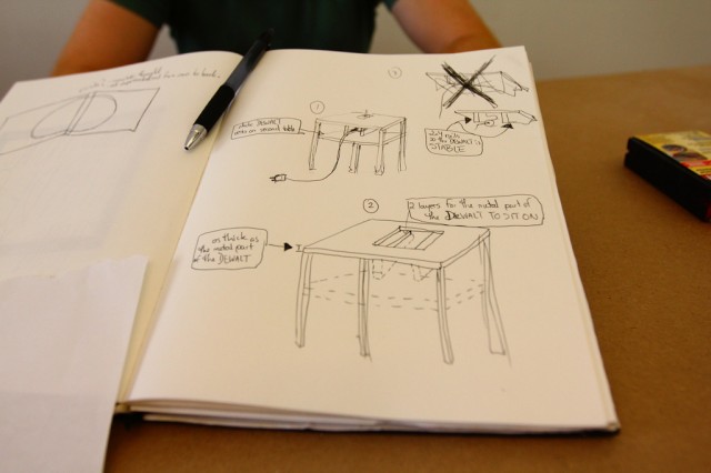
So, we had the idea to basically turn the jigsaw into a half ban saw (or something like that). Kevin went to work on it.
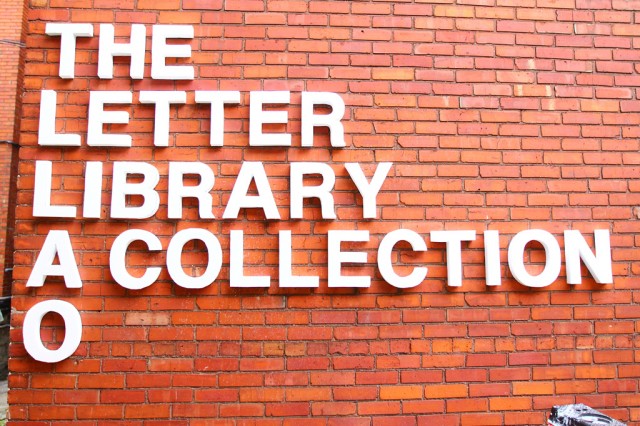
Outside, Josh continues the install.
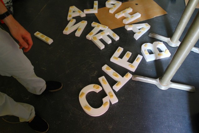
The letters remaining.
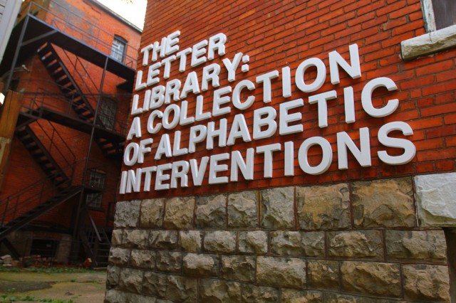
And finally, it’s done. We can’t wait to see how people use these letters to caption different parts of the city.
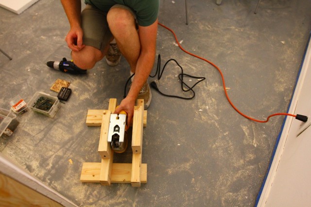
Kevin’s work on the jigsaw rig …
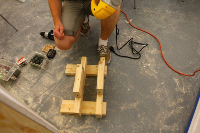
Crude, but it does the job. He finished the rig later on Friday night and it’s now waiting for us to start cutting styrofoam without breaking our wrists. We have to cut about 40 letters a day to hit our target.

We’re at the space from about 11am to 4pm everyday. If you’re in the neighbourhood, stop by. We’re also going to have a painting party to get these letters finished for next Thursday — interested? Let us know.
More Great News: We’re the Recipient of a Windsor Endowment for the Arts Grant!

We’re thrilled to announce this, and very flattered to be in such great local company!!!

Honouring leaders in Windsor’s arts community, the Windsor Endowment for the Arts (WEA) will officially present the WEAs, winners of the WEA Arts Leadership Awards and WEA Arts Grants on Saturday, May 5 at Windsor Music Theatre.  Ten recipients will be honoured including the recipient of the first Elizabeth Havelock Grant in the Arts.
Windsor Endowment for the Arts offers four Emerging Artist Grants to support the professional and creative development of emerging artists. Grants are awarded every second year to successful applicants. Artists who meet the eligibility requirements are invited to apply.

Outstanding nominations, from the public and recognized leaders in the arts culture community identified the seven winners of the WEA Arts Grants. Three arts organizations and four emerging artists will be recognized.

Arts Infrastructure Grants

Community Arts Nancy Johns Gallery & Framing
Performing Arts Chris Rabideau
Visual Arts Media City Film Festival

Emerging Artists Grants

Community Arts Broken City Lab Artist Collective
Literary Arts Kate Hargreaves
Performing Arts Crissi Cochrane
Visual Arts Amy Friend

Elizabeth Havelock Grant in the Arts

Visual Artist Shirley Williams

Huge thanks to Windsor Endowment for the Arts, and to Jennifer Willet and Rod Strickland for the nomination. We’re looking forward to celebrating on Saturday! See you there!

We Made the “2012 Sobey Art Award” Ontario Long List!

We’re really exited to post this … just found out today! We made the 2012 Sobey Art Award Ontario Long List! It’s incredibly flattering to have made it to this stage of the competition, and we owe a huge thanks to Srimoyee Mitra for the nomination.

And, in case you didn’t know, we’re not the first Windsor-based artists to have been included — Zeke Moores made the short-list just last year!

Ok, more soon, but in the meantime, here’s the official news from the press release:

The Art Gallery of Nova Scotia and the Sobey Art Foundation are pleased to announce the long list for the 2012 Sobey Art Award, the pre-eminent award for contemporary Canadian Art. This year marks the 10th anniversary of the Award. Following a three-month nomination process, the Curatorial Panel has announced the 25 artists vying for the 2012 Sobey.

The long-listed artists for the 2012 Sobey Art Award are:

West Coast and the Yukon
• Sonny Assu
• Julia Feyrer
• Gareth Moore
• Kevin Schmidt
• Corin Sworn

Prairies and the North
• Amalie Atkins
• Paul Butler
• Jason de Haan
• Robyn Moody
• Elaine Stocki

Ontario
• Broken City Lab 
• Aleesa Cohene
• Annie MacDonell
• Nicholas Pye & Sheila Pye
• Derek Sullivan

Quebec
• Olivia Boudreau
• Raphaëlle de Groot
• Julie Favreau
• Nadia Myre
• Ève K. Tremblay

Atlantic
• Mark Igloliorte
• Stephen Kelly
• Eleanor King
• Lisa Lipton
• Graeme Patterson

The 10th Anniversary shortlist of the Sobey Art Award will be announced in late June. An exhibition at the Museum of Contemporary Canadian Art (MOCCA) in Toronto will feature select work by the shortlisted artists from October 24, 2012 to December 30, 2012. The 10th Anniversary Sobey Art Award winner’s announcement will take place at a Gala event at the MOCCA on November 16, 2012.

The 2012 Sobey Art Award Curatorial Panel consists of:

• David Diviney, Curator of Exhibitions, Art Gallery of Nova Scotia;
• Louise Déry, Directrice Galerie de l’UQAM, Université du Québec à Montréal;
• David Liss, Artistic Director and Curator, Museum of Contemporary Canadian Art;
• Ryan Doherty, Curator, Southern Alberta Art Gallery;
• Bruce Grenville, Senior Curator, Vancouver Art Gallery.

For more detailed biographical information on the 25 long listed artists and members of the Curatorial Panel please go to: www.sobeyartaward.ca

New Exhibition: Unrest Everywhere (Tools for Playing with Halifax)

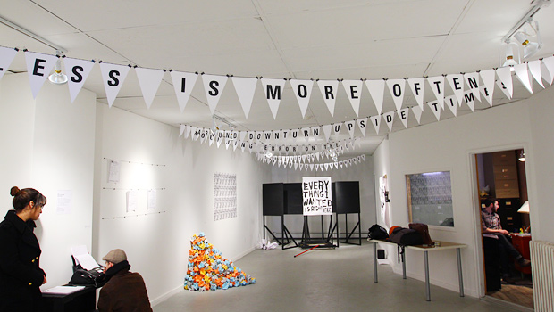
Just back from an incredible week installing at Eye Level Gallery for our show, Unrest Everywhere (tools for playing with Halifax), which runs until May 12, 2012. The show features a number of multiples and interactive works, all of which are yours for the taking and borrowing.

The premise for the show was to create a series of works that could directly or indirectly suggest access points for re-encountering the city and your role within it. We created works that aimed to be highly distributable, playful, and allowed a bit of critical commentary on the ways in which a sense of place comes to be planned, articulated, and established.

Below is a huge pile of documentation of the process — but first — we’d like to extend a huge thanks to all staff and volunteers at Eye Level, especially Michael and Matt, and to Emily and Kaley for the place to crash!

Continue reading “New Exhibition: Unrest Everywhere (Tools for Playing with Halifax)”

RISK: Design Vulnerability

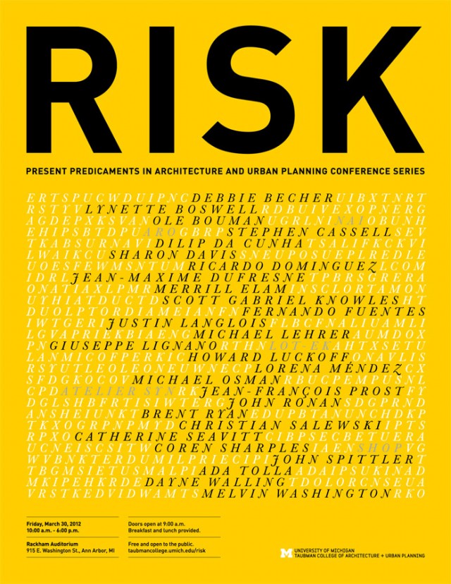
RISK, a conference that highlights present predicaments in architecture and urban planning, will explore the intersection between entrepreneurship and practice, taking risks in design, coopting strategies from other disciplines to advance architecture and planning, and in general not being afraid of change.

A dynamic group of speakers will engage the topic in 15-minute presentations, followed by faculty responses to provide commentary and provocations on themes such as personal risk; professional risk; environmental risk; risk of investing in the central city; and design as risk.

Details

March 30, 2012
Rackham Auditorium, 915 East Washington Street, Ann Arbor, MI 48109
Time: 10 AM – 6:30 PM, Doors Open at 9 AM

Justin is presenting on the Design Vulnerability panel, moderated by Walter B. Sanders Fellow, Etienne Turpin, alongside these incredible speakers:

Ricardo Dominguez, Associate Professor, UCSD; Co-Founder, Electronic Disturbance Theater

Jean-Maxime Dufresne & Jean-François Prost, Principals, SYN – Atelier d’exploration urbaine

Fernando Fuentes & Lorena Méndez, Co-founders, La Lleca Colectiva

Here’s the brief for the panel:

From the perspective of design research, the laboratory is a model for investigating urban scenography, interstitial space, transient icons, and the political economies which shape architecture and the city. The lab is not, in this model, the hygienic space portioned from the world to afford a distanced observation; the lab is instead a platform for embedded forms of inquiry, intervention, speculation, and experimentation. These precarious forms of practice are affirmed through design strategies that embolden our experiences of vulnerability at the level of the city, the social, and the ecological. These practices do not attempt to erase vulnerability through design but instead leverage design research and performative experimentation by collaborating with and among various vulnerabilities. The panel considers how practices of accumulating vulnerability offer new models of courage and conviction for post-heroic architecture and design.