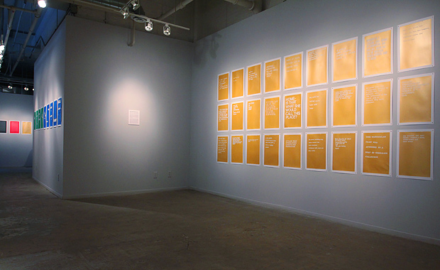
A quick three days at Martha Street Studio finished up with the opening for our exhibition, All the Stories We’re Not Telling About Winnipeg. The show features a series of posters made by participants from our workshops and created in response to the stories they collectively wrote.
The exhibition runs until January 5, 2012!
We have to extend an incredibly huge thank you to everyone at Martha Street Studio for facilitating this residency and exhibition. We were floored by the support we received there and were lucky enough to host some exceptionally great Winnipegers at our workshops.
Needless to say, we had a great time — and below is how it all came together.
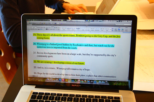
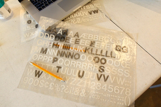
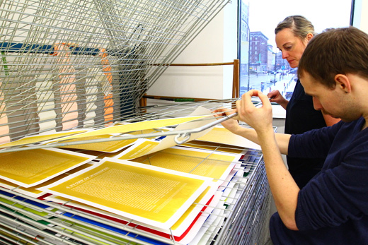
Wednesday morning admittedly felt a bit sluggish. We didn’t leave the studio until about 2am the night before. We had been Letrasetting each sentence of the collectively written story generated from the workshops and it was taking a long time. Above, the sentences, highlighted so Michelle and I could keep track of where we were.
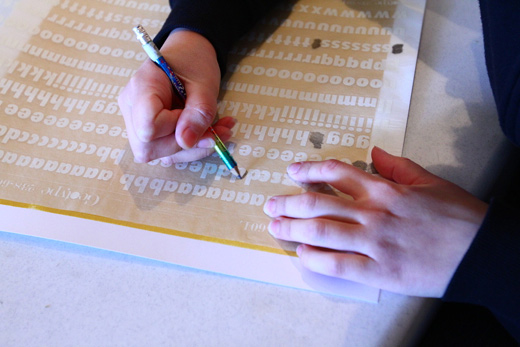
Michelle Letrasetting.
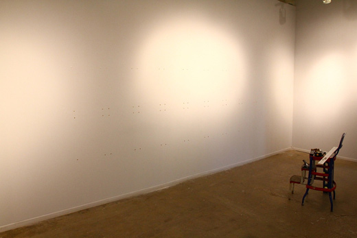
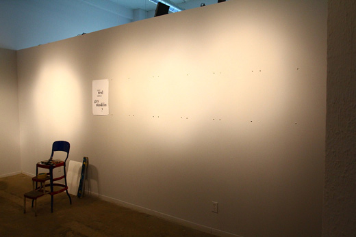
The gallery walls, with pins for our big grid.
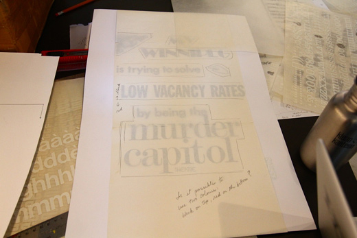
One of the posters from the workshop, the night before, waiting to be finished up with a colour overlay.
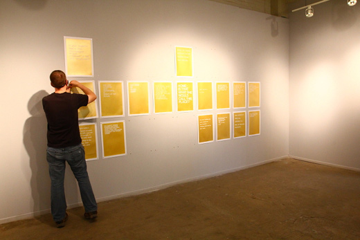
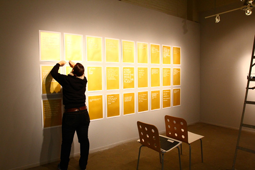
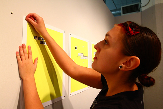
Andrew hanging our gold posters.
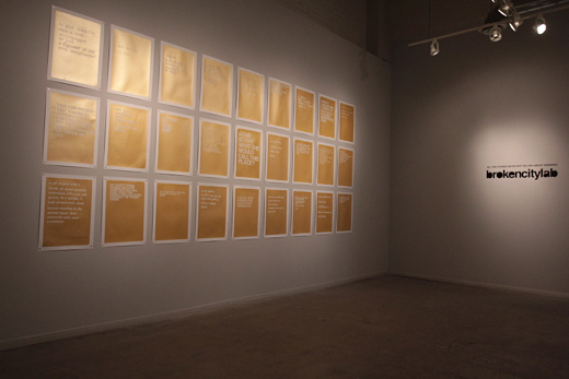
They’ll eventually be in a 9×3 grid.
One of the fonts I chose was fussy.
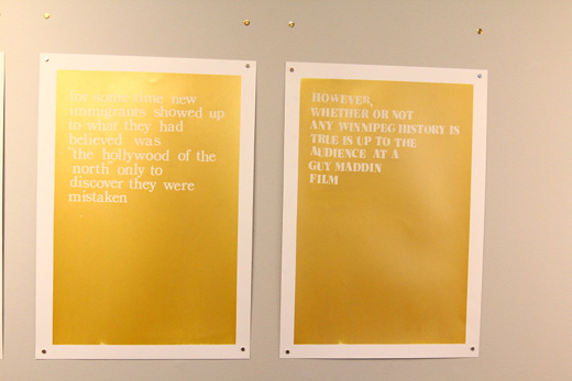
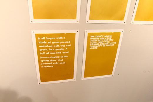
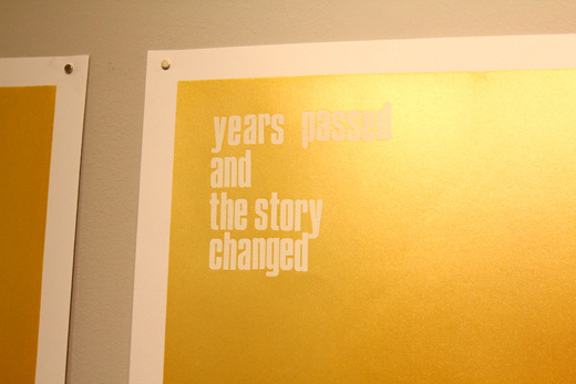
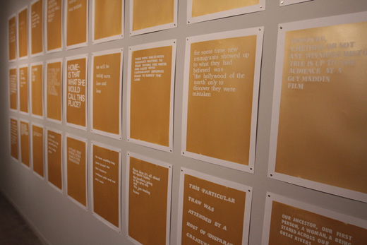
Some details of a couple posters.
More detail, gold posters.
More detail, gold posters.
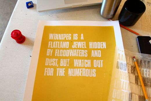
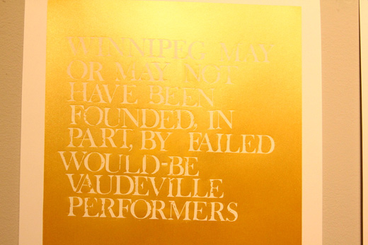
One of the shorter sentences.
And, one of the longer ones.
On another wall, more pins for the workshop posters. Martha Street Studio used pins and rare earth magnets to hang the posters, which meant no pin holes in the posters.
A sheet of Helvetica bold, after a poster.
Michelle touching up a few spots on our grid of gold.
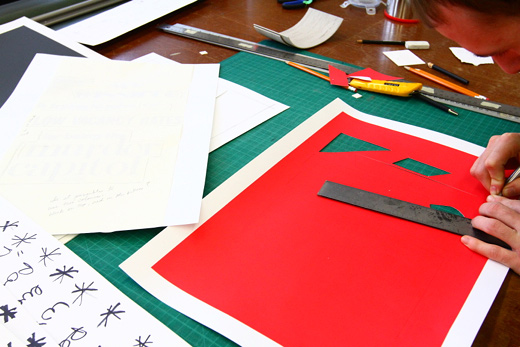
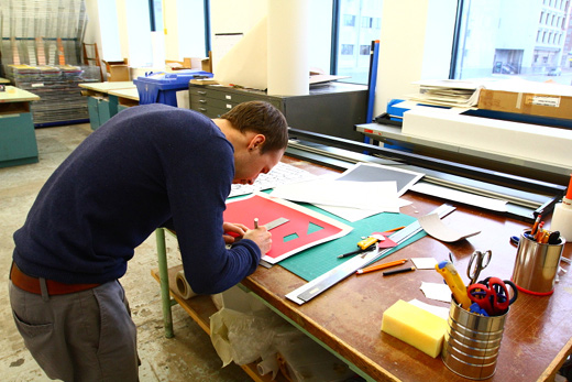
In the studio, Josh trims out the windows for an overlay.
Steady hands.
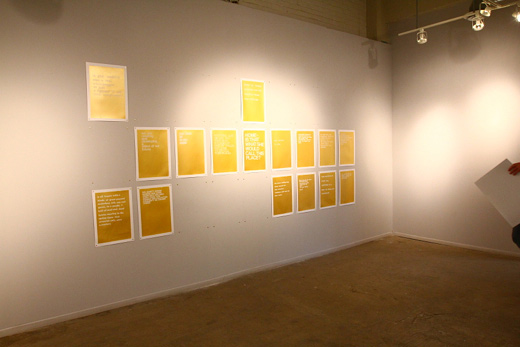
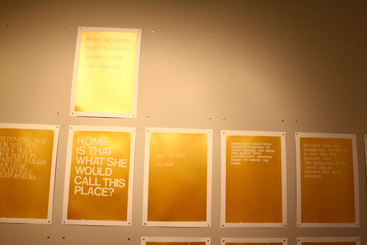
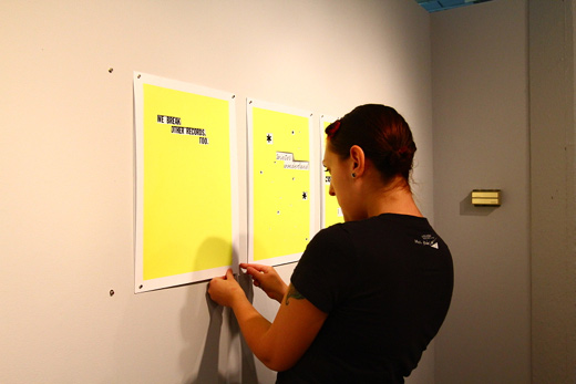
Some of the posters hung.
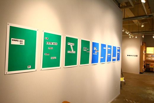
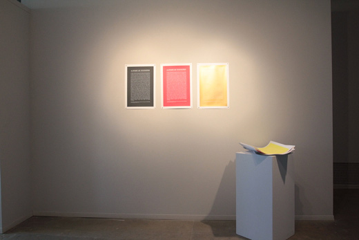
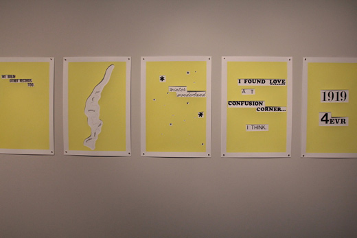
We set up the posters to be grouped in like-colours.
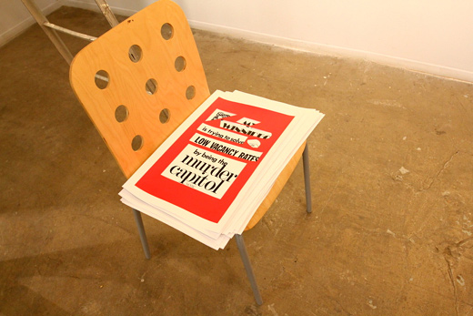
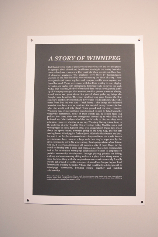
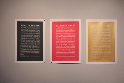
In the back, some of the silkscreened posters of the collectively written story. These were screened by Drex and you can get a free copy at the exhibition.
More posters waiting to be hung.
Michelle + magnets.
Straightening out the work.
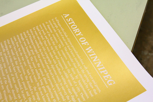
A detail of the silkscreen on gold.
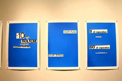
Three of the silkscreened posters and a stack for free.
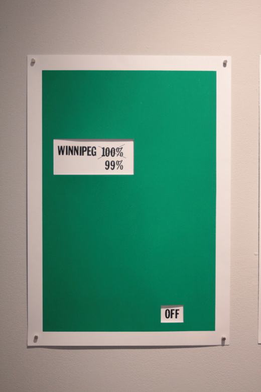
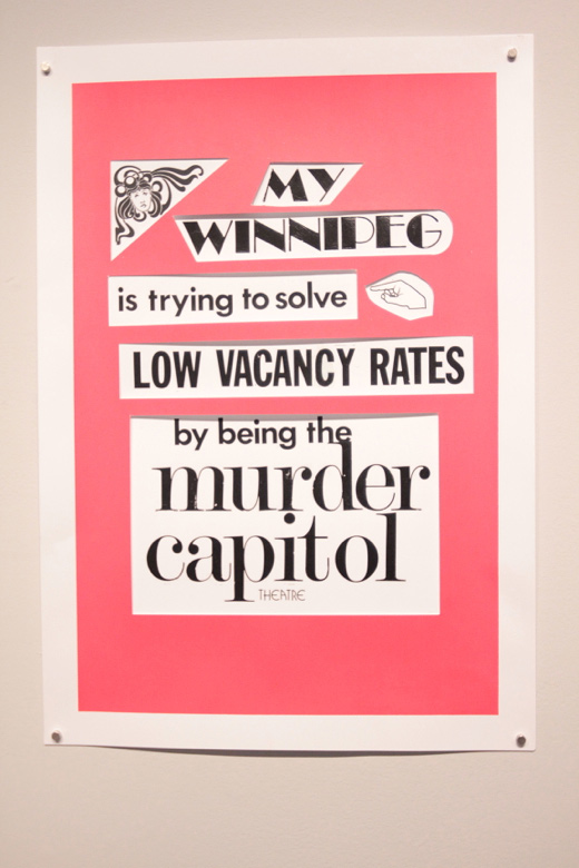
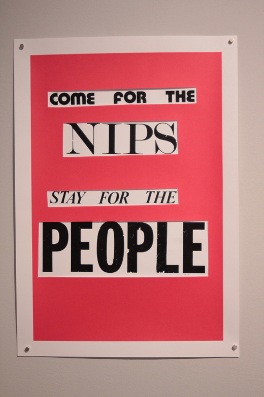
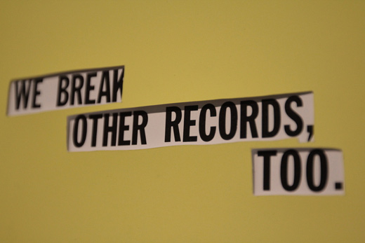
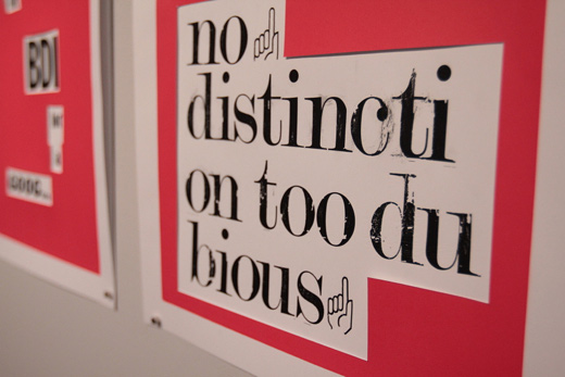
A detail of a poster made at one of the workshops.
A detail of the silkcreened poster.
A detail of a poster made at one of the workshops.
A detail of a poster made at one of the workshops. Nips is another word for a burger. Ha!
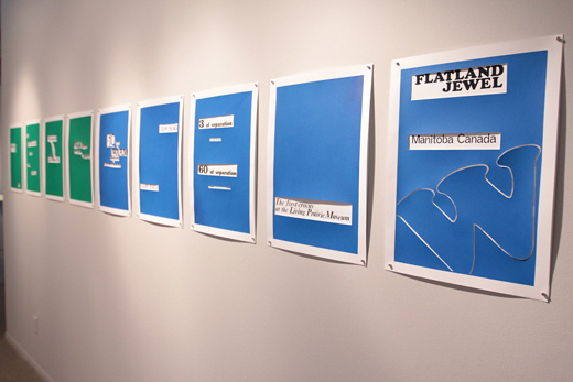
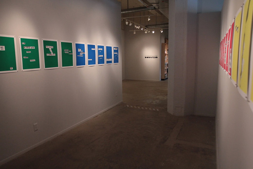
Green and blue posters hung.
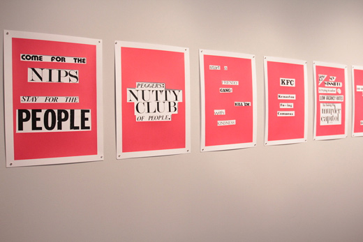
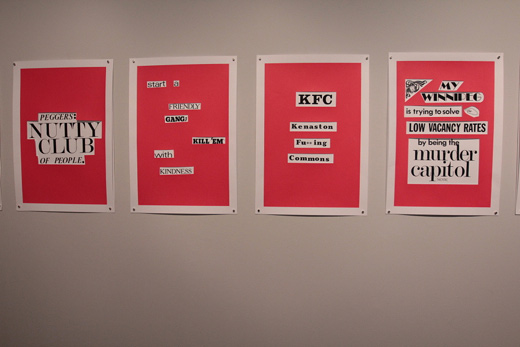
Red posters.
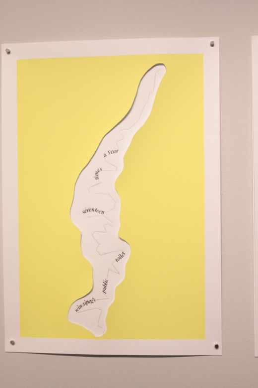
A detail of a poster made at one of the workshops — creative overlay cutout.
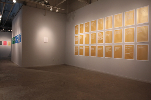
The exhibition up in its entirity.
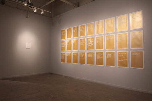
The grid and a didactic.
Detail of our grid.
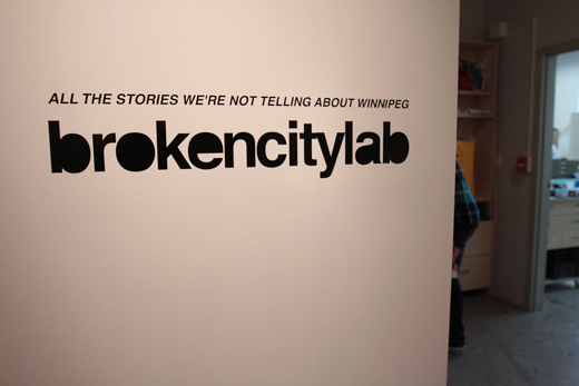
Title wall.
Red posters.
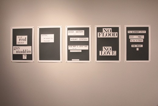
Grey posters.
Grid and title wall.
Detail, yellow poster.
Yellow posters.
Three of the silkscreen posters, featuring a collectively written story of Winnipeg.
The gallery brings you from the studio to the offices.
Detail of a red poster.
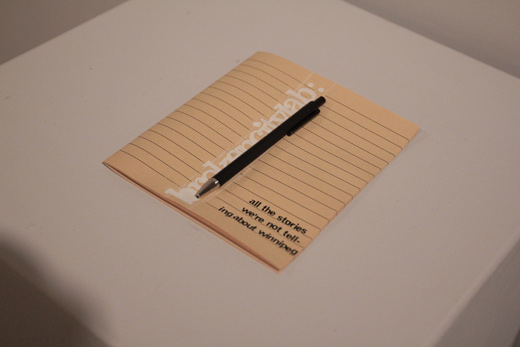
Our guest book!
Three days, two workshops, and an exhibition. Hopefully this isn’t our last time to Winnipeg, there was so much we wanted to see!
We learned a lot on this project — certainly about Winnipeg (things like the incredibly few degrees of separation from most people, the ways in which an isolated city seems to retain and attract a really interesting set of people, and the common experiences of place that seem to spread across generations) — but we also touched up on our silkscreening skills and figured out some new ways to run these kinds of workshops. And, as we usually find, there’s something very different about the rhythms of this city, at both the small and large scale. The climate undoubtedly has something to do with it, but it also seems like a city that activates its citizen’s imaginations — that is, it’s a city that gets its residents talking about it, and it somehow empowers those conversations to both critique and celebrate the intricacies of itself. There’s a lot of things about Winnipeg that we would have loved to have brought back with us, but maybe the most important one is the act of conversing about the city as an everyday practice, not a special meeting, occasion, or forum.
Again, it was an excellent time. I’m sure if we had one more day, we would have also tried to pull off a publication. Maybe we’ll do one retroactively when we get these posters back in the mail.

Excellent summary Justin.
<3
Awesome conclusion guys!
The overlay cuts are super enjoyable. I like how it’s as if you’re highlighting particular parts of a larger text, but can only see those parts; very interesting stuff.
Activating a conversation amongst the citizens seems like an interesting topic! “…getting the residents to talk about its city…” – SO important. Seems like not just a role, but a necessity for the local artist. As if its a responsibility of being a citizen. Super simple but people do not do it.