It was just Rosina and I on Wednesday night, but we didn’t let that stop us from starting some new work! I remember when I first posted / talked about the Imaginary Platform, Rosina had seemed keen on figuring out a way to distribute it. So, that’s how we spent the evening, working through ideas for sending out the Imaginary Platform to people who should read it.
We talked through a few different ideas — would we put up posters, projections, or make little handouts?
We finally came to the idea that sending out the platform, at least in the first instance, to all of the candidates would hopefully help to get these ideas spread around a bit more. And really, we’re hoping that we actually see some of these crop up in candidate’s platforms, so if they’ve missed it online, getting a physical copy mailed to them might help.
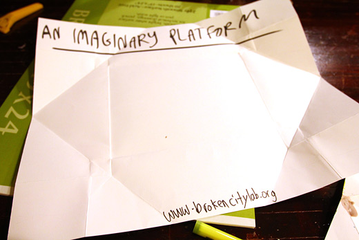
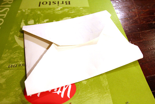
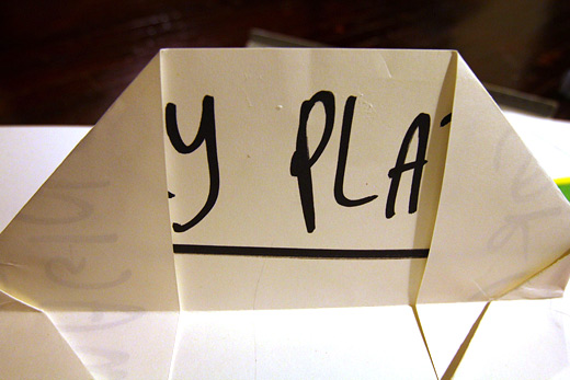
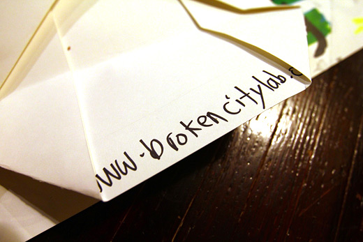
We’re working with large cardstock (19×24″) from Utrecht, which we set out to try to fold into a self-contained envelope, which is actually a bit difficult given the difficulty in folding thick paper like that. You can see a rough prototype above that will be held together by a few spots of hot glue. Admittedly, we tried some wax experiments that resulted in epic failure.
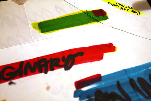
Since I’ve had these KRINK markers sitting around for a while, this seemed like a good excuse to start to play with them. The colours I have are cyan, magenta, yellow, and black, so mixing them together is a lot of fun.
We tried a few options in trying to sort out how best to make this poster look like something more than just a list. And, maybe because I’m a bit burnt out on computer design for the moment, or maybe because it’s just a lot more fun to do this kind of stuff together, or maybe because we figured there’s something important about handwriting these letters to the candidates, we’ve opted to do it by hand.
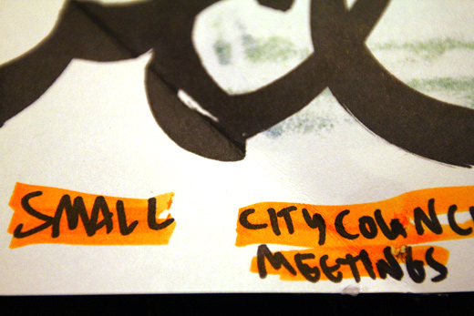
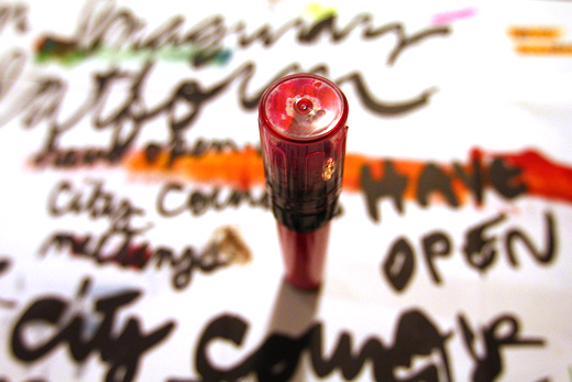
Rosina came up with the idea to work with highlighting the list text to reflect the aesthetic on the website. We tried highlighter at first, but it’s not bold enough next to the KRINK (in red above and yellow below).
You can see the basic fold and how some of the text becomes legible on the outside, which looks pretty great.
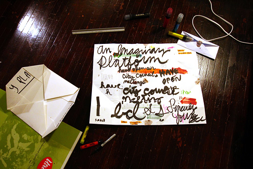
We were just working with some placeholder text to see how it would all unfold. Ultimately, we’ll probably all take on doing at least five of these, so we’ll need a common layout, so to speak.
Our test-site, details below.
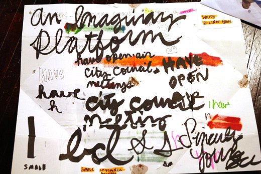
Trying a variety of handwriting tactics (cursive, all-caps) and weights of the text itself.
The KRINK markers are a joy to work with especially when writing cursive, but too big to do the entire list.
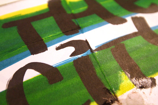
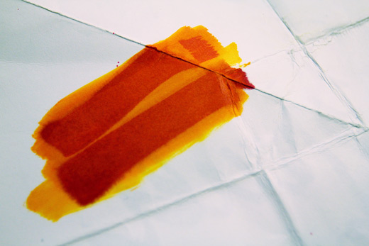
The bleeding of the markers becomes really interesting visible through the other side. You can also see part of our wax fail here.
More samples, but we’re generally settled on how we’ll move ahead. Looking forward to finding the time to get moving on this more soon.
And in the meantime, Rosina keeps working on the cardboard letters, Cristina has been packing for her big move to Toronto, Danielle is packing to move back up to Windsor, Michelle is starting to play(?) roller-derby (do you play roller-derby?), and Josh wonders aloud about the new Call Phone feature in Google.
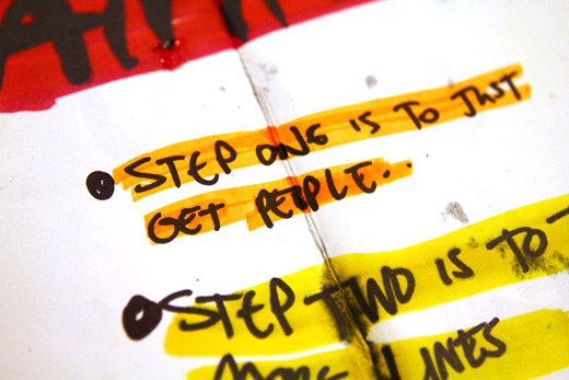
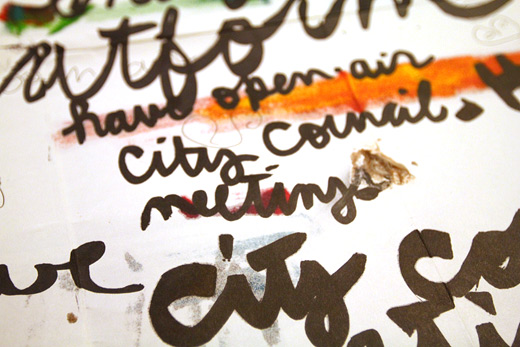
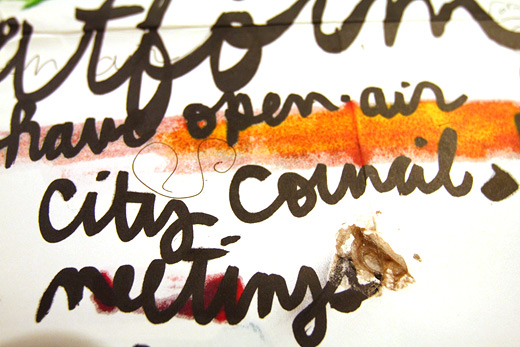

I really like the handwriting sample page. It’s an interesting aesthetic on its own.
Really glad you feel that way, Josh, because we’ll definitely need your steady hand and good penmanship to get these finished! I’m looking forward to seeing how all of them look together, since we’ll all have to do at least a few.
Utrecht, hardwood floors and Call Phone are amazing.