Tom Provost came by a couple weeks ago with an idea for a new collaboration. We’ve work with Tom before on How to Forget the Border Completely — in particular the proposals for 1,000 Pedestrian Walkways and the Windsor-Detroit Portals. In short, the new project is to take the form of a triangular sign, something like you might find on an empty lot waiting to be developed. On each of the three sides of the sign would be a proposed development for the particular site on which the sign is located, along with three perspectives on the possibilities of that development ever taking place or not.
The development would be a large-scale proposal — something that could undoubtedly transform a selected site, and would probably verge on the impossible — would attempt to articulate not just a “new use” for a selected site, but a one that might reflect the values and directions that we would like to see the city take on. We’re approaching this with the mindset of impatience and lack of confidence in the powers that be to create a truly interesting place to live. The proposals will aim to engage in imaginative speculation, but also try to draw into a critical discourse the ways in which we seem to disarm ourselves collectively from building truly great community assets. We so often rely and play into the very imaginary game of community consultation on projects long ago set (mostly) in stone, this seems like a great project to assert a different stance, process, and set of ideas for developing various parts of our city.
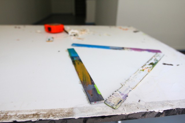
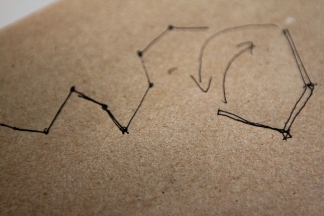
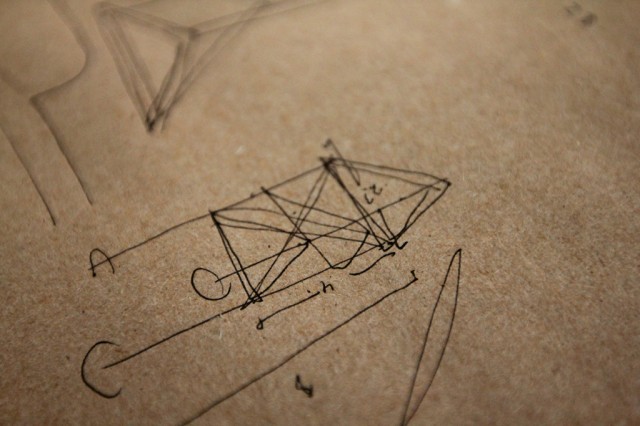
Also, these stir sticks were less a model, and more of a visualization tool for us to talk through the project. In early stages, I’m always so intrigued with how things shift and circle back around and change entirely.
When I caught up with Tom earlier this week, we spent a lot of time talking form.
Trying to find a balance between efficiency with the materials we’ll buy (how many faces, ideally, will come out of on piece of plywood), and making these things somewhat transportable led to discussions about size, the number of them we might build, and certainly the level of spontaneity in their arrival(s) to the selected site(s). All of these elements in turn vastly change the “weight” (in all senses) of the signs — where’s the line between an authority in structure and an intimidation (and in turn backgrounding effect) of the structures?
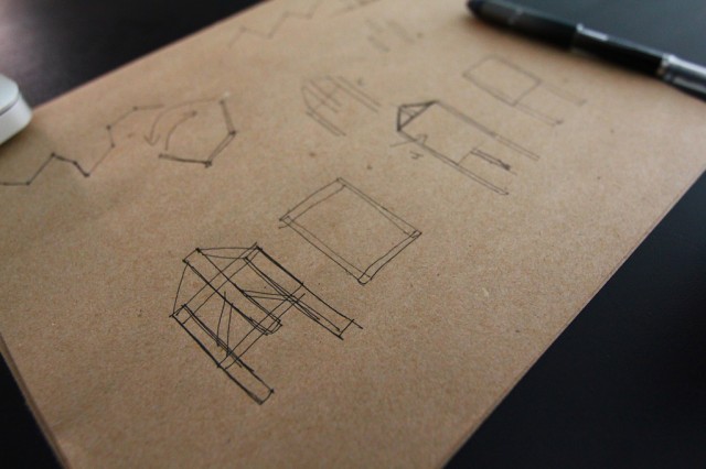
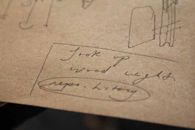
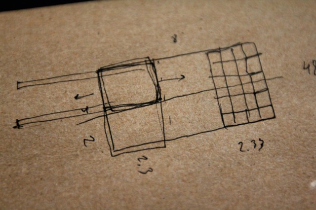
We took notes on this really basic paper (almost the feel of a smooth construction paper). In the past, Tom has used this for making the bases of architectural models, which looks incredible. We’ll be using a similar technique to basically grid and create a larger image for each face of the triangular sign.
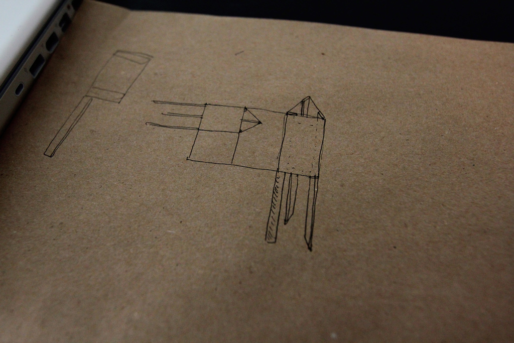
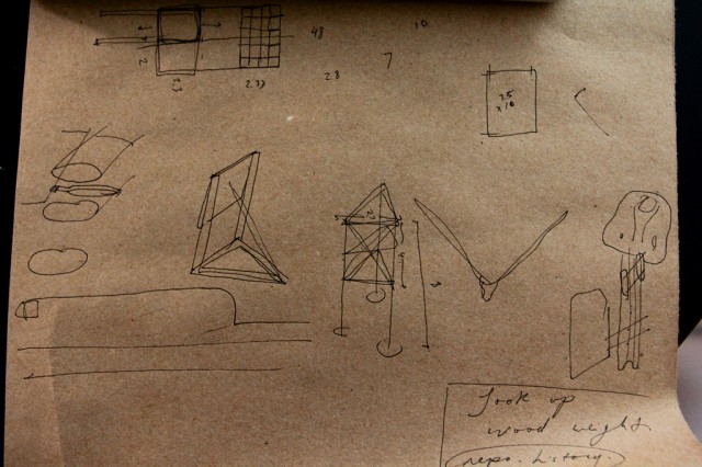
We’re looking at these signs being somewhere around 2ft x 4ft for each face. The sketch above was looking at other possible shapes.
A visual walk through of our discussion.
We also talked about the possibility of these forming a temporary a wall or partition that could provide more surfaces and the possibility to randomize the form on site, using hinges for each face.
But we ended up revisiting the three-sided structure, coming to a fairly resolved (at this point) direction, moving towards utilizing the three sides of the structure to discuss the limits of approach that various actors take to something like a development. What views, acts of persuasion, money, political tactics, and rhetoric does a developer bring to a new proposed project versus that of a city councillor or that of a community member who lives in the neighbourhood in which a new development is being proposed?
We’ll build later this summer.

” Pop-Up Possibilities: Sketches ” — http://t.co/pYxMJUhb
i like it – more sides to signs – more visible sides to plans, ideas
model making process more whole
The multi-side idea is nice. I like being able to walk around things as well. I can’t wait to see one of these in person.