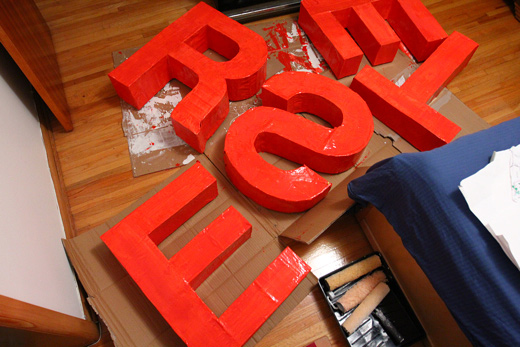
Yet another extremely productive weekend at BCL HQ! We’ve been finishing up the last preparations for our cardboard letters, which we hope to be unveiling them in our first chosen spot next week!
On friday night, we cracked open the paint once more to paint the final coats on before we begin to add the retroreflective glass beads.
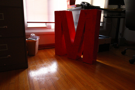
The red paint turned out extremely vibrant with just two light coats on the letters.
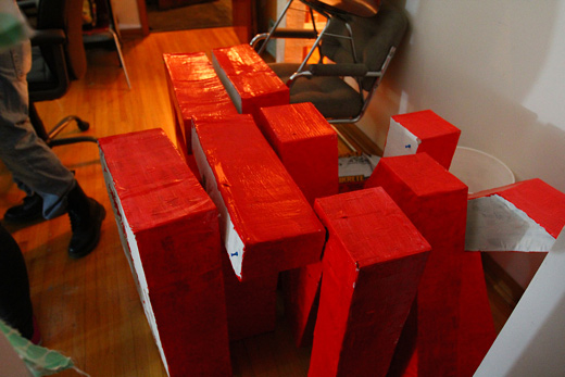
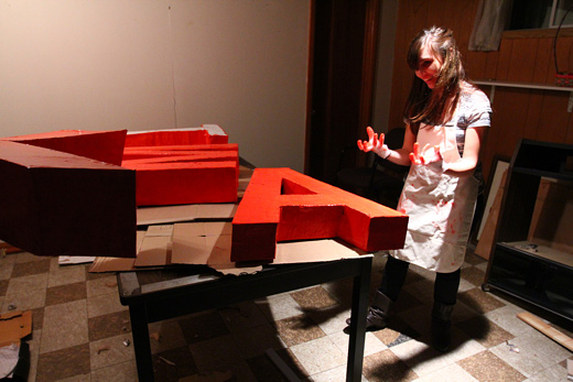
Karlyn’s messy hands after the fun task of manoeuvring the letters to a dry place. We attached push pins to the bottom to help keep the letters in shape and to ensure the bottoms don’t stick to the cardboard.
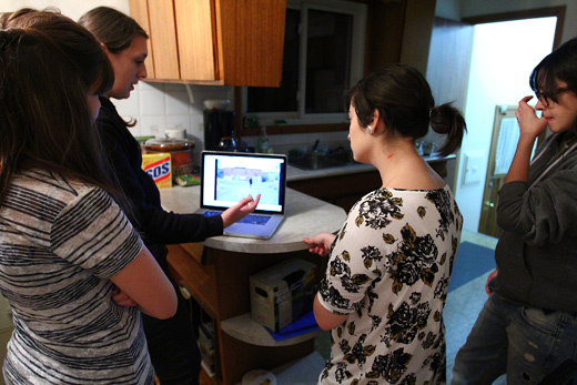
While we waited for the letters to dry, Michelle went over her first proposed location, which is situated within the downtown area. If all goes well, we will be positioning the letters there sometime next week!
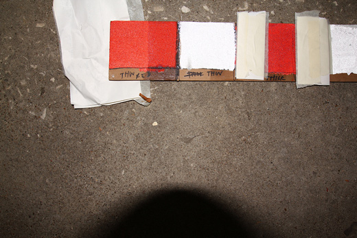
On Saturday, Michelle brought some clear coat to test on the bead samples we’d done previously to determine if it could hold the beads in place any better without altering the reflectiveness. On the first red panel, the left side was sprayed with clearcoat. Since it drastically shielded a lot of the light, we concluded that it wouldn’t be needed.
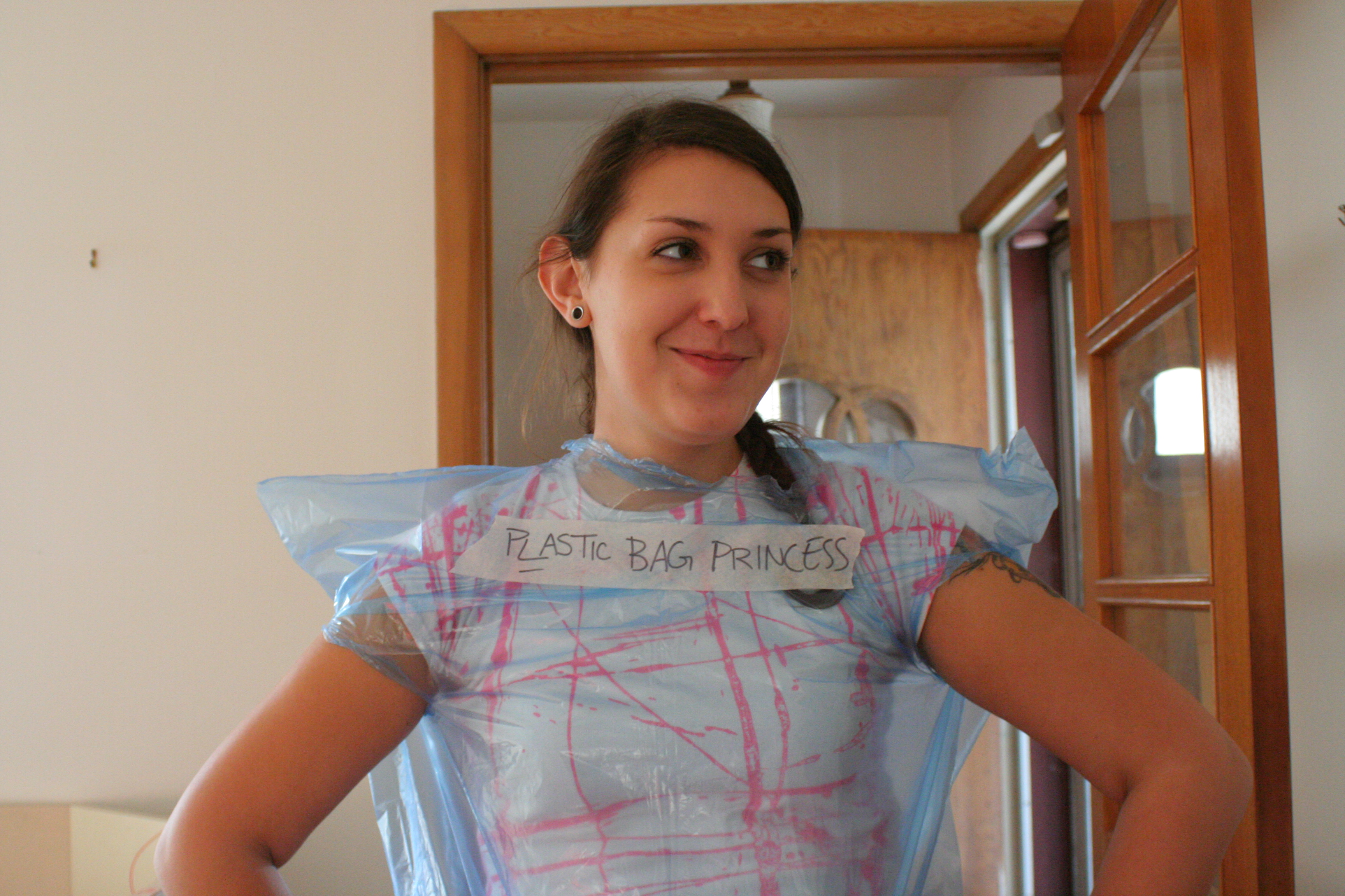
Michelle and I took fashionable precautions before painting the last coats on the faces of the letters.
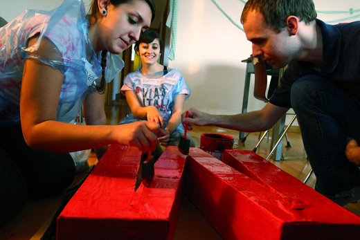
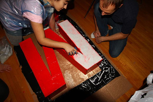
Michelle and Josh painted a final layer of red as I waited promptly to adhere the glass beads.
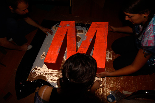
I coated the M with a very liberal amount of beads, making sure the surface area was completely covered.
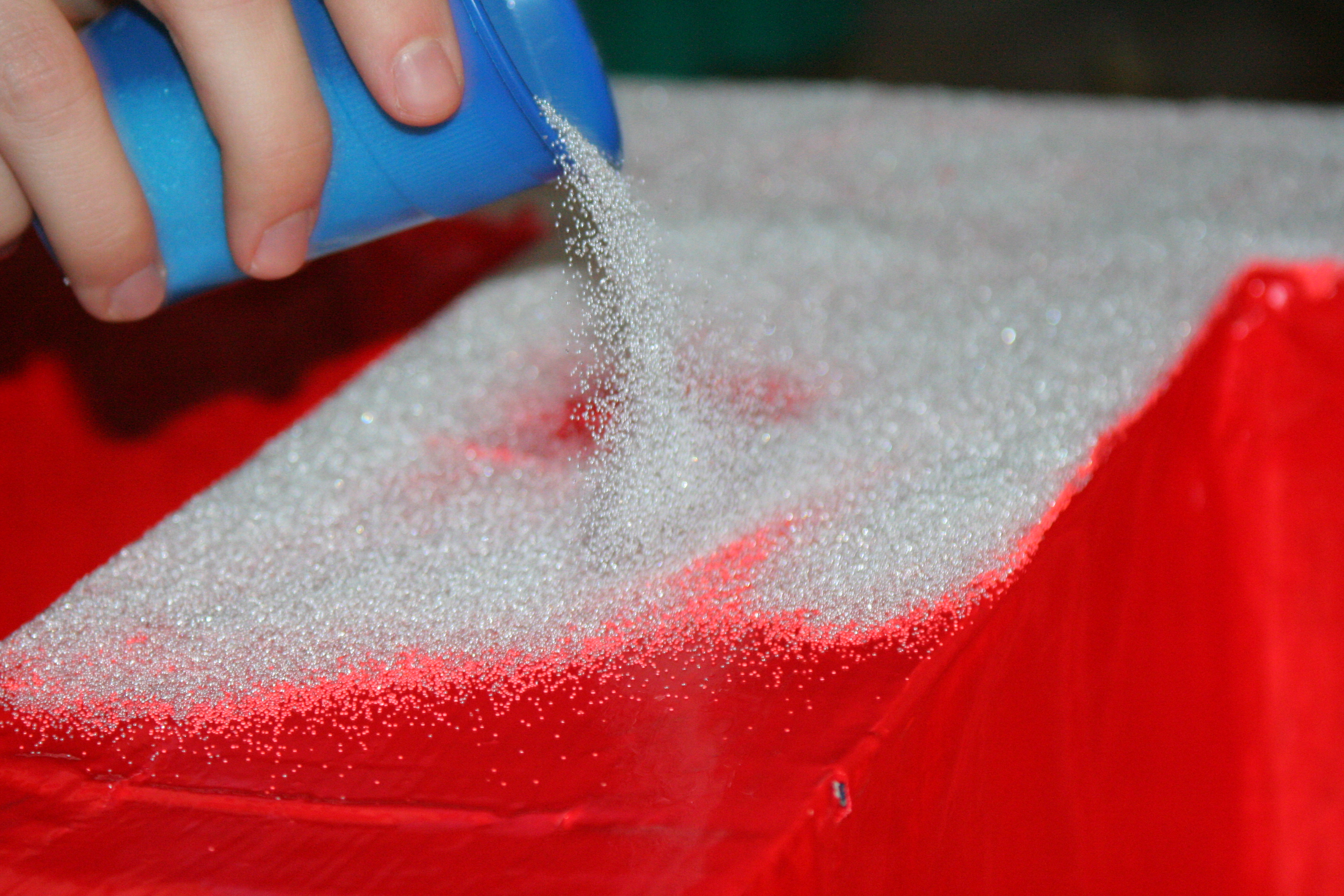
Once that was finished, we shook off the excess amount and filled in some spaces that were missing. The M (now covered in beads) looked brilliant with a flash!
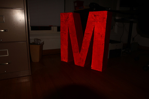
The ‘M’, in daylight, and …
with a flash!
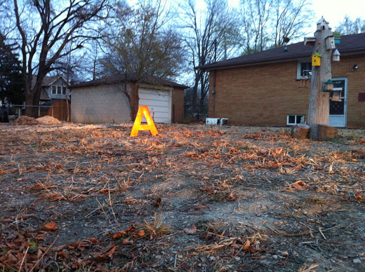
As I’m sure I’ve mentioned before, I’m ecstatic to see the progress fly on these letters! I’m looking forward to a field test to determine how we can photograph these letters effectively to both highlight the locations and the letters. Check back soon!

This was fun. Cannot wait to finish these up and test them on Saturday!
…also I kinda missed the ecohouse, it’s nice to be back there for a bit.
Yeah, I agree. Nice having a dedicated work space. Next one we find just has to have better light!!!!
I’m beyond excited to see these in action.
So little work left!!!
Letters look sooooooo awesome!
Idea expansion – what if, in addition to “make this better,” we also documented its counterpart location, which stands as an improvement and mark it as such.
I.e. In addition to Michelle’s park location, for “make this better” we should demarcate a similar location (that has been privy to some successes) as “better” like Atkinson Park. In it’s final photographic incantation we can have the unloved locations, “make this better” alongside the somewhat loved locations, “better.”
I think this might offer insights that reference the type of potential these forgotten places have or what they can become in this city. As such, these insights could also highlight the limitations of certain places within the city by acknowledging a less than satisfactory high point or zenith. However, this type of “is this the best we can do” discourse may provide a jumping point from where we can begin to re-imagine that particular place.
I definitely think that there’s a lot of room with this project to think about what we’re actually addressing and what we hope to see come out of it. Is it enough to hope to spark conversation or should we be going further?
I think the idea of pointing out the “better” counterpoints to some of these places can provide that insight to the limits we impose upon ourselves here, and in that we’ll find a lot to talk about for sure.
It is the limits that seem to play such a large role in defining a place.
What I hope we can talk about is just what sort of thing better looks like, and how the process of getting to better can look a lot different than how we might initially imagine. Better doesn’t have to mean tidier, or fixed up, or more developed, I think what we’re hoping to get at with this work is the idea that better (if I can borrow Steve Lambert’s language for describing utopia) is a direction rather than a destination.