Project Launch June 21st: The Letter Library (A Collection of Alphabetic Interventions)

Save the Date: June 21st, 2012 at 7pm

CIVIC SPACE (411 Pelissier St, downtown Windsor)

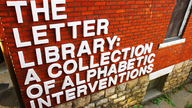
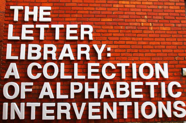
On June 21st at 7pm, we’ll be kicking things CIVIC SPACE with the Letter Library (A Collection of Alphabetic Interventions). This open community project invites anyone and everyone to come borrow from our letterset to caption the city around them.

With Windsor at the edge of so many transitions, how might we collectively reclaim and create our own public narratives about the future of our city through this playful intervention?

Anyone participating will be issued a Letter Library Card and will able to sign out 12″ 3D letters from our collection to create their own temporary installation, document it with one of our single-use cameras, and ultimately help to build an archive of new captions for the city’s build environment.

More soon.

Pop-Up Possibilities: Sketches

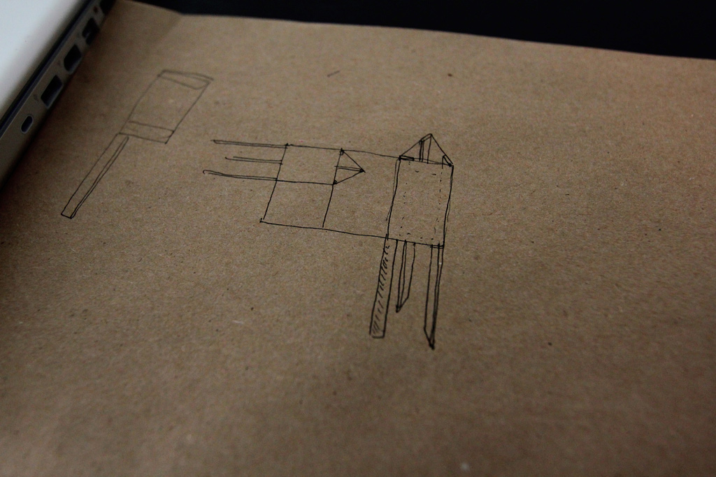
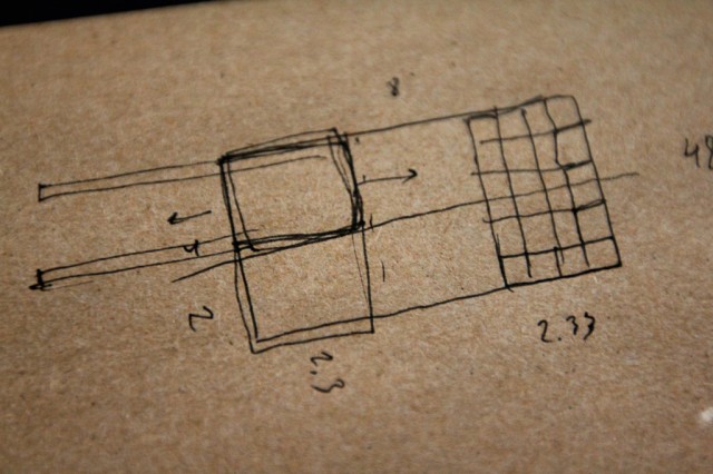
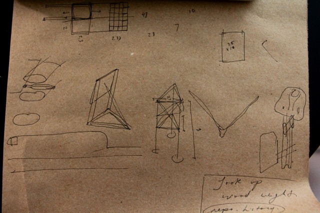
Tom Provost came by a couple weeks ago with an idea for a new collaboration. We’ve work with Tom before on How to Forget the Border Completely — in particular the proposals for 1,000 Pedestrian Walkways and the Windsor-Detroit Portals.  In short, the new project is to take the form of a triangular sign, something like you might find on an empty lot waiting to be developed. On each of the three sides of the sign would be a proposed development for the particular site on which the sign is located, along with three perspectives on the possibilities of that development ever taking place or not.

The development would be a large-scale proposal — something that could undoubtedly transform a selected site, and would probably verge on the impossible — would attempt to articulate not just a “new use” for a selected site, but a one that might reflect the values and directions that we would like to see the city take on. We’re approaching this with the mindset of impatience and lack of confidence in the powers that be to create a truly interesting place to live. The proposals will aim to engage in imaginative speculation, but also try to draw into a critical discourse the ways in which we seem to disarm ourselves collectively from building truly great community assets. We so often rely and play into the very imaginary game of community consultation on projects long ago set (mostly) in stone, this seems like a great project to assert a different stance, process, and set of ideas for developing various parts of our city.

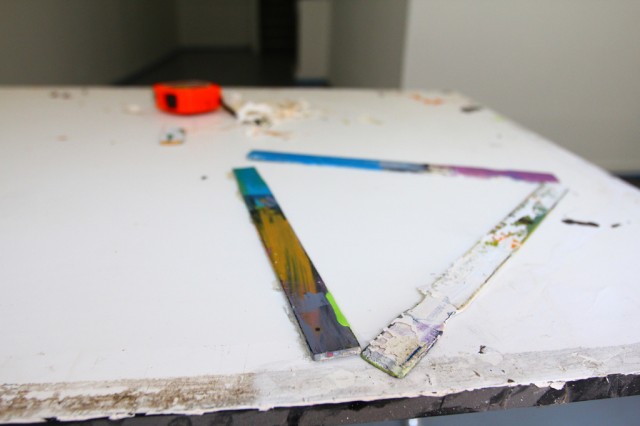
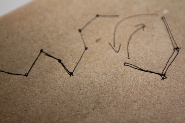
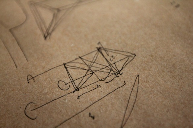
Also, these stir sticks were less a model, and more of a visualization tool for us to talk through the project. In early stages, I’m always so intrigued with how things shift and circle back around and change entirely.

When I caught up with Tom earlier this week, we spent a lot of time talking form.

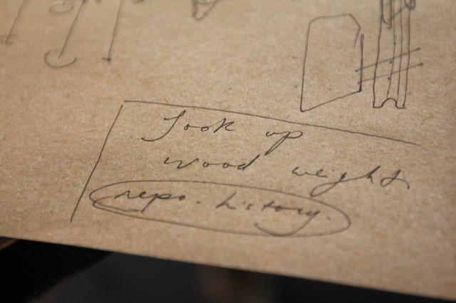
Trying to find a balance between efficiency with the materials we’ll buy (how many faces, ideally, will come out of on piece of plywood), and making these things somewhat transportable led to discussions about size, the number of them we might build, and certainly the level of spontaneity in their arrival(s) to the selected site(s). All of these elements in turn vastly change the “weight” (in all senses) of the signs — where’s the line between an authority in structure and an intimidation (and in turn backgrounding effect) of the structures?

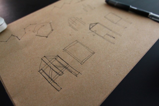
We took notes on this really basic paper (almost the feel of a smooth construction paper). In the past, Tom has used this for making the bases of architectural models, which looks incredible. We’ll be using a similar technique to basically grid and create a larger image for each face of the triangular sign.

We’re looking at these signs being somewhere around 2ft x 4ft for each face. The sketch above was looking at other possible shapes.

A visual walk through of our discussion.

We also talked about the possibility of these forming a temporary a wall or partition that could provide more surfaces and the possibility to randomize the form on site, using hinges for each face.

But we ended up revisiting the three-sided structure, coming to a fairly resolved (at this point) direction, moving towards utilizing the three sides of the structure to discuss the limits of approach that various actors take to something like a development. What views, acts of persuasion, money, political tactics, and rhetoric does a developer bring to a new proposed project versus that of a city councillor or that of a community member who lives in the neighbourhood in which a new development is being proposed?

We’ll build later this summer.

Early Research: Letters from Styrofoam (letter library)

These are early days for a spontaneous new project, but here’s how we’re starting. Rosina, Hiba, and I met on Friday and after going through our usual to-do list, we started discussing some new projects. These new projects are all going to be tied together, and we’ll be writing about what that tie might look like soon.

The starting point for this new project — maybe called the Letter Library Project, or maybe something very different — came from thinking about how we might collectively be framing the city of Windsor as it transitions (slowly) and what we might want to reframe, piece by piece. The city is once again at the top of the unemployment statistics, but there are some large infrastructural projects that are going to dramatically change the physicality of the city itself and in turn, the way we experience it, though it remains to be seen if this will actually change the city, or just reframe it for us.

And the background of this project might actually go back even a bit further, in terms of material, as Rosina and I had met earlier in the week to talk about working on some signage. Research led us to wanting to experiment with styrofoam — givens its rigidity and ease to work with.

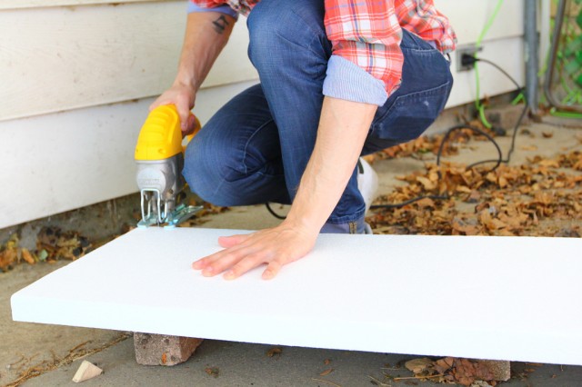
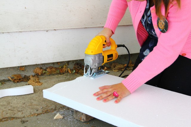
We saw a lot of videos online of people cutting styrofoam into different shapes (and certainly letters) with hot wires, electric knives, and yes jigsaws.

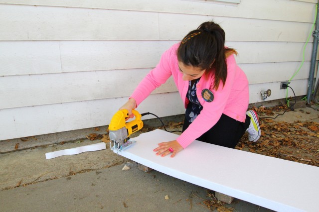
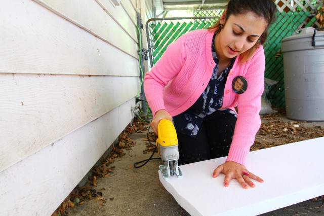
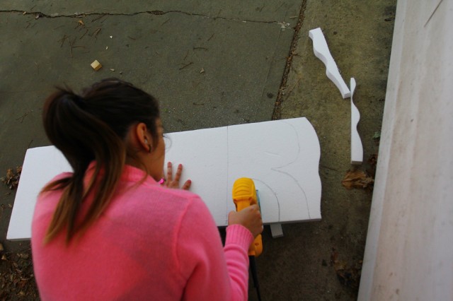
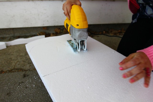
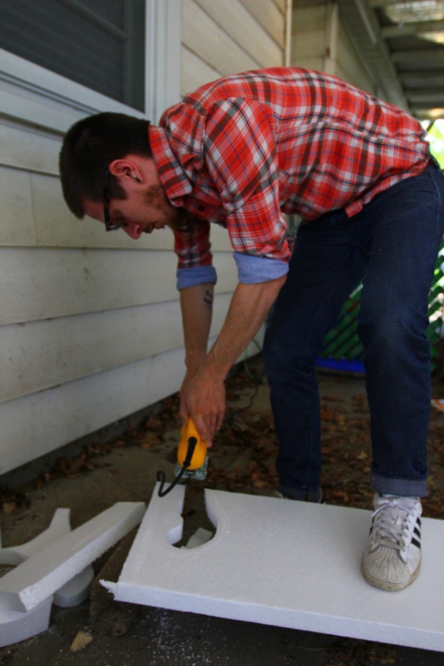
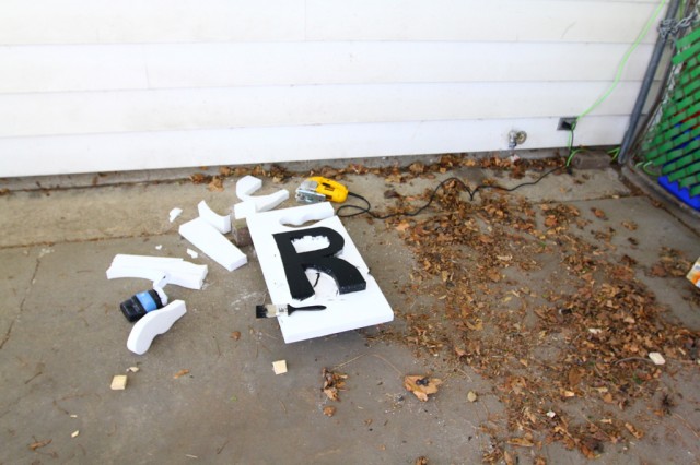
We had a jigsaw and so we went to it. The styrofoam we got was packaged at Home Depot as basically made for crafts and very small home projects. We weren’t sure that it would be dense enough for the cuts — at the time, we had assumed that the denser (and pink) insulation type of styrofoam would work better, but it was too expensive to bother testing with.

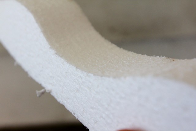
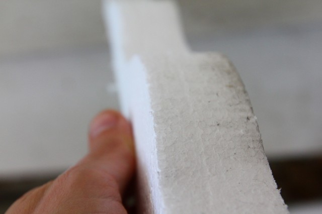
Given the scale of what we’re planning to do, the cost would have been enormous, so we went with the cheaper stuff to just get a feel for possible scale and process, even if the material itself may need to be changed down the road. But, as you can see above, the jigsaw with a 24 TPI metal blade did the trick and cut the styrofoam with a decent level of precision without the messy edges we had anticipated.

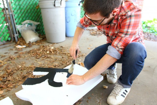
Hiba and I both took some test cuts before deciding to attempt a more complex shape.

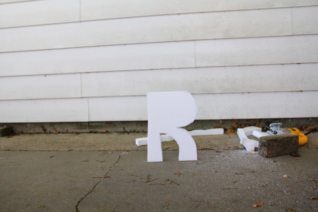
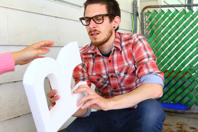
We selected the letter R for a test.

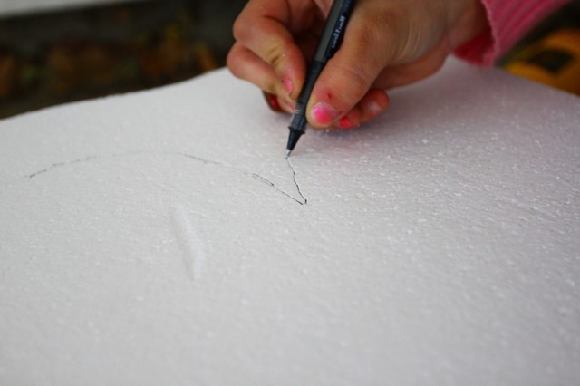
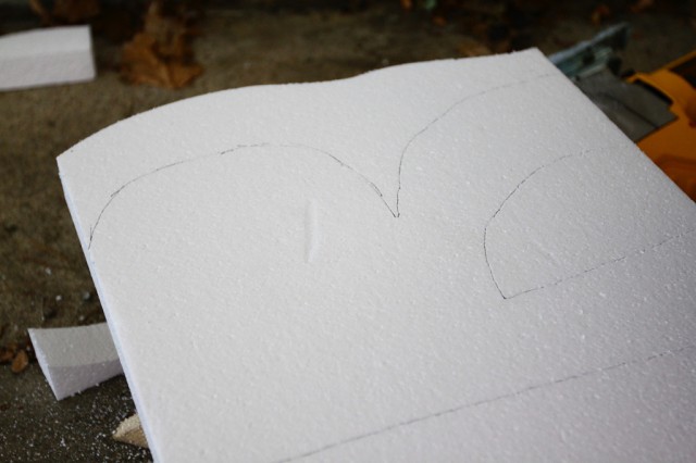
Hand-drawn for now.

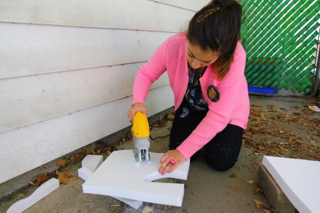
Rosina made the cuts.

Easy.

Rosina with the saw.

Hiba arrived a few minutes later.

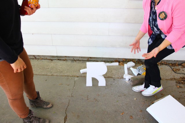
We had a test letter.

Another bonus of this type of styrofoam was the thickness allows the letter to stand up.

I think Rosina was really happy.

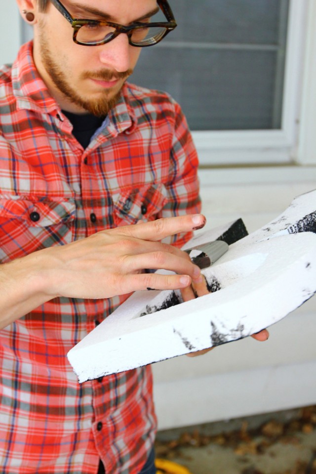
The cuts were fairly good, though we briefly wondered about finding a better way to avoid an angle on the edge of the letters — that is, the face of the depth of each letter would undulate a bit as we failed to hold the saw consistently at 90 degrees. A ban saw would be good for this, but it’s not essential.

I was trying to get a sense of how much we were moving the saw and what the effect was on the angle of the depth.

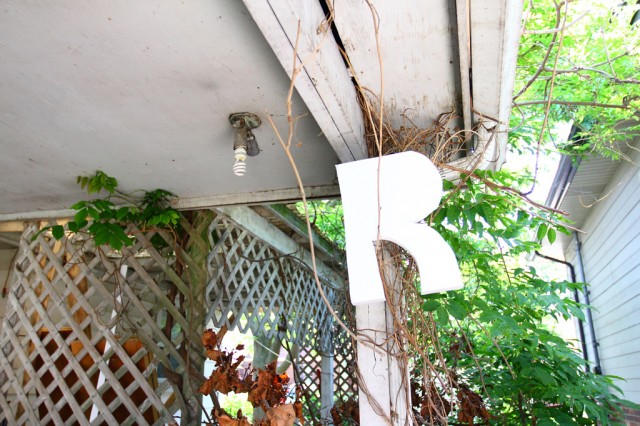
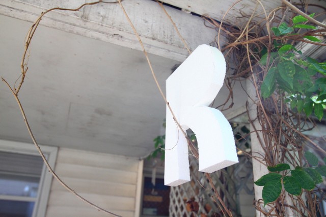
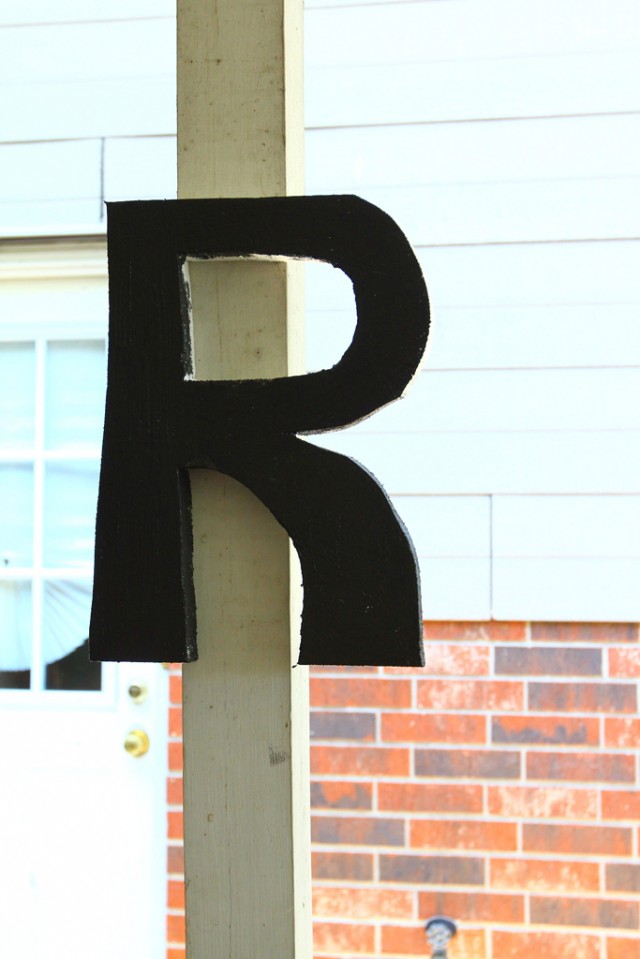
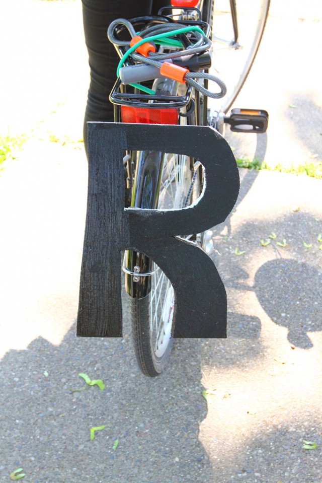
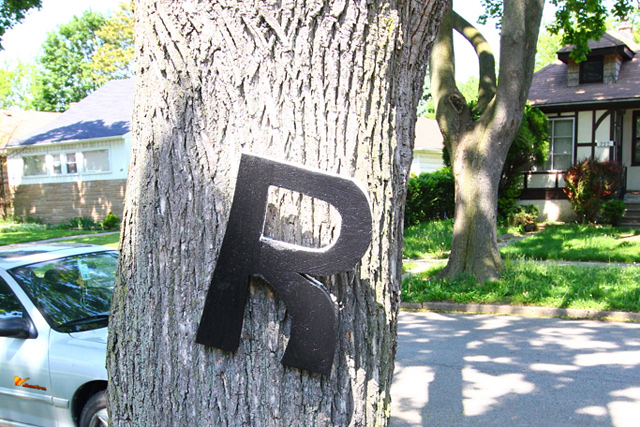
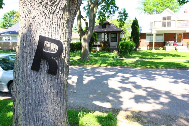
The letter R moves into the wild…

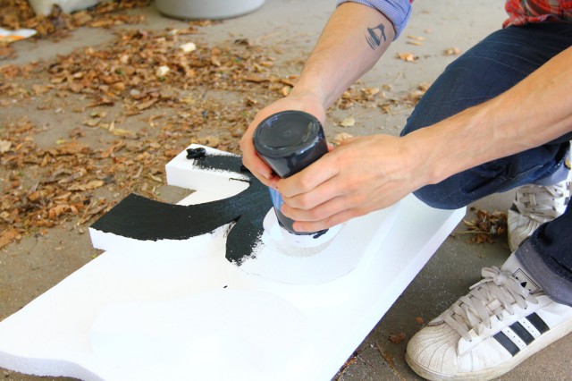
… and then returns for a quick coat of paint.

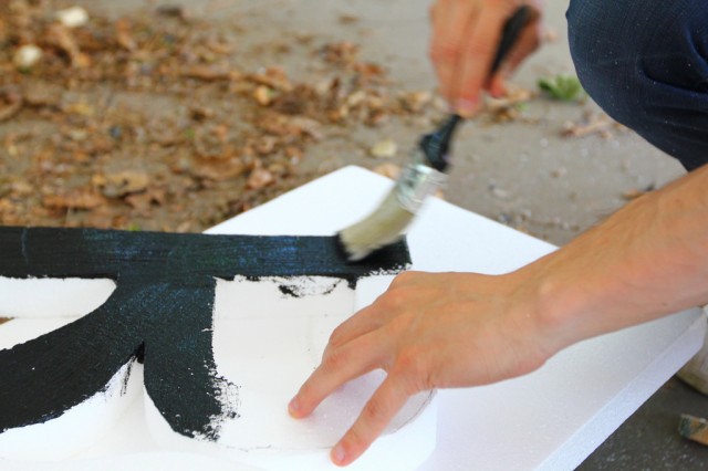
Spray paint would eat the styrofoam, but craft paint was no problem.

More painting.

The letter R dries.

Then, some duct tape.

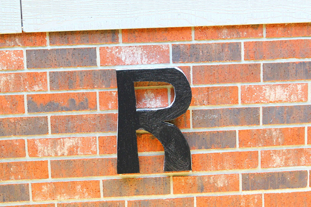
Given how incredibly light-weight the styrofoam is, duct-tape makes for a great mounting device. On brick.

On wood.

On metal.

On a tree didn’t work as well, there wasn’t a lot of surface area for the tape.

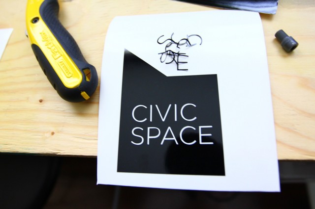
So, that’s the very early stages of a new project. The next steps will be cutting out a bunch of letter templates with the vinyl cutter in card stock, stencilling, cutting, and then a painting party, and then the project launch. Assuming all goes to plan.

And then there’s this … more soon.

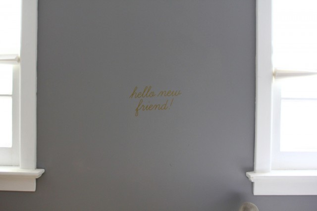
Hello new friend, some initial tests with our new vinyl cutter

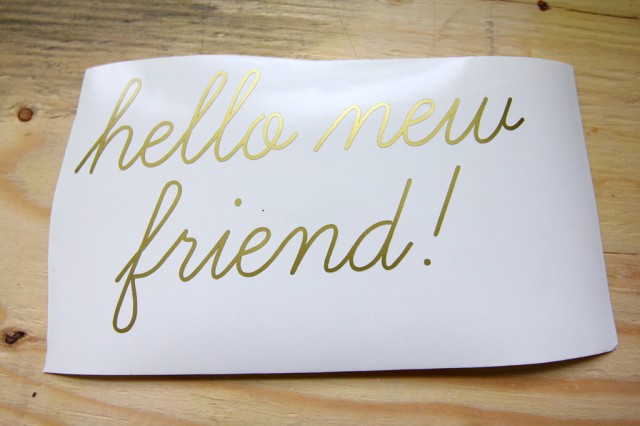
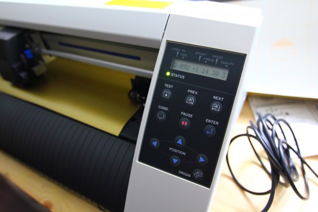
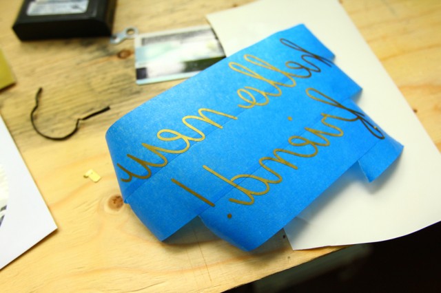
We recently acquired a Graphtec CE5000-60 cutter and we’re already dreaming up a whole bunch of new projects to put it to use. It cuts up to 24″ vinyl rolls (though I’ve also seen it score and maybe even cut cardstock) and with the Illustrator plugin, its incredibly easy. Above, a test with some gold vinyl.

It took only about 15 minutes to get it setup and running — there were some adjustments that needed to be made to in the offset to get the test triangle / square with the appropriate straight lines, but once that was setup and after I found the solution to the  HP-GL error 1 (change the command from HP-GL to GP-GL), I was able to send files from Illustrator just the same as you would send a file to print.

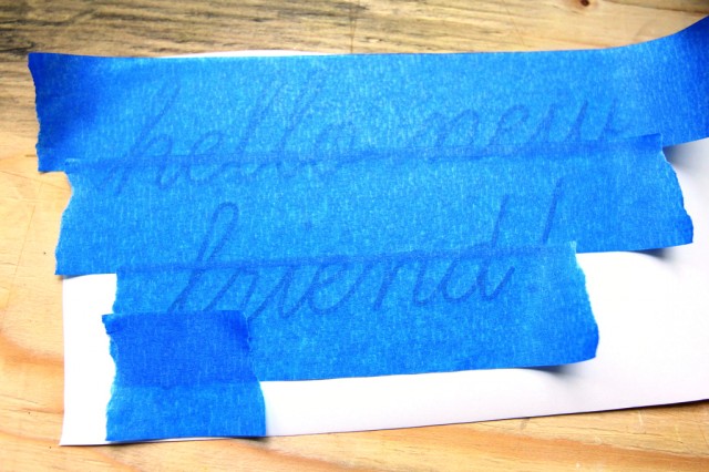
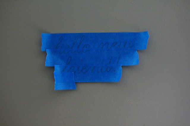
In these early tests, I’m just using some masking tape to transfer the vinyl.

It comes off pretty well — I was impressed with the quality and speed of the cut even with a cursive font like this.

I think they sell larger/wider rolls of masking-tape like material, but for now this works.

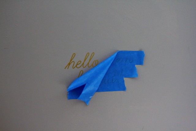
The maiden transfer onto a wall.

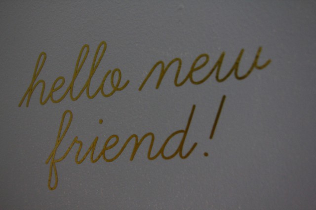
Easy transfer, just a little trouble with the bottom loop of the f.

So, a successful first test! In the past, we’ve worked with Printhouse for a lot of our one-off vinyl cuts, so if you’re looking for someone local we can highly recommend them. The things we’re going to be doing are just going to require so much volume that it was worth investing in one ourselves to do our own cuts. No details just yet, but I’m really looking forward to playing with this some more and I can’t wait to launch these new projects soon!

We Made the “2012 Sobey Art Award” Ontario Long List!

We’re really exited to post this … just found out today! We made the 2012 Sobey Art Award Ontario Long List! It’s incredibly flattering to have made it to this stage of the competition, and we owe a huge thanks to Srimoyee Mitra for the nomination.

And, in case you didn’t know, we’re not the first Windsor-based artists to have been included — Zeke Moores made the short-list just last year!

Ok, more soon, but in the meantime, here’s the official news from the press release:

The Art Gallery of Nova Scotia and the Sobey Art Foundation are pleased to announce the long list for the 2012 Sobey Art Award, the pre-eminent award for contemporary Canadian Art. This year marks the 10th anniversary of the Award. Following a three-month nomination process, the Curatorial Panel has announced the 25 artists vying for the 2012 Sobey.

The long-listed artists for the 2012 Sobey Art Award are:

West Coast and the Yukon
• Sonny Assu
• Julia Feyrer
• Gareth Moore
• Kevin Schmidt
• Corin Sworn

Prairies and the North
• Amalie Atkins
• Paul Butler
• Jason de Haan
• Robyn Moody
• Elaine Stocki

Ontario
• Broken City Lab 
• Aleesa Cohene
• Annie MacDonell
• Nicholas Pye & Sheila Pye
• Derek Sullivan

Quebec
• Olivia Boudreau
• Raphaëlle de Groot
• Julie Favreau
• Nadia Myre
• Ève K. Tremblay

Atlantic
• Mark Igloliorte
• Stephen Kelly
• Eleanor King
• Lisa Lipton
• Graeme Patterson

The 10th Anniversary shortlist of the Sobey Art Award will be announced in late June. An exhibition at the Museum of Contemporary Canadian Art (MOCCA) in Toronto will feature select work by the shortlisted artists from October 24, 2012 to December 30, 2012. The 10th Anniversary Sobey Art Award winner’s announcement will take place at a Gala event at the MOCCA on November 16, 2012.

The 2012 Sobey Art Award Curatorial Panel consists of:

• David Diviney, Curator of Exhibitions, Art Gallery of Nova Scotia;
• Louise Déry, Directrice Galerie de l’UQAM, Université du Québec à Montréal;
• David Liss, Artistic Director and Curator, Museum of Contemporary Canadian Art;
• Ryan Doherty, Curator, Southern Alberta Art Gallery;
• Bruce Grenville, Senior Curator, Vancouver Art Gallery.

For more detailed biographical information on the 25 long listed artists and members of the Curatorial Panel please go to: www.sobeyartaward.ca

New Exhibition: Unrest Everywhere (Tools for Playing with Halifax)

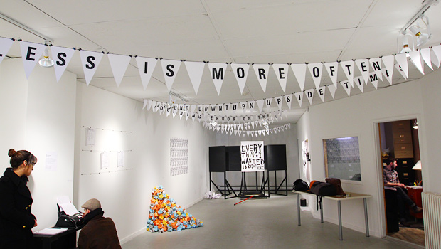
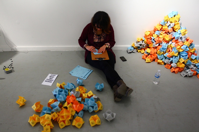
Just back from an incredible week installing at Eye Level Gallery for our show, Unrest Everywhere (tools for playing with Halifax), which runs until May 12, 2012. The show features a number of multiples and interactive works, all of which are yours for the taking and borrowing.

The premise for the show was to create a series of works that could directly or indirectly suggest access points for re-encountering the city and your role within it. We created works that aimed to be highly distributable, playful, and allowed a bit of critical commentary on the ways in which a sense of place comes to be planned, articulated, and established.

Below is a huge pile of documentation of the process — but first — we’d like to extend a huge thanks to all staff and volunteers at Eye Level, especially Michael and Matt, and to Emily and Kaley for the place to crash!

Continue reading “New Exhibition: Unrest Everywhere (Tools for Playing with Halifax)”

Two Tales of a City opens in Hamilton!

As February wrapped up, we prepared our bunting and banner components to be shipped up to Hamilton for the install. Sara and I went to Canadian Tire to buy Scotch Guard to weather-seal and water-proof the work.
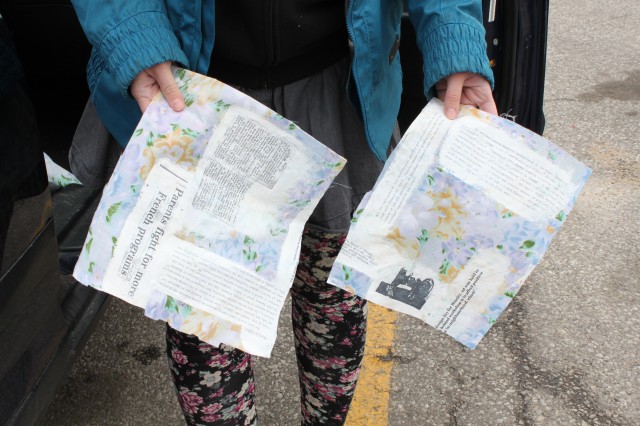
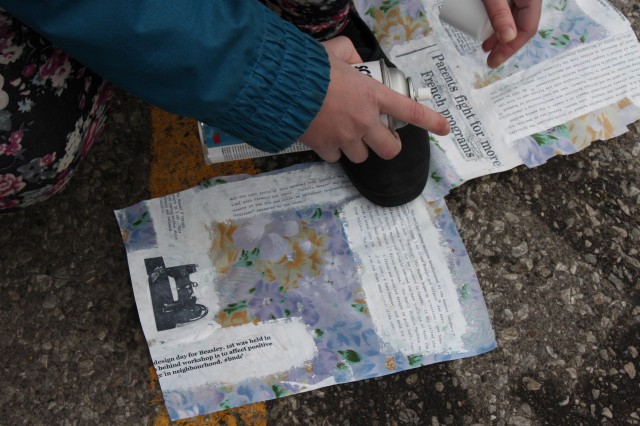
We bought two different kinds, both sealed the fabric adequately after setting to dry for a few hours.
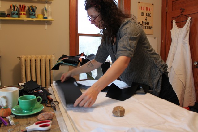
Next, we stopped off at Jodi‘s studio in The House to help her finish cutting and sewing the rest of the Helvetica text letters.
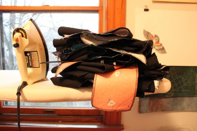
The letters are black with a backing and a layer of Heat N Bond Ultra adhesive in between, for mass and stiffness.
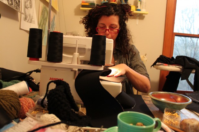
Jodi had mentioned that she was fortunate her surger hadn’t had any problems throughout the project. Shortly thereafter, a needle bent and we had to switch to her other machine to complete the remaining letters.
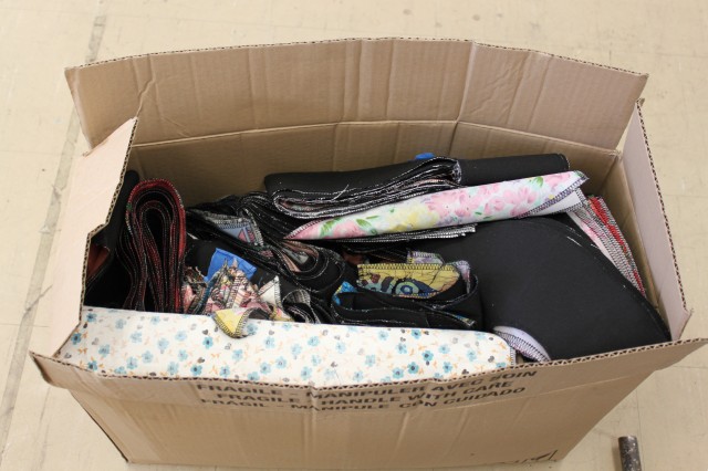
Once all materials were in one place, we counted, folded, and packaged everything up to fit neatly in this tiny little box. (Amazing!) This was sent off earlier on in the week to Hamilton Artist’s Inc so that Julie could start the install before we arrived on the 9th.
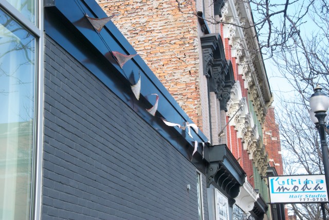
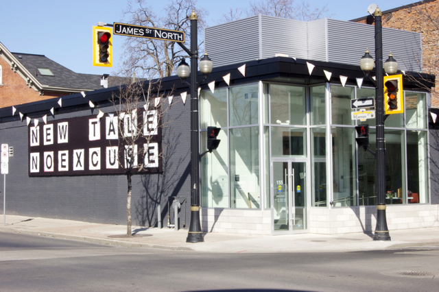
Once in Hamilton on March 9th, we headed to Hamilton Artist’s Inc to check out how the install was going. The bunting looked awesome on the front of the building!
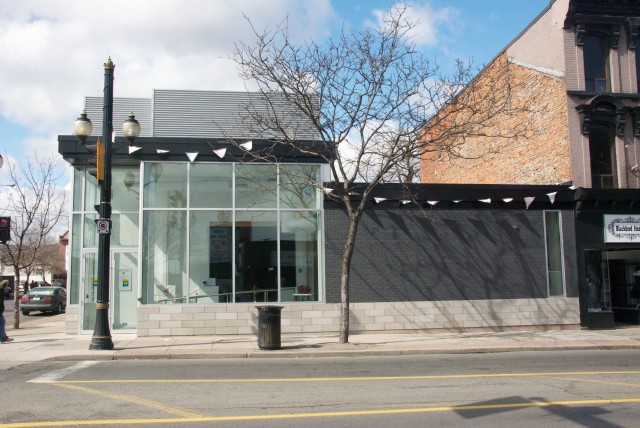
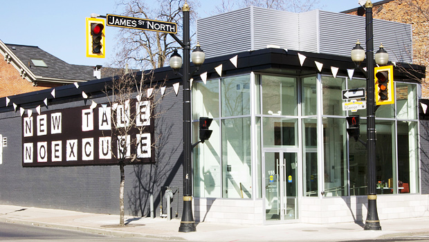
Another shot from James Street.
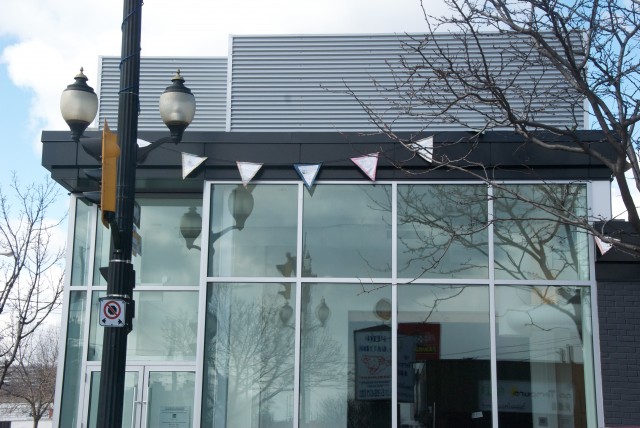
Pieces of this bunting will be distributed to various individuals and organizations in the final stages of the project.
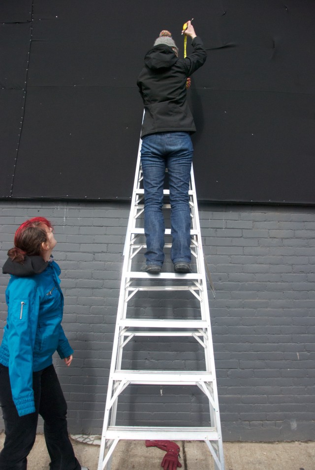
The banner along Cannon Street, an unforseen frosty wind tunnel, wasn’t fully installed yet. We helped Julie measure and install for a few hours.
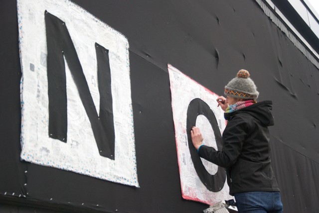
The install was a lot more slow-moving than expected, mainly due to the wind.  We were able to get a few letters up before heading over to the Farmer’s Market to set up for the workshop.
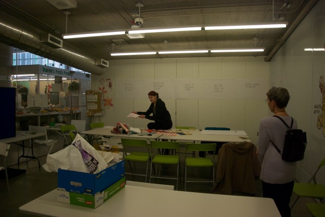
This space, called the Community Kitchen, is for rent by the hour in the Hamilton Farmer’s Market.
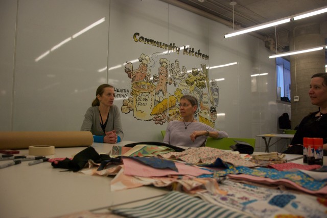
A white board wall? Pretty awesome. Wish we had one of these on hand at all times!
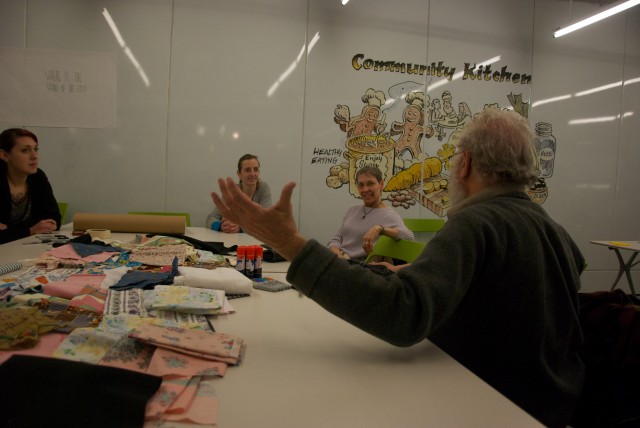
The workshop began with a discussion about headline stories that the rest of the country hears about Hamilton, then we started talking about the local stories, both published and passed on orally, specific to the city and city residents.
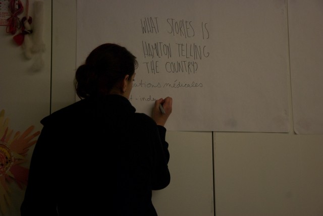
We ran the workshop in both French and English, as we had both French and English speaking people in attendance. Julie was on-hand to help translate. I wrote attendee’s comments and answers  on board-meeting-sized sheets of paper lined up on the wall.
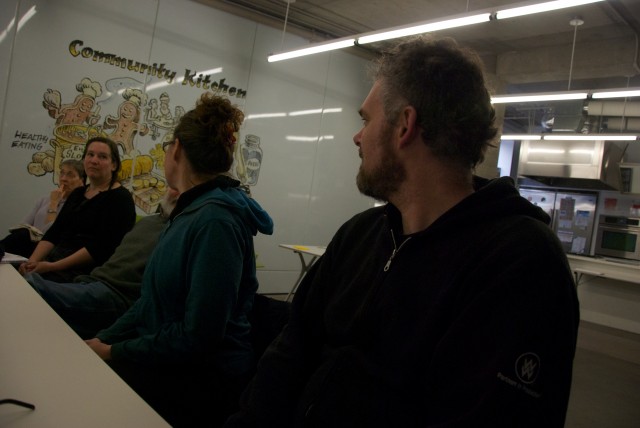
We then moved the conversation toward places in Hamilton, favourite places, places you avoid, places you go to speak/hear french.
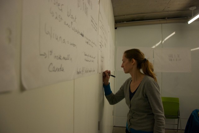
Julie helped out with writing when a lot of good things were being said and I couldn’t keep up!
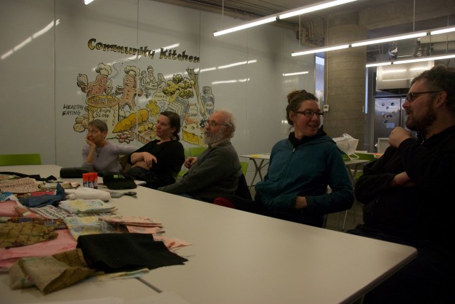
Everyone had a lot of good insights, as most were originally from Hamilton, or just generally curious and good observers of their city surroundings.
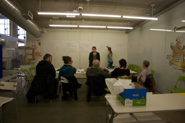
Stories of development for buildings previously sitting vacant in the downtown core, tales of infrastructures designed to keep people moving, failed and forgotten industries, rumours of neighbourhoods with bad reputations and stories of missed and seized opportunities were all shared.
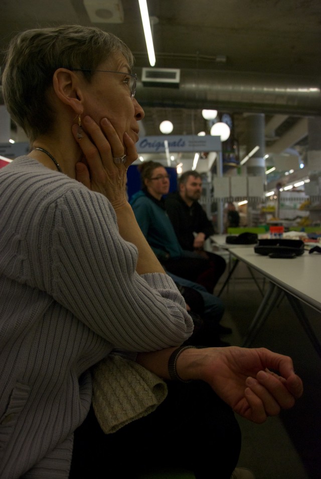
This woman, a francophone, had a lot of insights into local francophone culture. She also told some amazing personal stories about her experiences as a francophone in Hamilton.
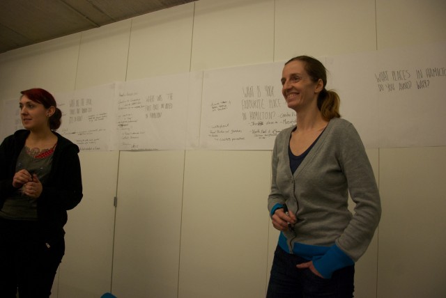
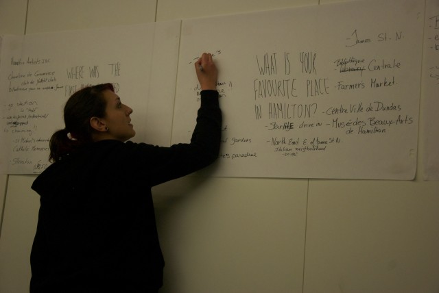
 

Some favourite places in Hamilton: James St N, Bibliothèque central, Musée sea beaux-arts de Hamilton, The Starlite, among others.
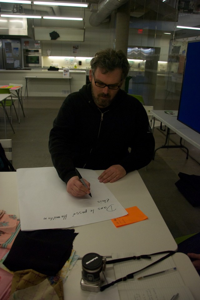
We then passed along a big sheet of paper and re-wrote an exquisite corpse-style history of Hamilton, in Franglais. Starting with the past, the story moved through to the present and then the future with each participant’s additions.
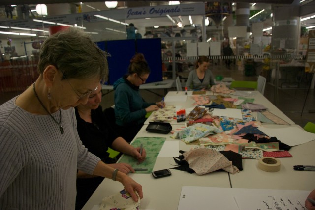
As the story was being passed around, we began work on our collaged maps. Using scraps of fabric, card stock, glue and sharpies, participants made artistic maps of a site, place or space in Hamilton discussed previously.
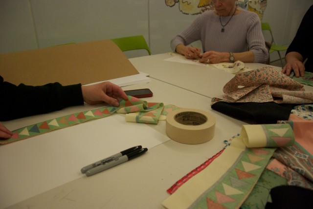
I used these strips of arrows to show one-way roads in the downtown core, namely Main St, and King St.
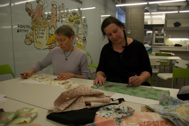
There were lots of fun materials and patterns to pick from.
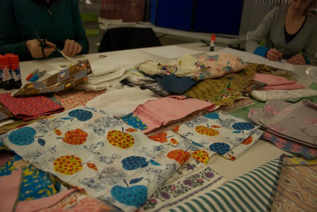
Here a participant is adding to the Hamilton narrative while another is making their map.
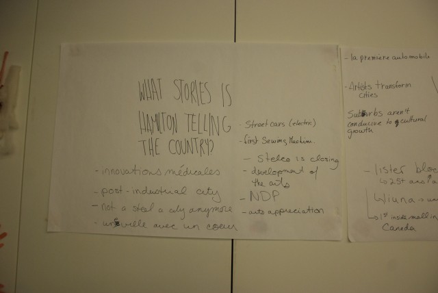
Finished brainstorm sheets; What stories is Hamilton telling the country?
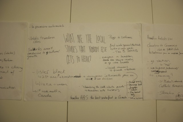
What are the local stories that nobody else gets to hear?
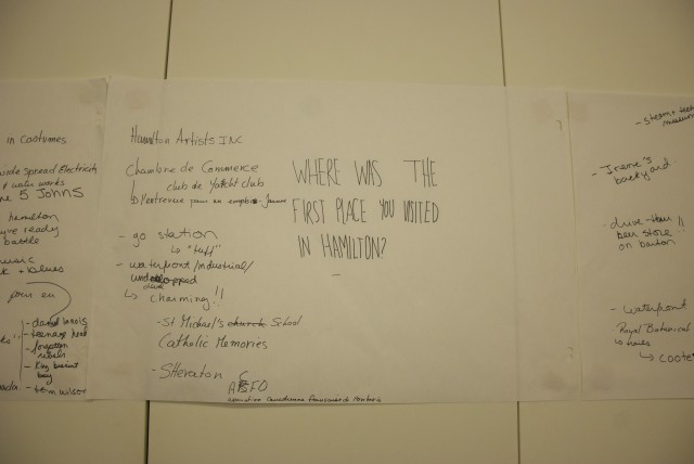
Where was the first place you visited in Hamilton?
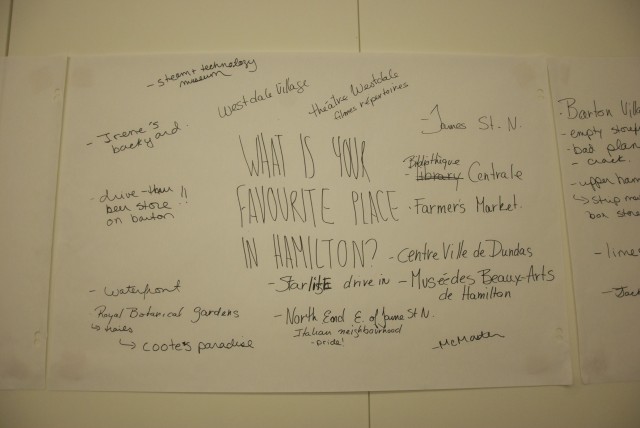
What is your favourite place in Hamilton?
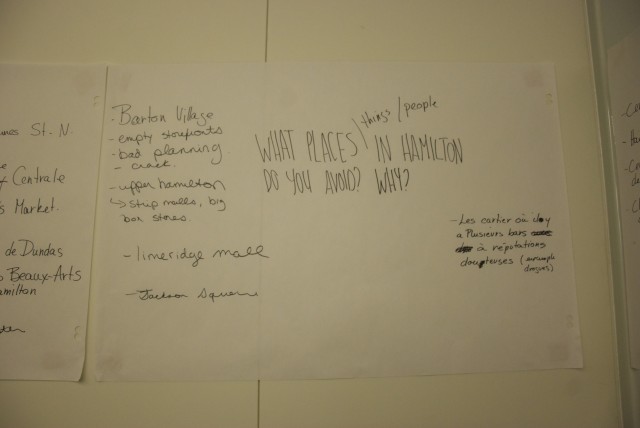
What places/things/people do you avoid in Hamilton and why?
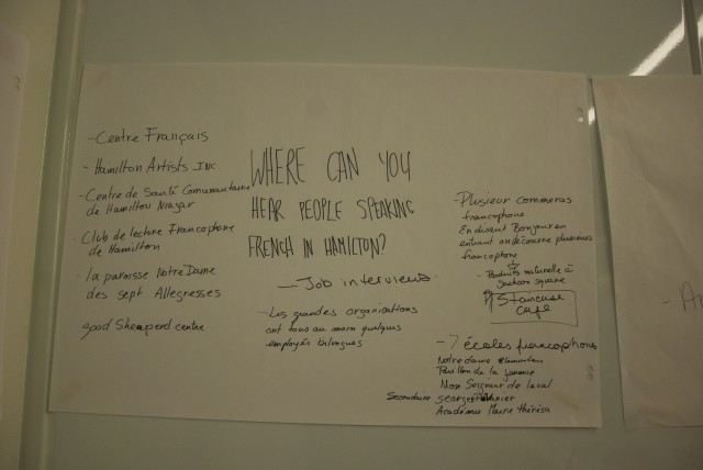
Where can you hear people speaking French in Hamilton?
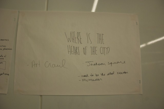
And finally, where is the heart of the city? The general consensus is that Jackson Square, the multi-use complex that hosts the Farmer’s Market, the public library and  a mall in the downtown core, is the heart of the city. Also, the monthly Art Crawls that happen the first Friday of every month were also considered to be a driving force in the city. We decided this question needed to be asked to more people, so we took it back to Hamilton Artist’s Inc to ask Art Crawl attendees.
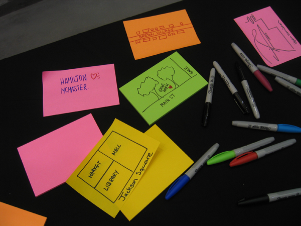
Back at HAI, we set up a table in the lobby for Art Crawl perusers to interact and participate.
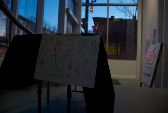
Signs in both English and French were displayed, asking Art Crawl-goers to draw us a map of the heart of the city.
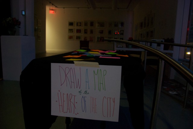
With super-sized post-its and some bright coloured sharpies, we thought this activity would be fun and quick for people of all ages and abilities attending the Art Crawl.
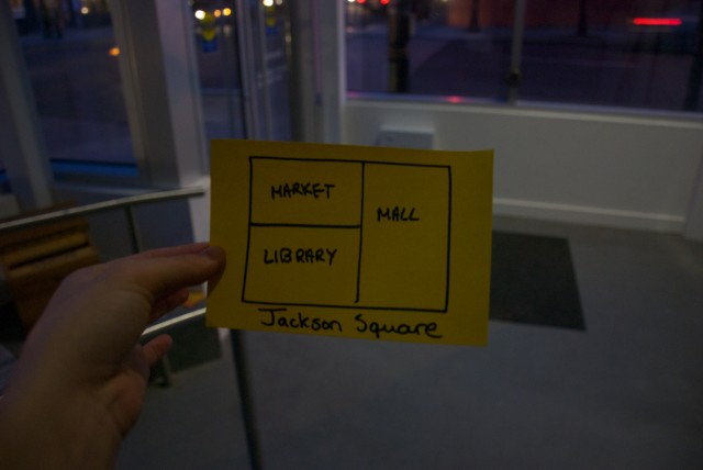
I drew an example, a rough interpretation of Jackson Square.
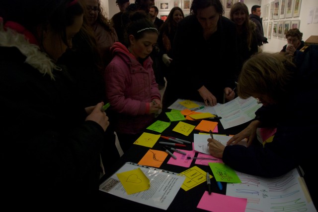
Everyone was having so much fun drawing maps during the Art Crawl!
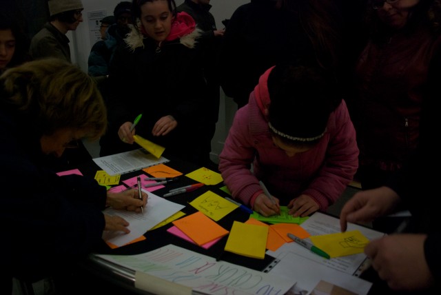
We had to leave before the night was over, but we are looking forward to having a look at these maps, and possibly including them in the forthcoming Two Tales of a City publication.
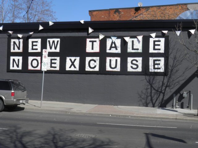
The first iteration of text of the banner on Cannon Street; NEW TALE NO EXCUSE
Watch out for more messages over the next two months! Want to participate? Fill out our Hamilton form, aussi en Français.


In Store: Laura of Bell Payphone Labs

The series continues… with an introduction from Daragh’s site:

There is a whole narrative to Bell Payphone Labs. Laura got into the lab coat for every installation she did, playing the role of the phone scientist. She had a little lab area in the storefronts the whole time as well, with educational posters about her department’s enterprises. I realized I had some assumptions about artists heading into this project: artists worked alone, used their own identities, and were removed from day-to-day life. Like lawyers, or dentists. But over the course of things I realized there were many artist collectives, artists who assumed different identities, and many who engaged with the world in far more interesting ways than I was expecting.