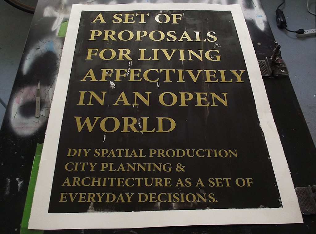
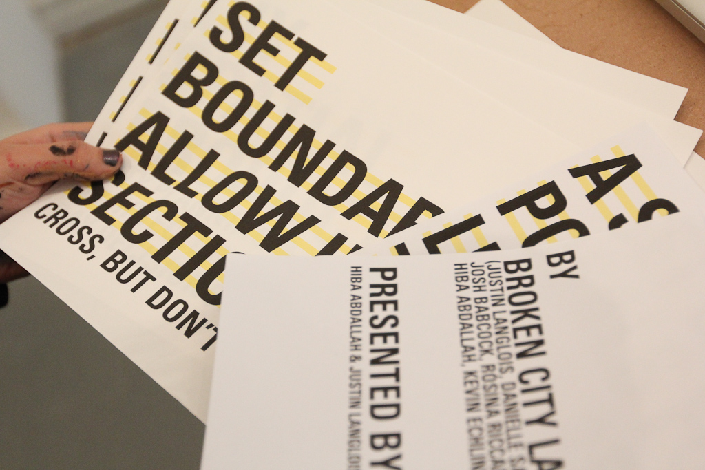
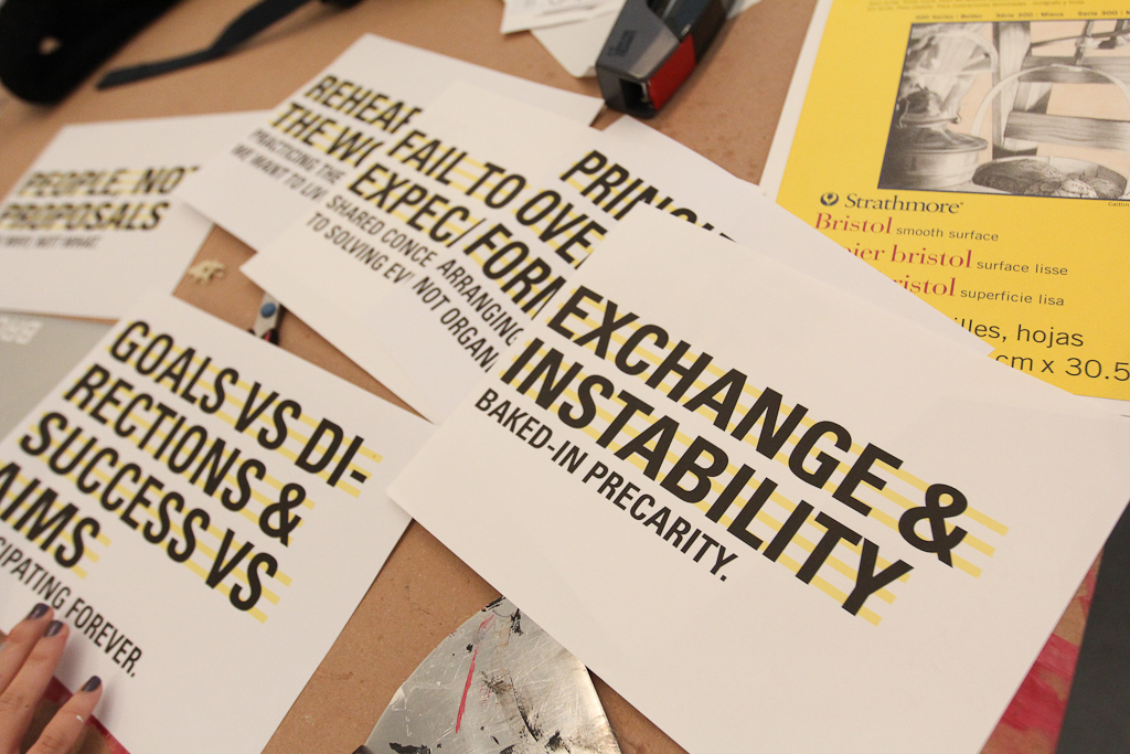
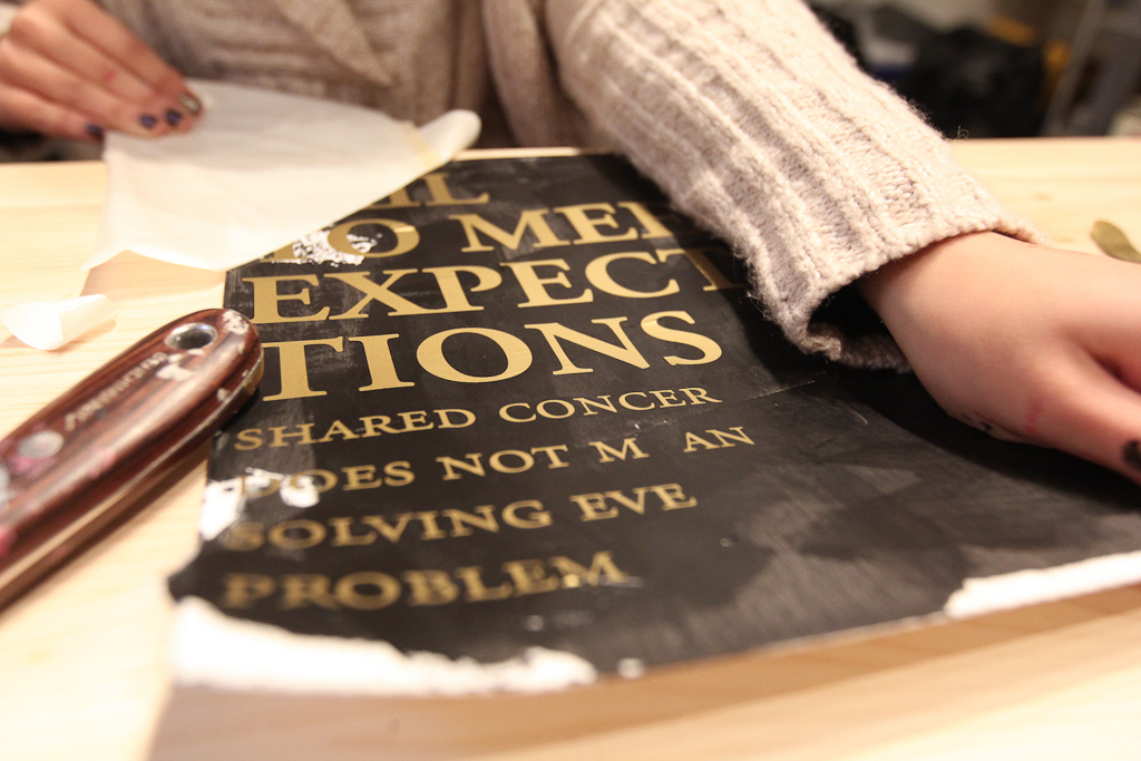
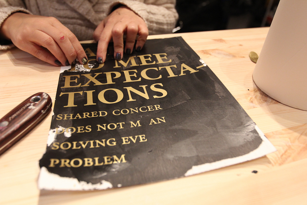
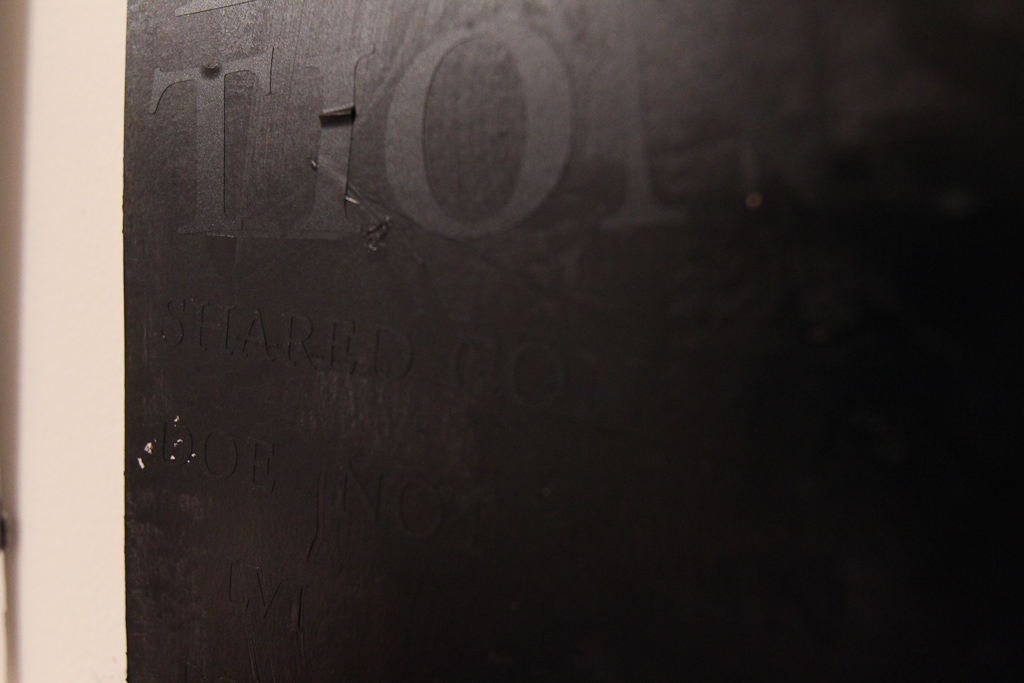
Today we’re working through a few poster designs for A Set of Proposals for Living Affectively in an Open World using gold vinyl on a previously hand-painted black background.
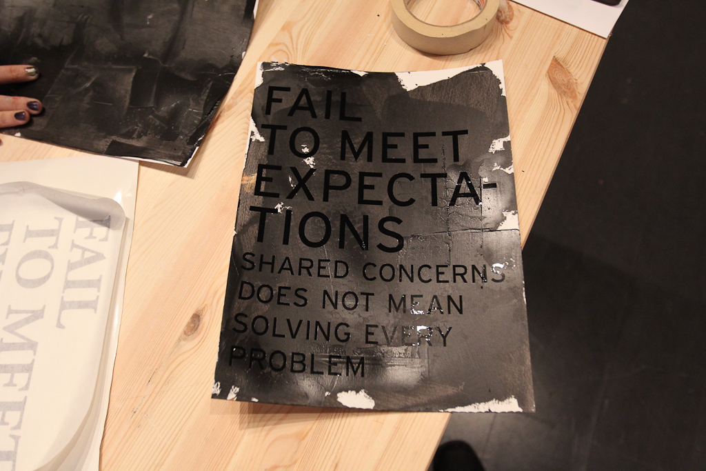
Fail to Meet Expectations: Vinyl on Paint Posters
We’ve been talking about picking up on some of the ideas we put together for the OPEN panel discussion from earlier in the month, and it seemed like posters were a natural fit. Given the text statements that we made to address the an idea of economies and creative practice that served as the backdrop for our talk (rather than the normal set of images), we wanted to find a place for them beyond that PDF file.
So, Monday seemed like a great day to start playing. We’ve been doing so much paper work lately, this is long overdue.
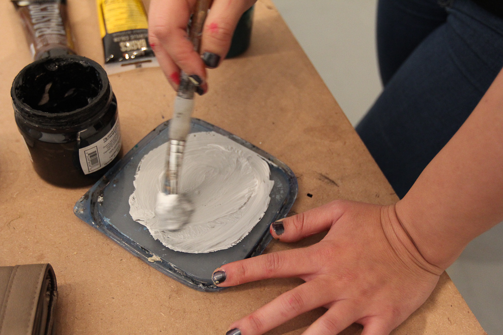
Hiba mixed some colours and started make some base colours.
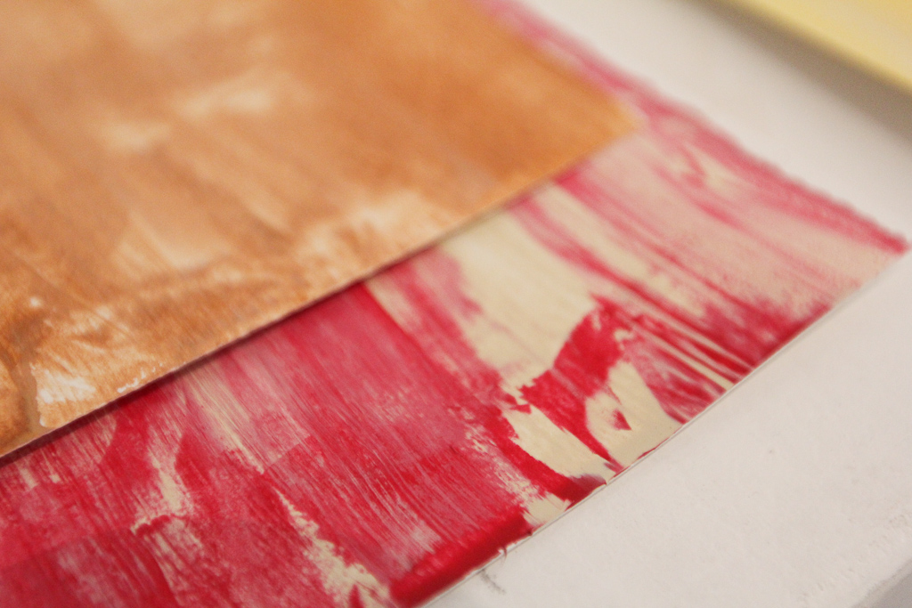
We decided from the start to cut some vinyl (rather than screen printing or stenciling at this point), so we experimented with some colour.
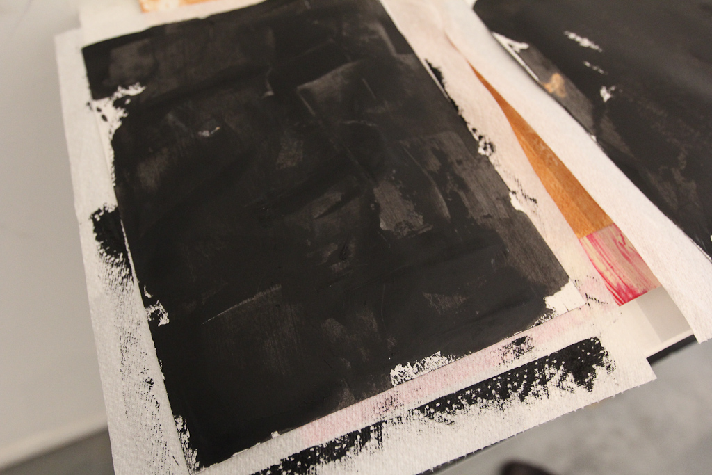
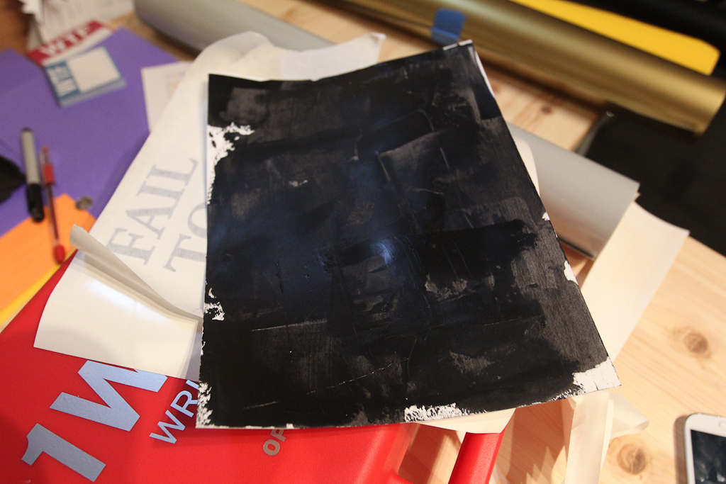
But, it wasn’t long before the black stood out. Hiba was using a metal scraper to spread the acrylic paint on these smaller 9×12 sheets. We want to make these larger posters soon.
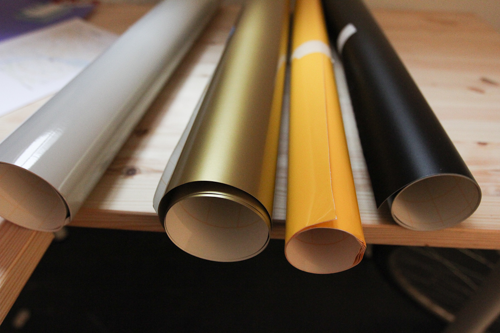
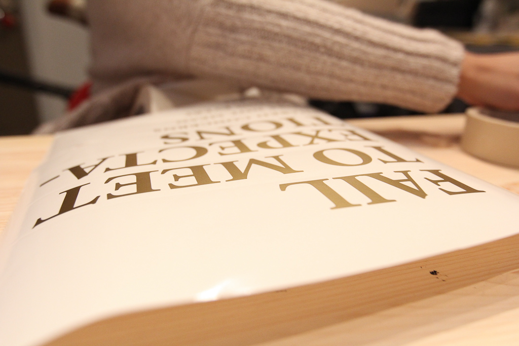
Also, decided to play with some other vinyl … haven’t pulled out that gold for a while.
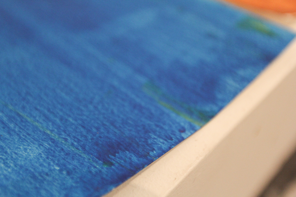
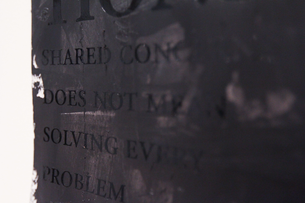
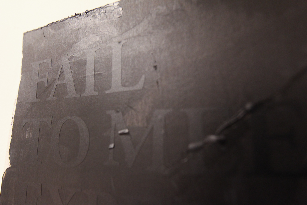
Detail of texture of the paint.
We printed out those slides and started sorting through.
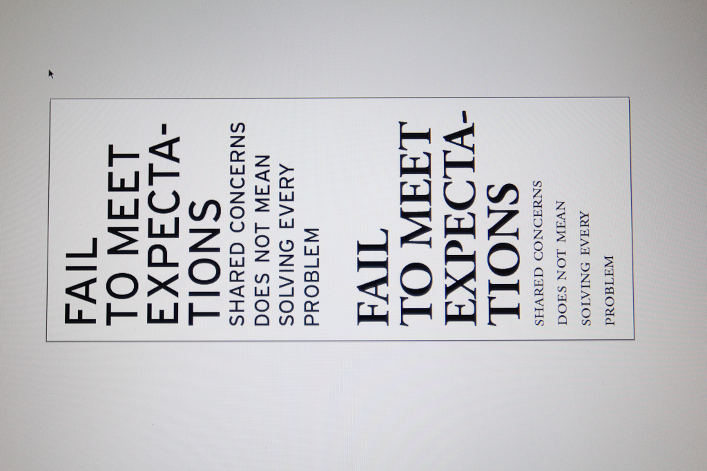
We decided to go with just one, as we were planning to cut a couple different fonts and colours and wanted to be able to compare the results.
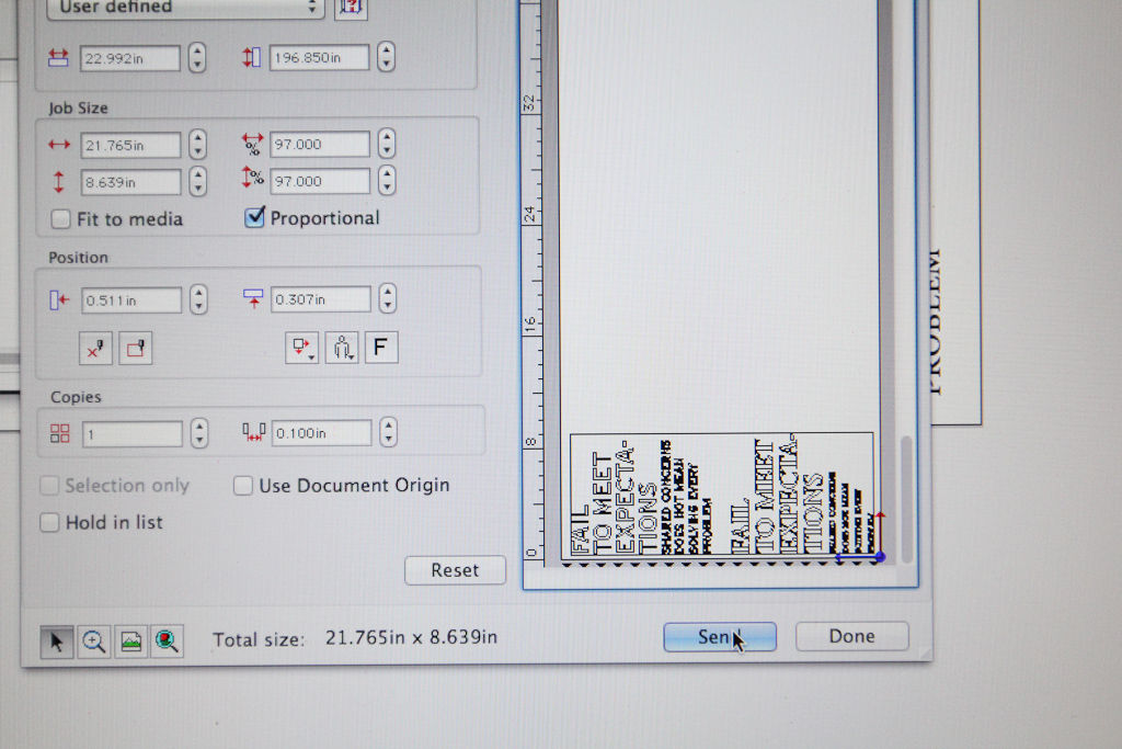
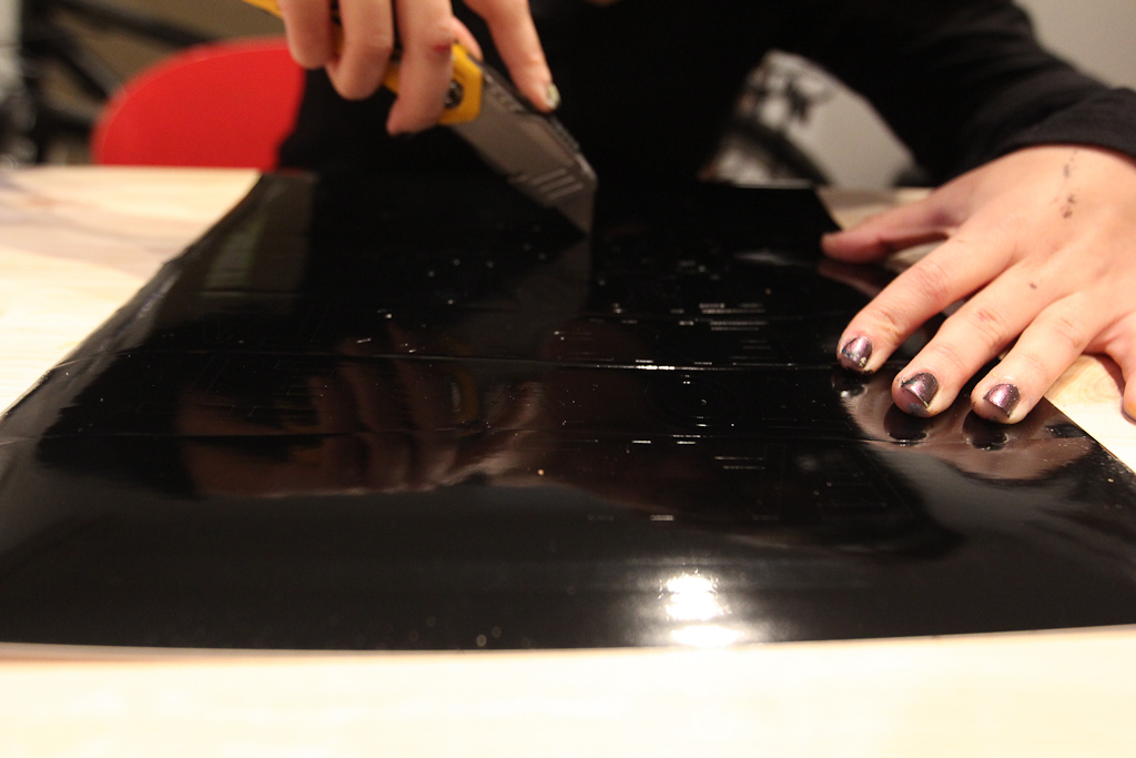
Good ol’ Cutting Master.
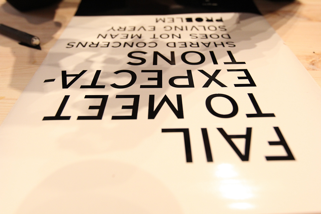
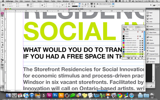
We went with Interstate and Garamond — all caps and small caps.
Hiba weeds the first cut of shiny black.
Interstate looked promising at first.
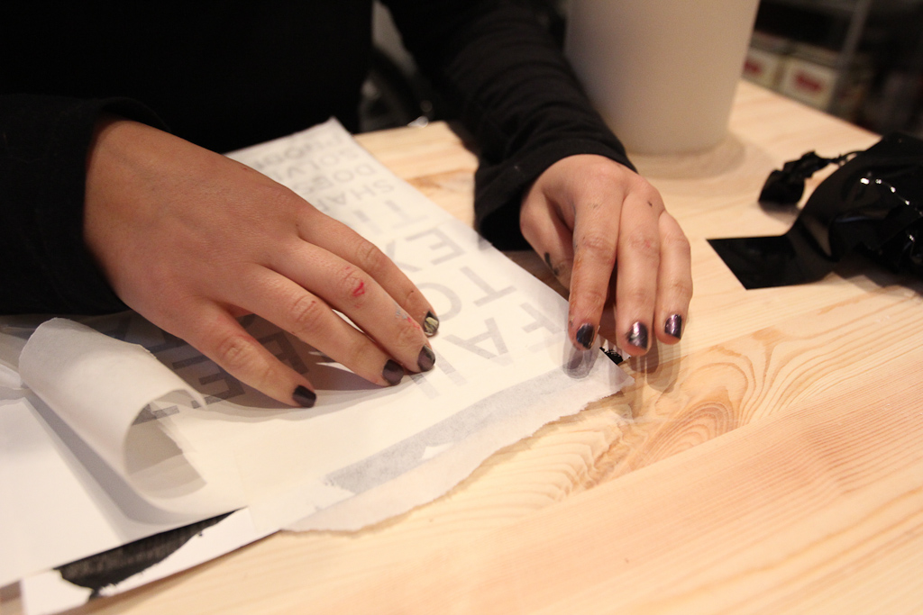
Hiba applying the vinyl to the paper.
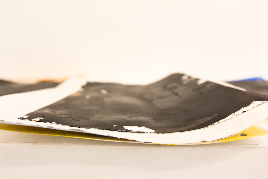
The paint dried, but was just a bit tacky, which helped get the vinyl to stick.
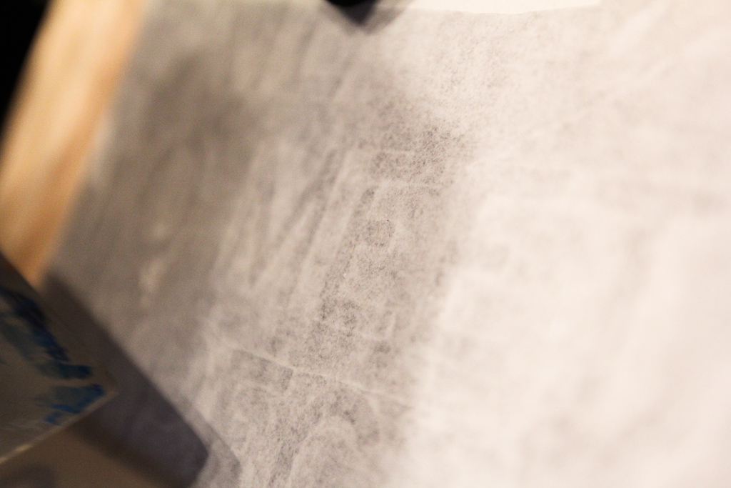
Detail, applying the vinyl, you can see the text through the masking.
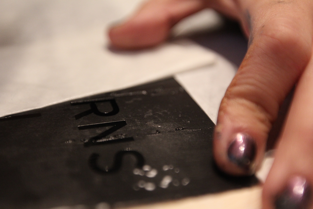
Pulling it up, the gloss black looks deep.
Nice and clear, but didn’t stand up to the serif font.
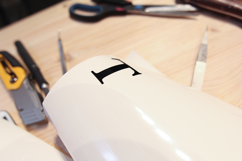
T.
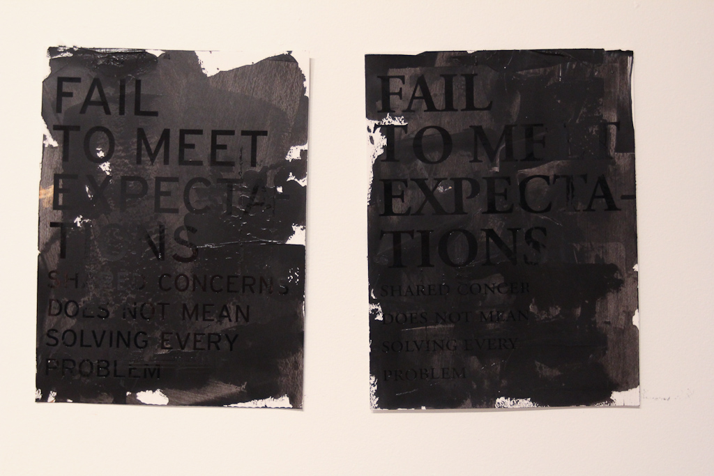
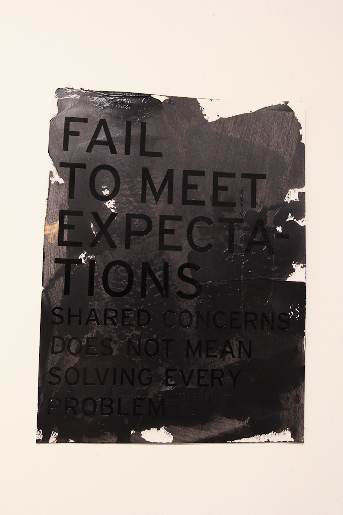
Side by side, we’re pretty convinced with the Garamond on the right.
Less surface area of the font face makes it a little less visible though.
Garamond.
Interstate.
Then gold, just to get some contrast into the test.
The gold is a cheaper vinyl, but a lot easier to weed.
Fixing it up, as it didn’t stick to the paint as well.
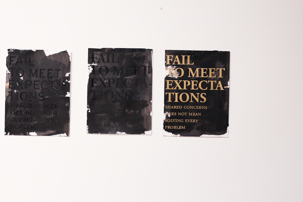
Side by side, the gold is most legible, but looks too much like a poster. Not sure what to do with the black on black yet. Thursday will be more time to play. Maybe we can get some larger paper by then … lots more to experiment with, but even looking at these photos now, I’m still pretty convinced of the black gloss serif. Maybe more play time with the texture of the paint.
I came back later on in the evening and saw the rest of the work Hiba did with matte black before she left for the day.
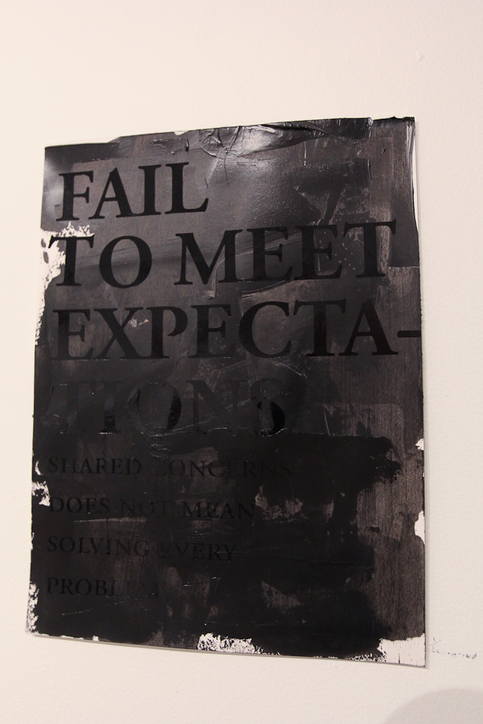
Definitely harder to read, but the thicker black paint and the matte vinyl really work up on the wall. Experiments on Thursday.
More soon.
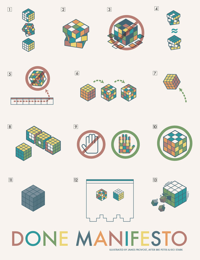
The Done Manifesto

Makerbot founder Bre Pettis and collaborator Kio Stark gave themselves exactly 20 minutes to create a manifesto encapsulating everything they knew about bring a creative vision to life. They called it The Done Manifesto.
Here’s the list:
- There are three states of being. Not knowing, action and completion.
- Accept that everything is a draft. It helps to get it done.
- There is no editing stage.
- Pretending you know what you’re doing is almost the same as knowing what you are doing, so just accept that you know what you’re doing even if you don’t and do it.
- Banish procrastination. If you wait more than a week to get an idea done, abandon it.
- The point of being done is not to finish but to get other things done.
- Once you’re done you can throw it away.
- Laugh at perfection. It’s boring and keeps you from being done.
- People without dirty hands are wrong. Doing something makes you right.
- Failure counts as done. So do mistakes.
- Destruction is a variant of done.
- If you have an idea and publish it on the internet, that counts as a ghost of done.
- Done is the engine of more.
New Project Soon (Keep Your July Open)

Not that we don’t already have our hands full, but seeing as it’s nearly March, we’re starting to look ahead to summer time activities. These activities might be somewhat related to this ongoing conversation we’ve been having on the blog.
We’ll be posting more information soon, but for now, just know that if you’ve been planning on visiting Windsor, you should try to keep your calendars open in July.
And, hope to see you SUNDAY, February 28th – 1pm at 362 California!
Saying Something with Banners

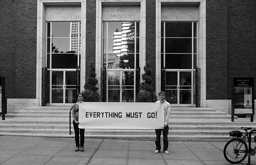
Anna Gray & Ryan Wilson Paulsen are working on a series of text banners / posters. Sometimes the banners are held between the two of them, other times they each hold smaller cards with texts that work off of one another. Sometimes they write the text on the banners, other times they invite others to compose it.
They’re fans of reading, typography, and from what I gather, lists.
Oh, the things that could be said with banners here—we should get on that.
