The Public Space Gallery At Eastern Edge

On Monday, some of us will be heading off to St.John’s Newfoundland to participate in Eastern Edge’s annual AM Festival!

While there, we’ll be creating a project called the Public Space Gallery. This project combines traditional elements found in a gallery space and places them outside in more untraditional public locations. Through a series of workshops, we’ll be collecting stories to interprete and curate into a public gallery. The gallery will contain different collections that will be summed up in a “walking tour” map that festival visitors can choose to experience on their own or take the gallery tour with the Broken City Lab art interpretors and tour guides.

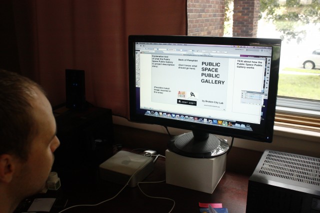
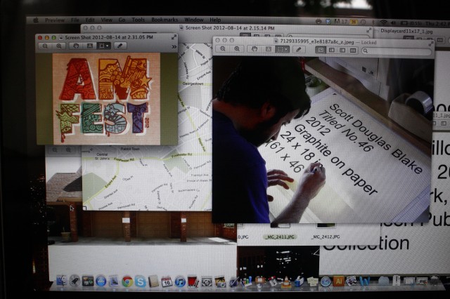
Josh works on the walking tour pamphlet.

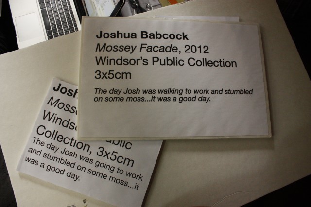
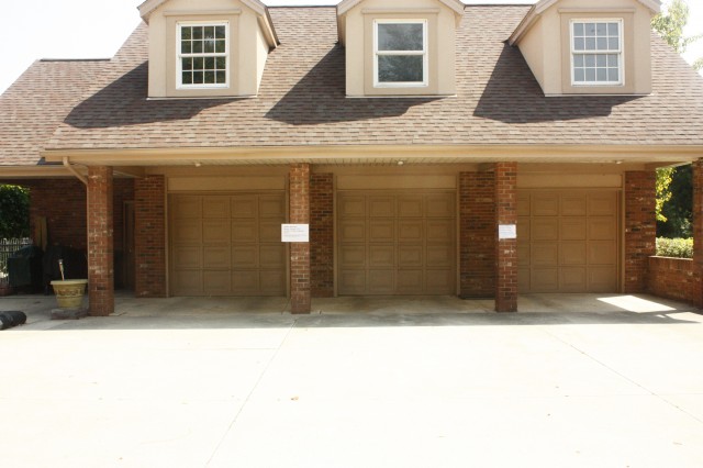
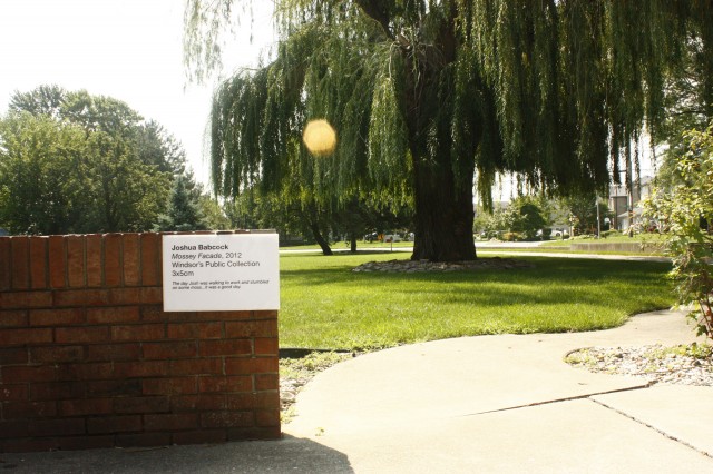
An example test shot of how the gallery cards would look outside.

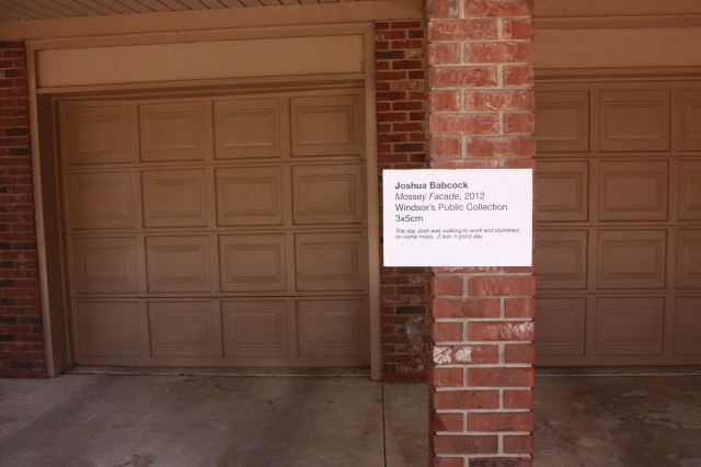
It’s interesting to try and put these up outside and properly frame the space the card pertains to.

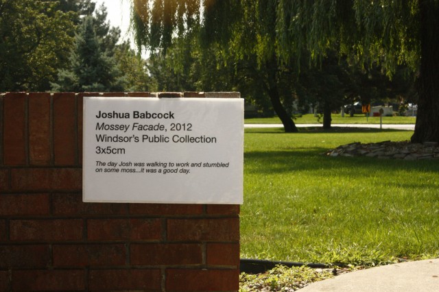
The 11 x 17 inch cards definitely have a better presence than the 8.5 x 11. It’s kind of interesting to me that from a distance, it just looks like a white disruption of space.

From a distance.

There are still a lot to decide on and more to create/design before we leave! Back to work. More soon.

Grades for Public Spaces (design phase)

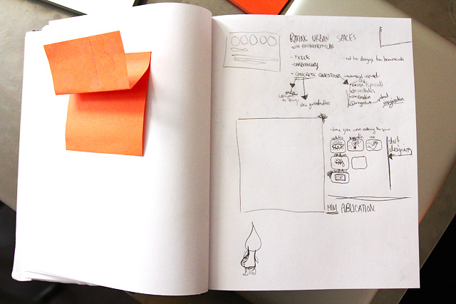
Sara's sketcbook

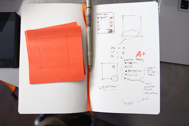
Sara and I spent some time planning out some very preliminary designs for our Grades for Public Spaces project. The gist of the project is to have a series of rubrics to annotate / grade public space — or rather, use those rubrics as a tool to generate conversation and engagement in the use and rethinking the use of public spaces. This project will probably accompany some upcoming drifts we’re planning.

Justin's sketchbook

We’re planning carbon-copy style prints, anyone ever print anything like that before?

The stickies — trying to map out the carbon copy part of the pages.

Can’t wait to get some rough designs up! Soon.

The Creation of Place in Abandoned Railway Cuts in Windsor: 1/4 Intro

Lee Rodney teaches one of the best courses at the University of Windsor, Border Culture. I took the course in the fall of 2010 and wrote a book: The Creation of Place in Abandoned Railway Cuts in Windsor.

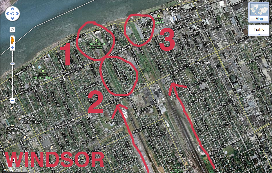
The book serves as documentation and comparative analysis of three specific forgotten spaces in downtown Windsor, Ontario, Canada. Each of these are former sites of railway lines that ran across the Detroit River into Michigan at the height of industrialization in the first quarter of the twentieth century, but are now closed up dead ends and dead zones, unlit at night and undetectable from street view due to their below street level geography.

These spaces have a transient quality, as people exist in them only while passing through, usually as quickly as they can in order to reach a safer location. The contents of this book are based on my own personal experience in and around these spaces as a young adult white female artist, including historical research on the areas as well as references from multiple disciplines including activism, art, urban planning, geography, design, visual culture, gender and feminist studies. The invisible borders embedded within the fabric of these hidden, forgotten underused and misused spaces is examined.

Over the course of the next month, I will be posting chapters of the book with images on a weekly basis. However, I would like to introduce the book by providing some info and context around what I was reading prior to and during the research phase of this project.

So, without further adieu, a few books that informed my book:

Continue reading “The Creation of Place in Abandoned Railway Cuts in Windsor: 1/4 Intro”

I Wish This Was…

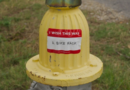
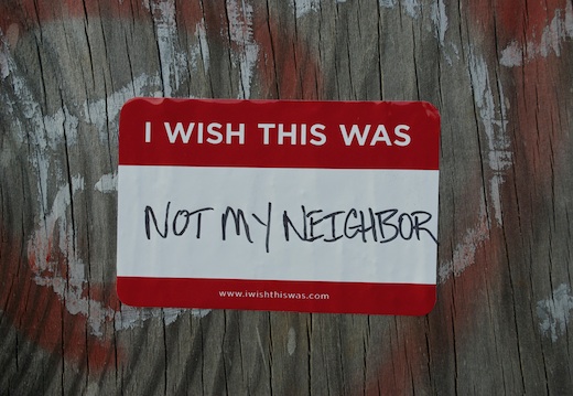
This project, appropriately called “I Wish This Was“, was created by New Orleans designer Candy Chang. Candy actually did her B.F.A. at the University of Michigan and created a design firm and record label called Red Antenna. The project you see above is quite a simple, but powerful, little proposition. She created a vinyl sticker design based on the famed “My Name Is…” badge with the intention that people would fill them out and stick them to anything in the city. Apparently her idea has caught the attention of quite a few concerned citizens; there is a Flickr album full of examples. I’ve included a few below. This reminds me of something that Windsor’s graphic designers could do as a sort of weekend public design project.

Continue reading “I Wish This Was…”

Reverse Graffiti in South Africa

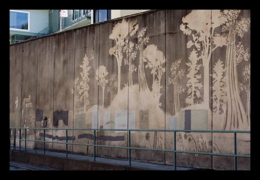
We’ve tossed around the idea of engaging in some form of reverse graffiti in Windsor for quite a while now. I assume there must be a few Windsor buildings dirty enough for a nice contrast-heavy design. Any suggestions? I think the Hiram Walker storage facilities near Russel Woods are covered with a black residue, but the premises are private and probably inaccessible. Apparently there are no laws prohibiting reverse graffiti in this part of South Africa. I wonder if we have any? I’d like to find out!

Via: The Center for Sustainable Practice in the Arts

Talking to Walls: A Conversation About the Public Realm

Thursday night Cristina and I were up in Toronto at Propeller Centre for the Visual Arts, participating in the Christopher Hume curated exhibition, Public Realm.

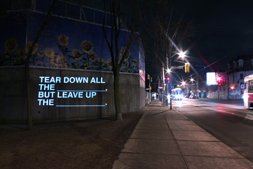
We did a series of projections with short texts / fill-in-the-blanks that dealt with issues of public and private space, which were generated from the answers to the questionnaires we created, responses on Twitter, and conversations amongst ourselves.

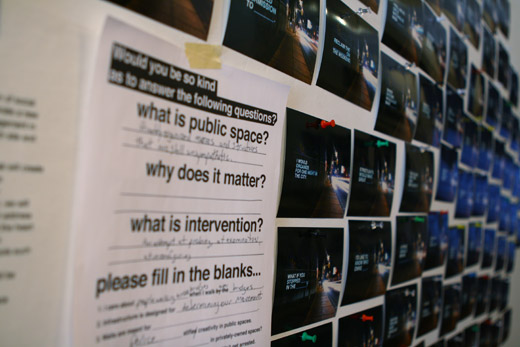
Public Realm is up until January 31st, and there’s documentation of the projections up in the gallery along with a growing collection of our questionnaires with a ton of great answers. If you’re in the neighbourhood, stop by, there’s a lot of great work in the show!!!

After the jump, there’s a photo from all 100 fill-in-the-blanks that we projected.

Continue reading “Talking to Walls: A Conversation About the Public Realm”

Public Realm Questionnaire

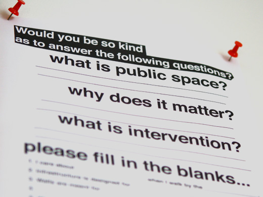
We’re participating in an upcoming exhibition entitled, Public Realm, at Propeller Centre for the Visual Arts in Toronto. For the exhibition we’re going to be doing some outdoor projection around the gallery, and we want to have your input!

We want to know what you think about the public realm, and about public and private space, and about what you can do in that space and maybe even, why you’d want to bother doing something in that space in the first place.

To participate, you can do one of two things …

Download this fillable PDF, fill it in and email it back to us, or fill in this form below:

[form 2 “Public Realm”]

We’re going to project all of the submissions we get on Thursday, January 21st, as part of the opening for the exhibition!

PreFab Parks for Park(ing) Day

httpvh://www.youtube.com/watch?v=VBNUQsEUKlU&feature=player_embedded

Every year in New York, parking spots are taken over by people wanting to transform urban space into something more useable than concrete boxed in by painted lines under the banner of, Park(ing) Day. The even was originally imaged by San Fransisco’s Rebar, an interdisciplinary studio operating at the intersection of art, design and activism. The “small, functional, vibrant” parks that are part of Park(ing) Day each have a theme and are nearly all temporarily turfed with sod.

In the video, there’s a number of interviews highlighting people taking on the initiative for fun or for politics, but nearly all want to suggest the potential for rethinking the many, many, many parking spaces used by a single car at a time.

This certainly works given the sheer number of people in a city like New York, but if there was one parking spot in Windsor that you’d take over for a day, where would it be?

[via Worldchanging]

Dour Power [Nathan Coley]

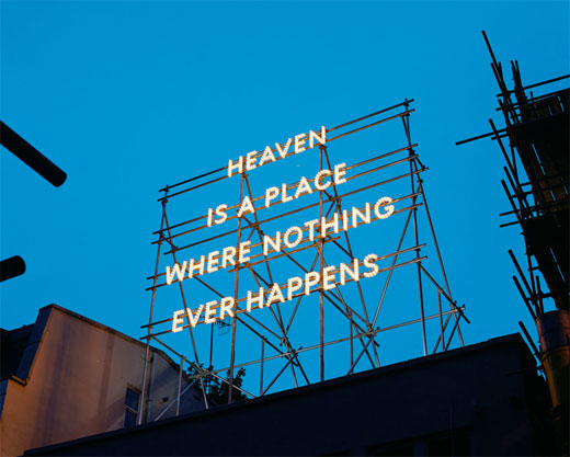
Nathan Coley – Heaven Is A Place Where Nothing Ever Happens (2008)
Nathan Coley – Heaven Is a Place Where Nothing Ever Happens (2008)

Since one of the recurring project ideas for BCL has been to “send a message to Detroit” (though this particular wording sounds decidedly menacing, which is hilarious and probably unintentional), and since one of the ideas for accomplishing this was to build a lighted sign that would be visible across the Detroit River, I thought it might be appropriate to bring Glaswegian artist Nathan Coley into the discussion.

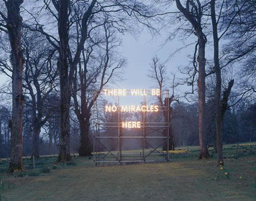
Nathan Coley – There Will Be No Miracles Here (2006)

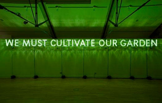
Coley is perhaps best known for his incandescent light signs, such as these, and, while the tenor of his work is decidedly more dour than much of what the Lab sets out to do, his work does bring to bear certain issues that might be of interest. In particular, his work explores the ways in which modes of public address—particularly architecture—constitute articulations of collective desire and belief, the “values” of a place. Coley himself has a particular chip on his shoulder re: organized religion (which I, for one, appreciate), but some of the issues he works through might be more broadly-applicable, just the same.

If Broken City means to “disrupt and engage the city,” it’s important first to have a sense of what values are embodied in the existing structures and infrastructure of that city. I’m quite sure I’ve spent a good deal less time thinking about this than many of the other people here, but, so far as I can tell, Windsor’s public front would seem to suggest a firm conviction in the redemptive potential of (1) the automobile, (2) the Casino, (3) trans-border truck traffic, and (4) massage parlors. It’s not quite the historical God and country business that Coley contends with, but I don’t see any reason why the tactics he employs couldn’t be as well-suited to the interrogation of a strip mall as they are to places of worship, etc.

Anyway, this interview, given on the occasion of his nomination for the 2007 Turner Prize, is definitely worth a look, as are pieces like this one from 2006 where he makes use of dazzle camouflage (a geometric camouflage pattern developed in Britain by artist Norman Wilkinson and used extensively during World War I).

Nathan Coley – We Must Cultivate Our Garden (2007)