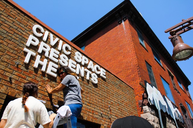
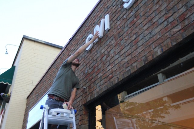
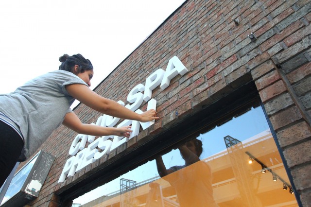
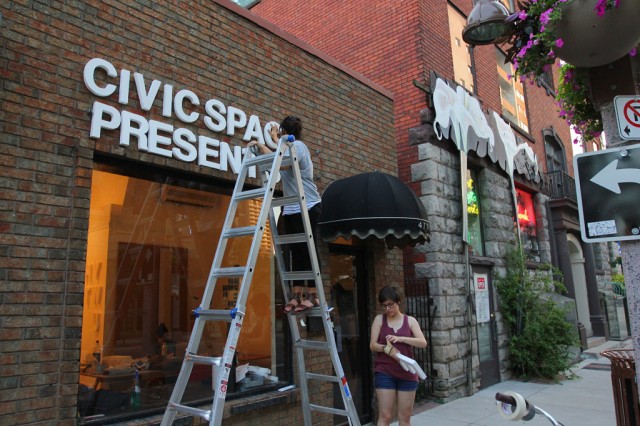
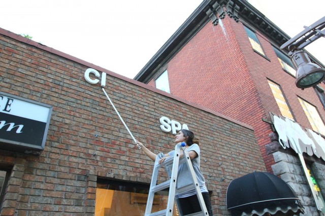
Props to Hiba for wrapping up what we started last night. Most time spent on the ladder.
Installing the sign for CIVIC SPACE, take 1
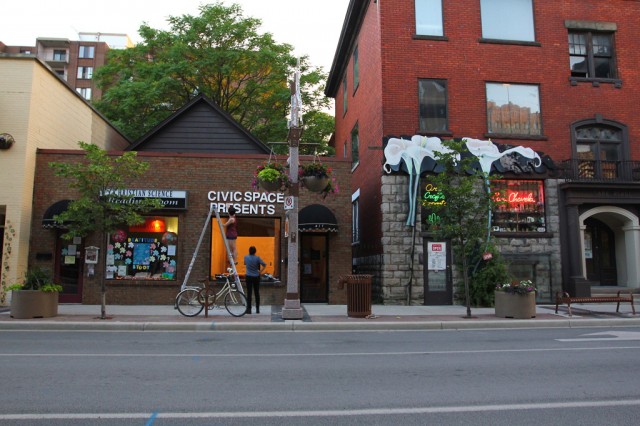
Last night, Hiba, Sara, and Justin tackled some initial planning for the installation of the CIVIC SPACE / Letter Library sign. The Letter Library idea came out of trying to think through how we might make our own sign for the space, so it’s really great to finally see the letters going up.
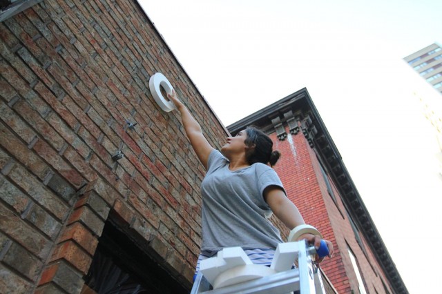
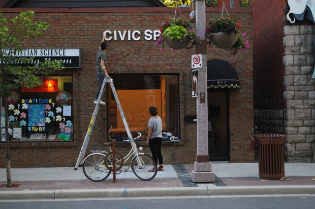
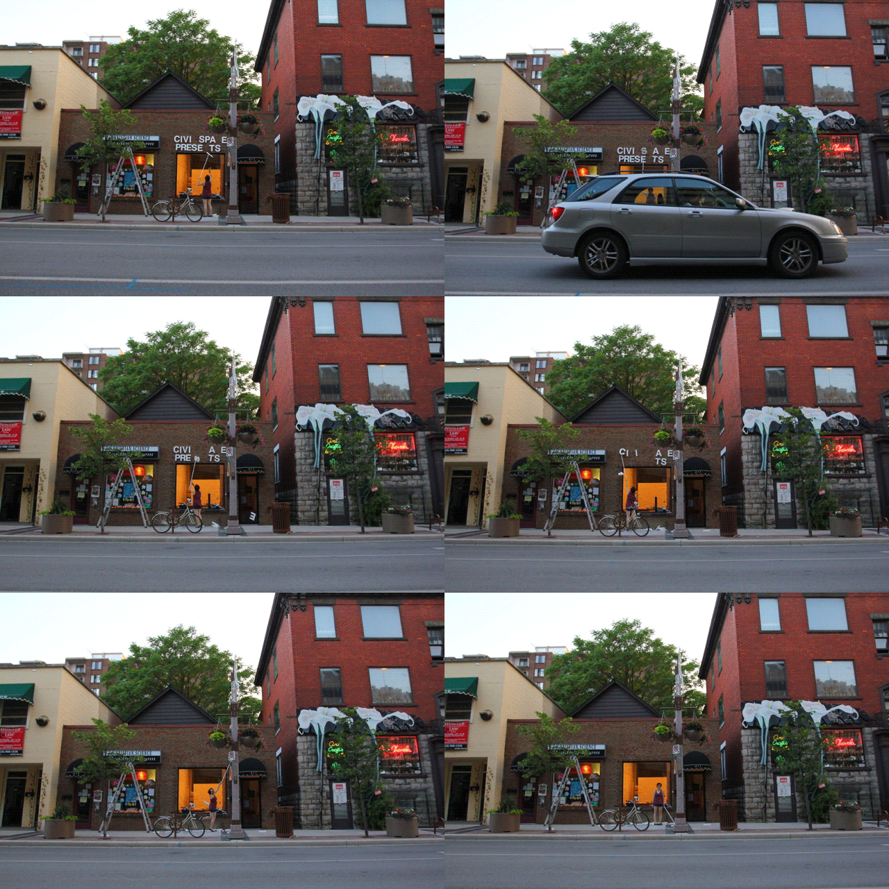
Hiba got on the ladder first, installing the letters with some tape, while Sara helped to position from the vantage point across the road.
Then Justin made some attempts as well.
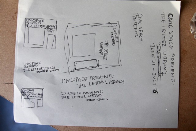
We did some photoshop mock-ups earlier, but we still wanted to be able to play a bit.
The sign will read something like, “CIVIC SPACE PRESENTS THE LETTER LIBRARY.”
The title might bleed down into the window where we’ll likely have our return pile of letters.
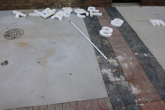
We tried the letters up high and hugging the window. We’ll do some more tests later today. We used a pole to remove our well-taped letters.
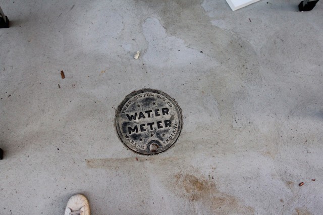
As an aside, this is the nicely designed new water meter cover in front of our building.
Danielle came by for inspection — and approved.
End of the night clean-up.
Sara demonstrating the letter removal technique.
Pop-Up Possibilities: Sketches
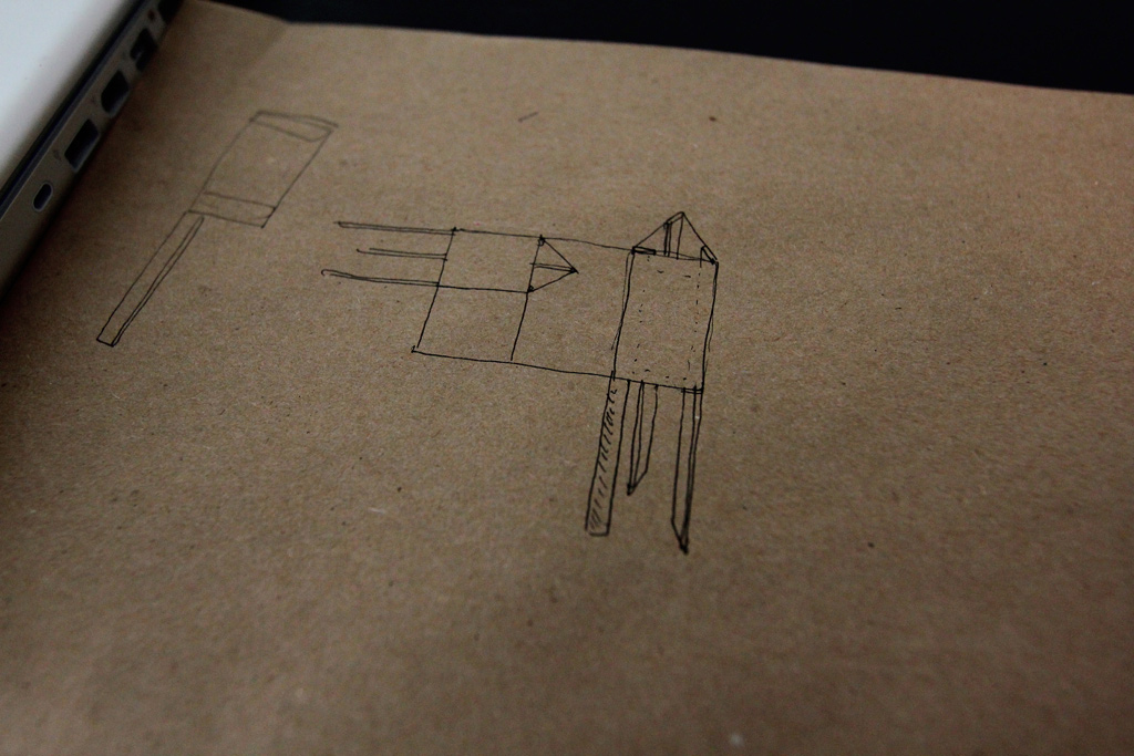
Tom Provost came by a couple weeks ago with an idea for a new collaboration. We’ve work with Tom before on How to Forget the Border Completely — in particular the proposals for 1,000 Pedestrian Walkways and the Windsor-Detroit Portals. In short, the new project is to take the form of a triangular sign, something like you might find on an empty lot waiting to be developed. On each of the three sides of the sign would be a proposed development for the particular site on which the sign is located, along with three perspectives on the possibilities of that development ever taking place or not.
The development would be a large-scale proposal — something that could undoubtedly transform a selected site, and would probably verge on the impossible — would attempt to articulate not just a “new use” for a selected site, but a one that might reflect the values and directions that we would like to see the city take on. We’re approaching this with the mindset of impatience and lack of confidence in the powers that be to create a truly interesting place to live. The proposals will aim to engage in imaginative speculation, but also try to draw into a critical discourse the ways in which we seem to disarm ourselves collectively from building truly great community assets. We so often rely and play into the very imaginary game of community consultation on projects long ago set (mostly) in stone, this seems like a great project to assert a different stance, process, and set of ideas for developing various parts of our city.
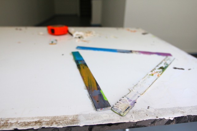
Also, these stir sticks were less a model, and more of a visualization tool for us to talk through the project. In early stages, I’m always so intrigued with how things shift and circle back around and change entirely.
When I caught up with Tom earlier this week, we spent a lot of time talking form.
Trying to find a balance between efficiency with the materials we’ll buy (how many faces, ideally, will come out of on piece of plywood), and making these things somewhat transportable led to discussions about size, the number of them we might build, and certainly the level of spontaneity in their arrival(s) to the selected site(s). All of these elements in turn vastly change the “weight” (in all senses) of the signs — where’s the line between an authority in structure and an intimidation (and in turn backgrounding effect) of the structures?
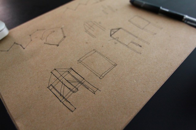
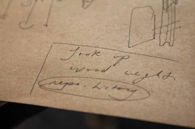
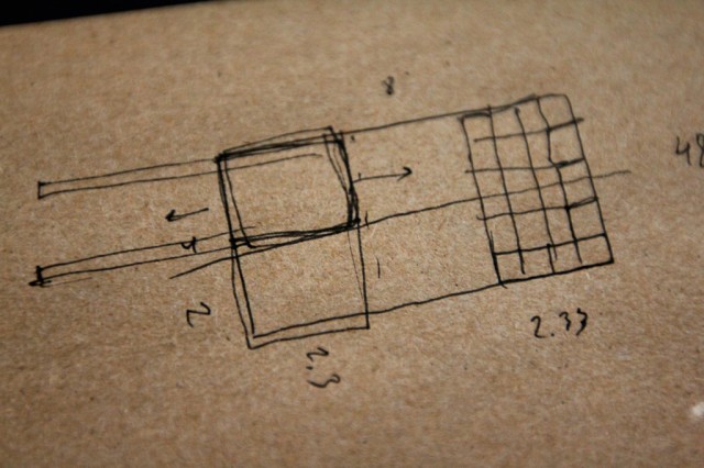
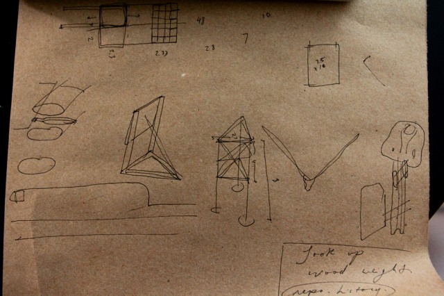
We took notes on this really basic paper (almost the feel of a smooth construction paper). In the past, Tom has used this for making the bases of architectural models, which looks incredible. We’ll be using a similar technique to basically grid and create a larger image for each face of the triangular sign.
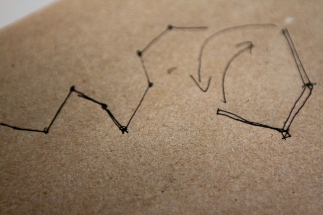
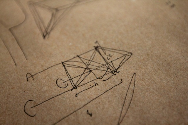
We’re looking at these signs being somewhere around 2ft x 4ft for each face. The sketch above was looking at other possible shapes.
A visual walk through of our discussion.
We also talked about the possibility of these forming a temporary a wall or partition that could provide more surfaces and the possibility to randomize the form on site, using hinges for each face.
But we ended up revisiting the three-sided structure, coming to a fairly resolved (at this point) direction, moving towards utilizing the three sides of the structure to discuss the limits of approach that various actors take to something like a development. What views, acts of persuasion, money, political tactics, and rhetoric does a developer bring to a new proposed project versus that of a city councillor or that of a community member who lives in the neighbourhood in which a new development is being proposed?
We’ll build later this summer.
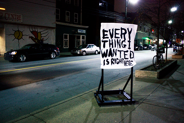
Everything I Wanted Is Right Here (street installation shot)
A little preview of our exhibition, Unrest Everywhere, up now at Eye Level Gallery.
More shots of the process and install soon, hopefully over the weekend.
Prototyping Projects for Halifax
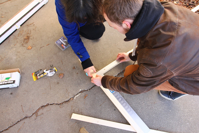
Josh, Hiba, and I spent Monday prototyping some projects for our upcoming project in Halifax. This was building off of some small macquettes that Hiba did a week ago.
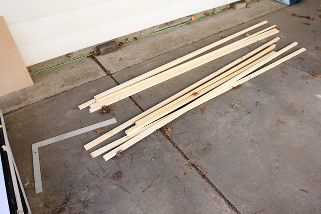
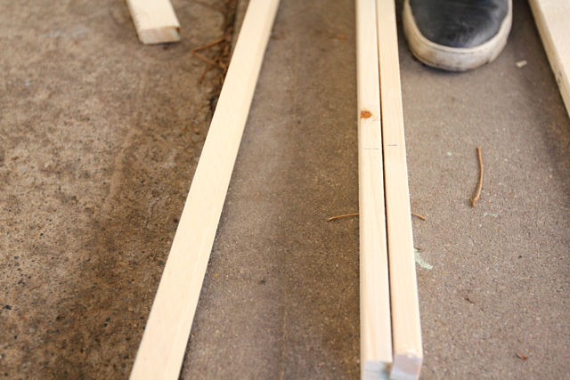
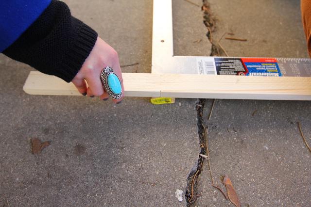
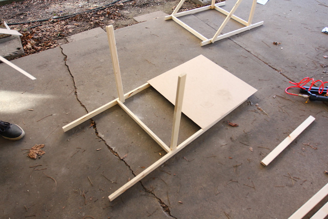
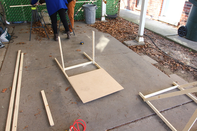
We wanted to work at full scale, so we got a bit of wood and started thinking through building.
The process was really quick and dirty, we just wanted to get some things closer to full scale to start looking at them and figuring out how we’ll move forward.
We’ll likely end up rebuilding these out in Halifax anyways, so these really will act just as a model.
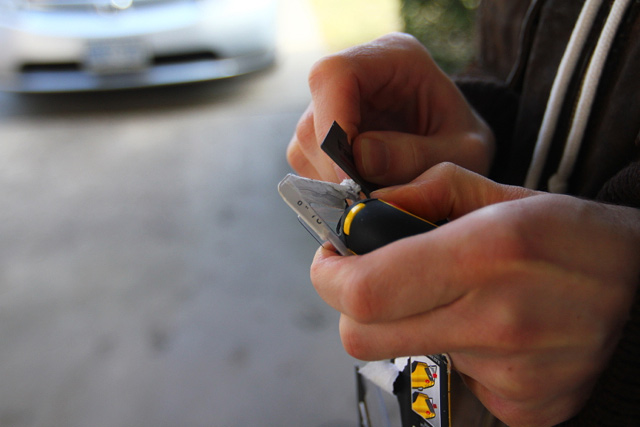
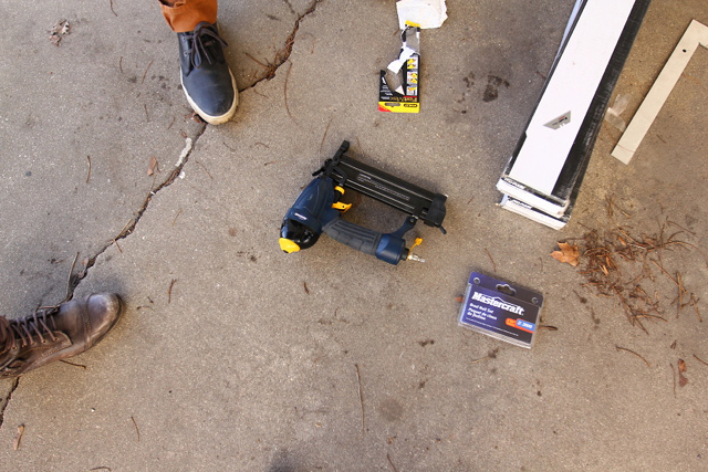
Some of the tools. Yes, a nail gun. More fun and less sturdy than a drill.
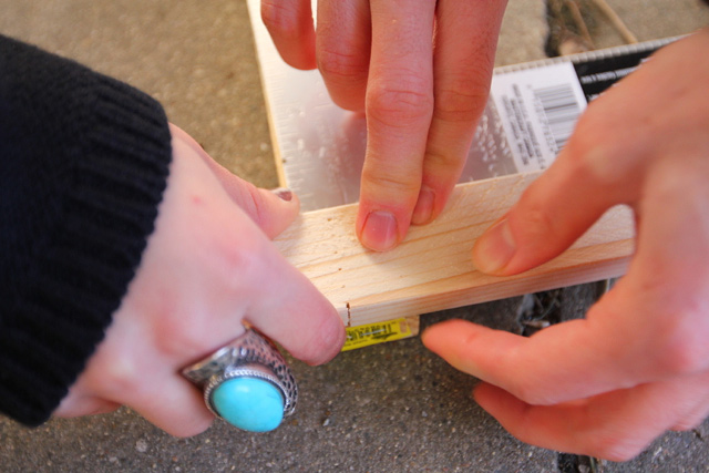
Hiba squaring things up.
Josh, perfecting.
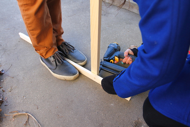
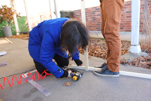
Hiba nail-gunning.
It stands.
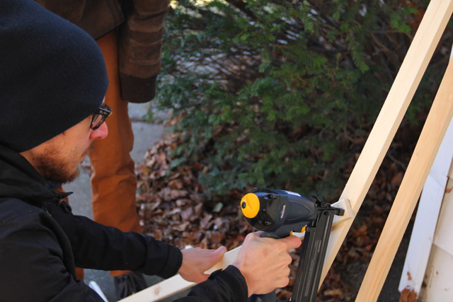
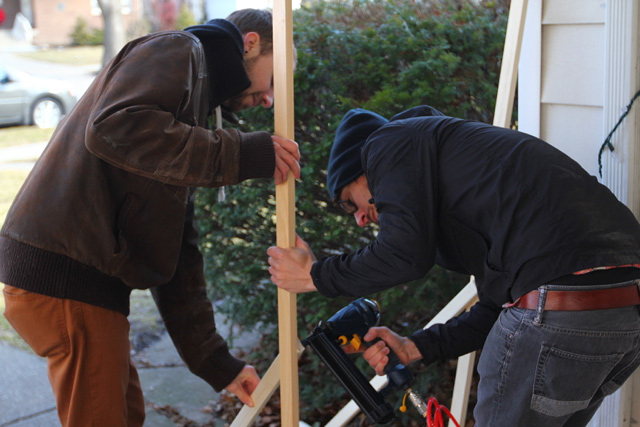
Nail gun attack.
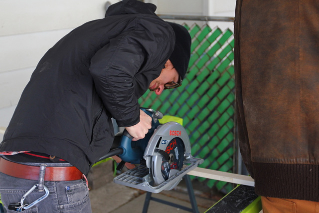
Circular saw. Serious.
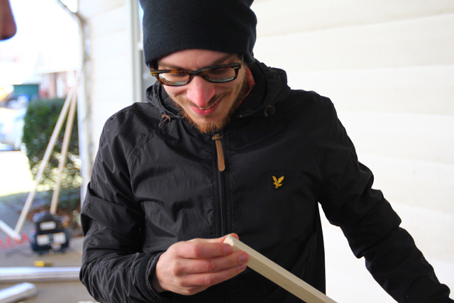
Inspecting the cut.
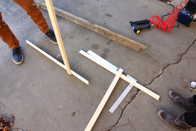
The second leg…
More reinforcements.
And this as a result.
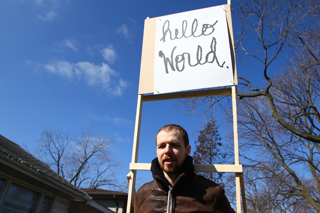
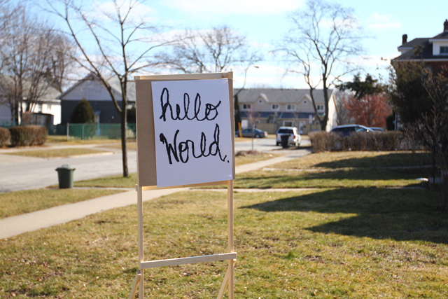
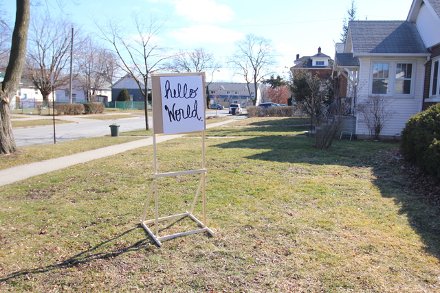
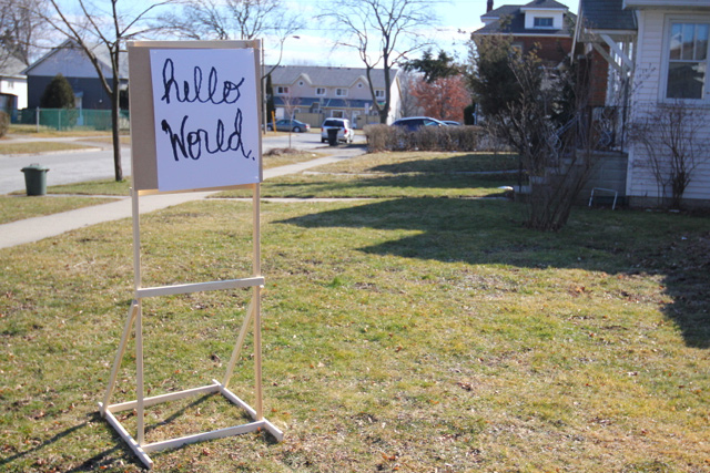
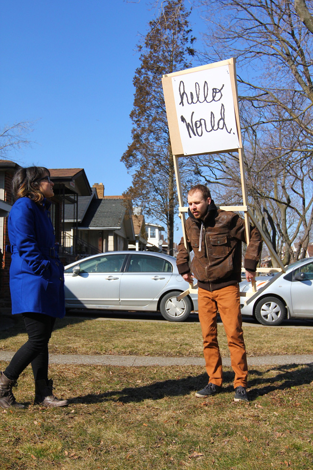
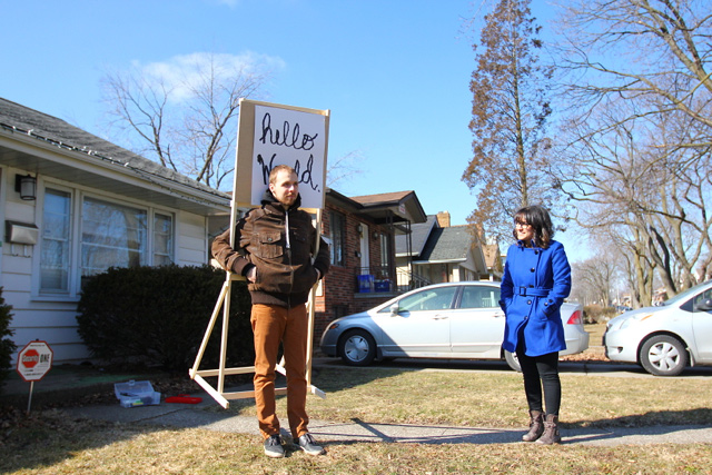
A very light-weight and portable sign easel. Designed for anyone to borrow and use for their own messaging.
Not quite scaled appropriately. We’ll end up with more surface area for the hardboard and the poster will actually be made on a roll of paper.
And maybe we’ll turn it into a backpack.
Josh seems comfortable enough.
Other ideas include adding some wheels and making it foldable for even easier transport.
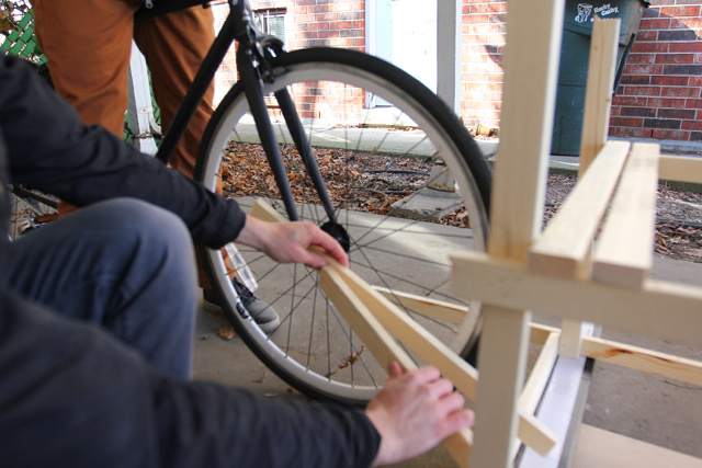
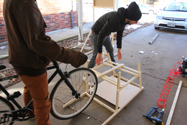
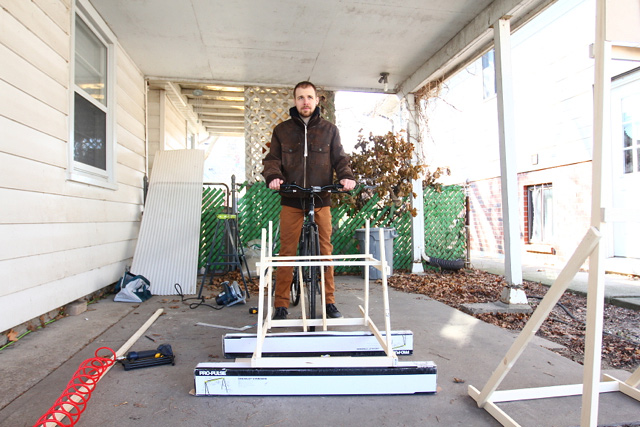
Then, onto the next project model — the bike projector attachment.
This was seriously fast prototyping, and a lot of fun. Though it’s possible that Josh had moments of panic watching joints going together that were not measured, cut correctly, or even all that well secured.
But, here’s the gist of it…
Almost a reverse trailer for the front of the bike to hold a projector and a lot, lot, lot of extension cord.
Maybe tomorrow we’ll add some castors and more bracing. More soon.
Smiley Face Visualizations from Mood Data of a City
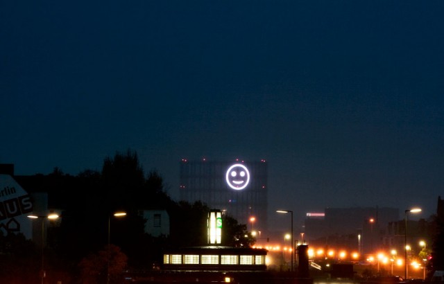
Project Stimmungsgasometer, by Richard Wilhelmer, Julius von Bismarck and Benjamin Maus, is a giant smiley face that changes based on the mood of Berlin citizens. When they are collectively “happy” the light is a smile, and when they are not, it is a sad face. Input comes from facial recognition software (contributed by the Fraunhofer Institut) that takes in video from a strategically placed camera. The obtained mood data are then stored on a server and processed by the smiley on the screen to visualize the emotions in real-time.
Kind of hilarious, a bit weird, and somehow already feeling like its showing its age (though as I understand it, it was a temporary installation back in 2008). Data-driven artwork is already boring — that is, taking dataset x and applying it to artwork parameter y. Somehow I feel like Cory Arcangel had something to do with wrecking this for everyone, in the best way possible.
Thinking about ways to animate the intangibility of the city still seems like a good idea though.
via an email from Kim seen on Flowing Data & [Stimmungsgasometer via infosthetics]
The Arts Supports You
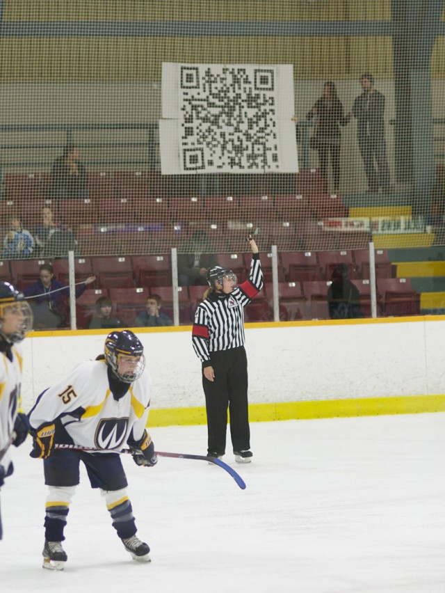
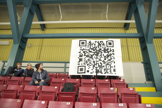
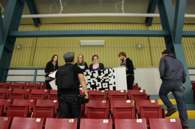
The Arts Supports You is a project thought up by some fellow students and I at the University of Windsor. The project aims to occupy certain spaces for a period of time in which we hold an oversized QR scanning code for passers by (or people situated in the space) to scan. One of the places in which this was done was in the seating at a Windsor women’s hockey game, and the other (not pictured), being in front the University of Windsor School of Music building, facing the intersection of Sunset Avenue, and Wyandotte.
The set up was rather simple: We projected the QR onto some foam core, and taped off the white areas, painting over all the exposed parts. We created our own personalized handles on the backsides, and attached each panel with velcro so that the whole 8 pieces cold fold into one, and unfold into a large piece.
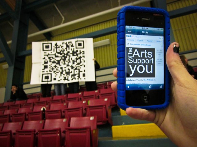
The QR code takes you to a link that has a nice little image depicting the message, and a link to a facebook page that explains the project in more detail.
A Summary of Things I’ve Been Thinking About
Today, a very brief summary of some things that I’ve been thinking about and noted over the last few weeks…
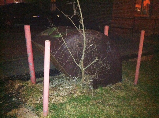
Above, a portal. Perhaps a cross-border portal. An under-used, long forgotten relic of a portal prototype. Cordoned off, waiting for a new route. Partington and Wyandotte on our side, where’s the related neighbourhood in Detroit? Maybe the portals we’ve been thinking about are more readily located than we’ve realized, or maybe this is all about something closer to what Rosina pointed out last week. I’m certain that it’s worth re-appropriating all kinds of infrastructures for our own imaginary impossibilities.
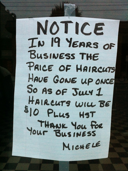
Down the street, a message from an anchor in the neighbourhood. Somehow this made me feel like things are going to be okay in this end of town — maybe that this hair salon sits steadily against the constant tide of rental units, impermanence — or maybe business is just really bad, but maybe, just maybe, this hand-written notice to passersby suggests that 19 years went by with some things really able to stay the same.

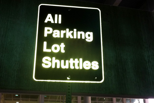
And across the river, a simple sign, retroreflective glory, the layout, the strangeness of nearly all type of informative signage, somehow these messages always make me ask more questions — that is, curiosity about the space between what this sign can tell me and the uncertainty of the missing information and details about just how to get back to where I started, a parking lot I can’t geographically place in my mind days after leaving my car and after hours of travel. Signs everywhere communicate with a strange grammar, commands and directions, and I’m continually interested in why I often have to reread signs so many times to try to ascertain exactly what they’re trying to get me to do.
Perhaps a summary was too generous. This is more just a collection, an attempt to annotate these photos before they’re long buried in a photo library and an attempt to try to think through some projects on the go and in the works.
Steve Lambert: The Making of 98.5%
This one goes out to Josh, our resident wood worker.
Steve Lambert on video making his latest work, 98.5%. From his vimeo page, “While this video only takes three and a half minutes, the actual sign took several days to make. Victoria Estok and Kyle Hittmeier helped along the way – Kyle can be seen painting, Victoria is more elusive. The soundtrack is from some old friends.”
This reminds me that we need to make more stuff.
[via MAKE]
Math, Markers, and Measurements + Eric’s micro-documentary
We spent last night watching a rough cut of some of Eric’s ongoing micro-residency project, did a lot of measuring, used Google Earth, did some math, drew some diagrams, and brainstormed a new project (because Cristina wants to sew, a lot).
With the semester basically over now, we’re hoping to wrap up a couple things before the new year before starting on some bigger new projects in the new year, which you will hear about soon!
Continue reading “Math, Markers, and Measurements + Eric’s micro-documentary”

